
AWS Architecture Diagram: Complete Guide to Designing, Documenting, and Automating AWS Infrastructure
If you've ever spent an hour hunting for the right AWS icon, aligning connection points, and manually updating a diagram after every infrastructure change, you know exactly why AWS architecture diagrams are simultaneously essential and painful.
AWS architecture diagrams are the visual blueprints of your infrastructure on Amazon Web Services. They map how AWS services, compute, storage, networking, databases, and security controls, interconnect to deliver applications and data. But here's the problem most engineers don't talk about: the diagram that took you two hours to create will be outdated in two weeks.
This guide covers everything you need to know about AWS architecture diagrams, from the official icons and best practices to the tools that actually make diagramming sustainable. If you're an AWS engineer who wants to stop fighting diagramming tools and start documenting effectively, this is for you.
Cloud Architecture
Create cloud architecture diagrams for AWS, Azure, GCP, and more. Design scalable infrastructure with professional cloud icons.
Complete guide to AWS architecture diagrams, official icons, best practices, common patterns, and AI tools for designing and documenting AWS infrastructure.
Click Cloud Architecture to open AI Line Studio and generate diagrams from natural language in seconds.
What Is an AWS Architecture Diagram?
An AWS architecture diagram is a visual representation of your AWS-based solution's components, their relationships, and how data flows between them. It typically includes:
- AWS services (EC2, S3, Lambda, RDS, VPC, etc.)
- Networking components (VPCs, subnets, load balancers, route tables, Internet Gateways)
- Security boundaries (Security Groups, NACLs, IAM roles, private subnets)
- Data flows (arrows showing how requests and data move through the system)
- Logical groupings (VPCs, Availability Zones, Regions, accounts)
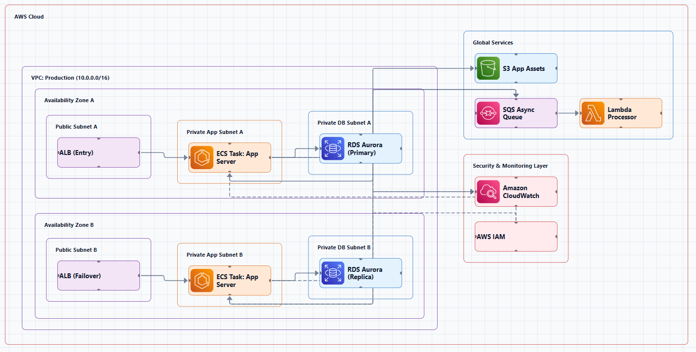
AWS architecture diagrams are a great way to communicate your design, deployment, and topology. A good diagram doesn't just show what you built, it communicates why you built it that way. It's a communication tool that helps implementers, stakeholders, and security reviewers understand the system's design intent.
The AWS Icon Library: Your Visual Vocabulary
AWS provides an official collection of architecture icons. This is the foundation of every professional AWS diagram.
Where to Get AWS Icons
The official AWS icons are available from the AWS Architecture Icons page. AWS architecture icons are designed to be simple, so you can easily use them in diagrams. You can also put icons in materials like whitepapers, presentations, data sheets, and posters.
Important: Architecture icon packages are released on a quarterly basis: Q1 (end of January), Q2 (end of April), and Q3 (end of July). No releases occur in Q4. Always check that you're using up-to-date icons, because some third-party libraries may contain legacy icon sets.
Icon Usage Guidelines
AWS permits customers and partners to use these toolkits and assets to create architecture diagrams. Consistent use of official AWS icons makes diagrams easier to read because the visual language is familiar to cloud engineers and architects alike.
AWS Architecture Diagram Best Practices
Following these best practices ensures your diagrams are readable, maintainable, and professional.
1. Use Standardized Icons and Symbols
Always use the official AWS icons provided by AWS. Consistent AWS icons and labels reduce ambiguity and make diagrams easier to scan across teams and projects. Avoid generic shapes or third-party icon packs that can cause confusion.
2. Use Directional Arrows
Avoid lines without arrows, it's hard to understand the relationship without direction. Always show the flow of data. In AWS diagrams, prefer flat layouts, placing all service icons as direct children of the AWS Cloud group with text cells for section labels. This produces the cleanest edge routing.
3. Label Everything
Provide clear, accurate, and meaningful labels for each icon, grouping container, and relationship. Don't assume readers will recognize an icon and know what it means.
Good labels are short but descriptive:
- "Web Server (EC2)" not just "EC2"
- "User Database (RDS)" not just "RDS"
- "Application Load Balancer (ALB)" not just "ALB"
4. Group by Logical Boundaries
Use containers to show VPCs, subnets, Availability Zones, or Regions. This visually communicates security and organizational boundaries. Show logical tiers or trust zones to make responsibilities and ownership clear.
Common grouping elements in AWS diagrams:
- VPC boundary: The overall virtual network
- Availability Zones: Separate AZs for high availability
- Public subnets: Resources that need internet access
- Private subnets: Resources that should not have direct internet access
5. Use Multiple Availability Zones
Always leverage multiple AWS Availability Zones (AZs) to create resilient infrastructures. This is a core best practice from the AWS Well-Architected Framework.
6. Include Metadata
Ensure every diagram contains metadata: title, description, last updated date, author, version. A diagram without a date is assumed to be outdated.
7. Layer, Don't Overload
Resist the urge to encode every subsystem in a single diagram. If your diagram has more than 15 to 20 nodes, it's too complex. Split it into multiple diagrams at different abstraction levels.
Common AWS Architecture Patterns (with Examples)
Understanding common patterns helps you read and create diagrams faster. Here are ready-to-use patterns for common AWS architectures.
1. Serverless Web Application
This is the modern standard for building web applications without managing servers.
Services shown:
- CloudFront: Content delivery network for static assets and API routing
- S3: Stores static website files (HTML, CSS, JavaScript)
- API Gateway: REST API endpoint that triggers Lambda functions
- Lambda: Serverless compute that runs application logic
- DynamoDB: NoSQL database for storing application data
- Cognito: User authentication and authorization
Layout (left to right): Users → CloudFront → S3 Bucket (static) → API Gateway → Lambda → DynamoDB. Cognito connects to API Gateway for authentication.
Why this works: Every component scales automatically. You pay only for what you use. No servers to patch or maintain.
When NOT to use this: Long-running processes, heavy computation, or applications with predictable, sustained traffic where reserved instances would be cheaper.
2. VPC with Public and Private Subnets
This is the foundational network architecture for most AWS deployments.
Services shown:
- VPC: The virtual network, defined with a CIDR block (e.g., 10.0.0.0/16)
- Public subnets: Contain resources that need internet access (load balancers, NAT gateways)
- Private subnets: Contain resources that should not have direct internet access (application servers, databases)
- Availability Zones: Multiple AZs for high availability
- Internet Gateway: The entry point for internet traffic
- Application Load Balancer (ALB): Distributes traffic across application servers
- EC2/ECS instances: Compute resources running the application
- RDS: Managed database, with a primary and standby replica across AZs
Layout (nested groups): AWS Cloud → Region → VPC → AZ-1 (Public Subnet with NAT Gateway and ALB, Private Subnet with EC2/ECS instances and RDS primary) and AZ-2 (Public Subnet with NAT Gateway, Private Subnet with EC2/ECS instances and RDS standby). Users connect through Internet Gateway → ALB → EC2/ECS.
Why this works: The public/private split provides security. The multi-AZ setup provides high availability.
When NOT to use this: For simple, single-server applications where the overhead of VPC design isn't justified. For serverless architectures that don't use VPC resources.
3. Microservices on ECS/EKS
For organizations adopting microservices, this architecture shows how to deploy and manage containerized services.
Services shown:
- Route 53: DNS and traffic routing
- CloudFront: CDN for global delivery
- Application Load Balancer (ALB): Distributes traffic to services
- ECS/EKS Cluster: Container orchestration
- Multiple services: Each service runs independently (Service A, Service B, Service C)
- ElastiCache: In-memory caching for performance
- RDS Aurora: Managed relational database
- ECR: Container image registry
- CloudWatch: Monitoring and logging
Layout: Route 53 → CloudFront → ALB → ECS/EKS Cluster. Services communicate with each other. ElastiCache and RDS Aurora connect to the services. ECR stores container images used by the cluster. CloudWatch monitors everything.
Why this works: Each service can be developed, deployed, and scaled independently. Teams can own individual services.
When NOT to use this: For small applications where the operational overhead of microservices outweighs the benefits. For teams without strong DevOps practices.
4. Data Pipeline / Analytics
For data engineering workloads, this architecture shows how to ingest, process, and analyze data at scale.
Services shown:
- Data Sources: External data streams and batch uploads
- Kinesis Data Streams: Real-time data ingestion
- S3: Data lake storage (raw, processed, curated layers)
- Kinesis Data Firehose: Loads streaming data into S3
- Glue ETL Jobs: Transforms and prepares data
- Lambda: Real-time data transformations
- Glue Data Catalog: Metadata management
- Athena: Serverless query service for S3 data
- Redshift: Data warehouse for analytics
- QuickSight: Business intelligence dashboards
- Lake Formation: Data governance and access control
Layout (pipeline flow): Data Sources → Kinesis Data Streams (real-time) and S3 (batch) → Processing (Firehose, Glue, Lambda) → Storage (S3 Data Lake, Glue Catalog) → Analytics (Athena, Redshift, QuickSight).
Why this works: The layered approach separates ingestion, processing, storage, and analytics. Each layer can scale independently.
When NOT to use this: For small data volumes where a simpler database would suffice. For teams without data engineering expertise.
5. CI/CD Pipeline
For DevOps teams, this architecture shows an automated deployment pipeline.
Services shown:
- Developer: Code commits trigger the pipeline
- CodeCommit: Source code repository
- CodePipeline: Orchestrates the build, test, and deploy stages
- CodeBuild: Compiles code and runs tests
- S3: Stores build artifacts
- CodeDeploy: Deploys to staging and production environments
- ECR: Container image registry (for container-based deployments)
- CloudWatch: Monitoring
- SNS: Notifications for pipeline events
Layout: Developer → CodeCommit → CodePipeline → CodeBuild → S3 (artifacts). CodePipeline then → CodeDeploy (staging) → Manual Approval → CodeDeploy (production). ECR if deploying containers. CloudWatch for monitoring, SNS for notifications.
Why this works: Automates the entire deployment process. Reduces human error. Provides audit trails.
When NOT to use this: For small projects where a simple script would suffice. For teams without CI/CD experience.
AWS Architecture Diagram Tools: What Actually Works
The tool you choose determines whether diagramming is a sustainable part of your workflow or a constant source of frustration.
Draw.io (diagrams.net), Free and Reliable
Draw.io is the most widely used free option for AWS diagrams. You don't need to register or sign up, and you can store your diagrams in your favorite cloud storage platforms like Google Drive, One Drive, and Dropbox.
Draw.io provides you with several years worth of AWS icon (shape) libraries as well as Amazon's 3D or isometric shapes. It also includes AWS templates you can use as starting points.
Pros: Free, browser-based, works offline, integrates with GitHub and Google Drive, includes AWS templates and icon libraries.
Cons: Manual diagramming only, diagrams go stale quickly, limited collaboration features.
To enable AWS shapes in Draw.io: In the left panel, at the bottom, click on More Shapes, scroll down to the Networking section, select the AWS library you want, then click Apply.
Lucidchart, Enterprise Collaboration
Lucidchart offers AWS-specific templates and icon libraries, real-time collaboration, and revision history.
Pros: Professional output, strong collaboration, AWS templates available.
Cons: Paid, canvas-first (manual dragging), not AWS-specific.
AWS Built-in Tools
AWS provides several ways to generate diagrams:
- AWS Management Console includes some visualization capabilities for specific services
- AWS CloudFormation can generate diagrams from infrastructure-as-code
- AWS Well-Architected Tool includes diagramming for review purposes
Diagram-as-Code Tools
Tools like Diagrams (Python library), PlantUML, and Mermaid let you generate diagrams from code, which means they're version-controlled. Changes to the diagram are tracked alongside infrastructure code.
Pros: Version-controlled, automatable, consistent output.
Cons: Learning curve, limited layout control, diagrams can feel rigid.
AI-Powered AWS Diagram Generators
AI-powered tools are the newest category and arguably the most impactful for AWS engineers. Instead of dragging boxes, you describe your architecture in natural language, and the tool generates a professional diagram.
How AI generation works:
- Describe your system: Input a prompt like "I want to build a real-time food delivery app with live order tracking, payments, and ratings"
- Select your provider: Choose AWS and select a deployment strategy, such as Low Cost/MVP or High Availability
- Technical discovery: The AI will ask clarifying questions to refine the stack (e.g., choosing between Relational or NoSQL databases)
- Automated generation: The AI instantly builds a clean, interactive diagram using official AWS icons
- AI-powered modification: Use the AI Modify tool to refine the design. Simply type "Add WAF and CloudWatch monitoring," and the diagram updates automatically
AI Line Studio takes this prompt-first approach with AWS support. Describe your system, "a 3-tier web app on AWS with EC2, RDS, and CloudFront", and it generates a structured diagram with official AWS icons in 15 to 20 seconds. The output supports PNG, GIF, and MP4 exports, plus shareable documentation links. For AWS-specific workflows, the dedicated AI cloud diagram generator is designed to turn AWS descriptions into production-ready visuals. If you're working across multiple providers, the AI architecture diagram builder supports AWS, Azure, GCP, and OCI with over 3,000 officially licensed icons.
The honest limitation: AI Line Studio is an early-stage product with a smaller install base and fewer third-party integrations than established tools like Lucidchart or Visio. It's not a general-purpose diagramming tool, if you need org charts, mind maps, or non-technical diagrams, a broader tool is a better fit. And as with any AI-generated output, complex or ambiguous system descriptions may need manual cleanup. It's not a zero-review tool for mission-critical documentation.
Pros: Lightning-fast generation from natural language, animated exports (GIF/MP4), multi-cloud support.
Cons: Less fine-grained control, early-stage product, not suitable for non-technical diagrams.
Amazon itself has recognized the value of AI-driven diagramming. As announced in April 2025, Model Context Protocol (MCP) enables tools like Kiro CLI to generate AWS architecture diagrams using natural language prompts, handling alignment, icons, and AWS standards automatically. The AWS Diagram MCP server specifically enables generative AI to generate architecture diagrams using the Python diagrams package, with access to the complete AWS icon set and architectural best practices.
When to Use AI vs. Manual Tools
Use AI-powered generation when:
- You need a first draft quickly (under a minute)
- You're iterating on design ideas and want to compare options
- You need animated diagrams for presentations or training
- Your infrastructure changes frequently and you need to regenerate diagrams often
Use manual tools when:
- You need pixel-perfect control over layout and annotations
- You're creating final, polished documentation for external stakeholders
- You're working with non-standard or highly custom components
- You need diagrams that don't follow typical AWS patterns
The pragmatic approach: Use AI for speed and iteration. Use manual tools for final polish. Most AWS engineers will benefit from both.
Common AWS Diagram Mistakes (And How to Avoid Them)
Mistake 1: Using the wrong icons. Generic shapes instead of official AWS icons make diagrams look amateur and confuse readers. Always use the official AWS icon library.
Mistake 2: No arrows on lines. Directionless lines make relationships ambiguous. Always use directional arrows.
Mistake 3: No labels. Icons without text labels leave readers guessing which service is which. Include product names close to each icon.
Mistake 4: Outdated diagrams. A diagram without a last-updated date is assumed to be wrong. Include metadata and update regularly.
Mistake 5: Overloading one diagram. Trying to show everything in one diagram creates visual noise. Layer your diagrams by abstraction level.
Mistake 6: Inconsistent notation. Different arrow styles, icon sizes, or colors for similar elements confuse readers. Standardize across all your diagrams.
Mistake 7: Ignoring security boundaries. Not showing VPCs, subnets, Security Groups, or private subnets misses a critical part of the architecture story.
Summary
AWS architecture diagrams are essential for design, documentation, and communication. But they're only valuable if they're accurate and maintainable. The official AWS icon library, the AWS Well-Architected Framework's diagramming practices, and the right tooling all work together to make this possible.
Key takeaways:
- Always use the official AWS icons
- Use directional arrows to show data flow
- Label everything clearly
- Group by logical boundaries (VPCs, subnets, AZs)
- Show multiple Availability Zones for high availability
- Include metadata (title, date, author)
- Keep diagrams updated, an outdated diagram is worse than none
The tooling landscape has shifted. AI-powered generators can now turn natural language descriptions into production-ready AWS diagrams in seconds, changing the workflow from "hours of manual dragging" to "seconds of generation with minutes of review." If you're tired of fighting diagramming tools, try using an AI cloud diagram generator to see how quickly you can turn an AWS description into a visual. For broader architecture needs beyond AWS, the AI system architecture generator covers hybrid and multi-service designs. And to see how these concepts translate into production-ready visuals, explore our AWS architecture diagram tool for templates and examples.
Stop spending hours on diagrams that will be outdated next week. Start documenting your AWS architectures in a way that actually keeps pace with your infrastructure.