
Cloud Architecture Diagram: Components, Patterns & Best Practices
A cloud architecture diagram is a visual blueprint of a cloud-based system. It shows the services, infrastructure, security boundaries, and data flows that work together to deliver an application or workload.
For engineering teams, a good cloud architecture diagram is more than documentation. It helps architects explain design decisions, gives developers a shared view of dependencies, supports security and architecture reviews, and makes complex infrastructure easier to maintain.
A useful diagram does not attempt to show every resource. Instead, it communicates the parts of the system that matter: what components exist, how they are connected, where data moves, and where important security or infrastructure boundaries exist.
This guide explains cloud architecture diagrams, their core components, common architecture patterns, real-world examples, diagramming best practices, and modern AI architecture diagram generator approaches to creating them.
Cloud Architecture
Create cloud architecture diagrams for AWS, Azure, GCP, and more. Design scalable infrastructure with professional cloud icons.
Learn how to create cloud architecture diagrams with real examples, common patterns, AWS, Azure, GCP components, best practices, and AI tools.
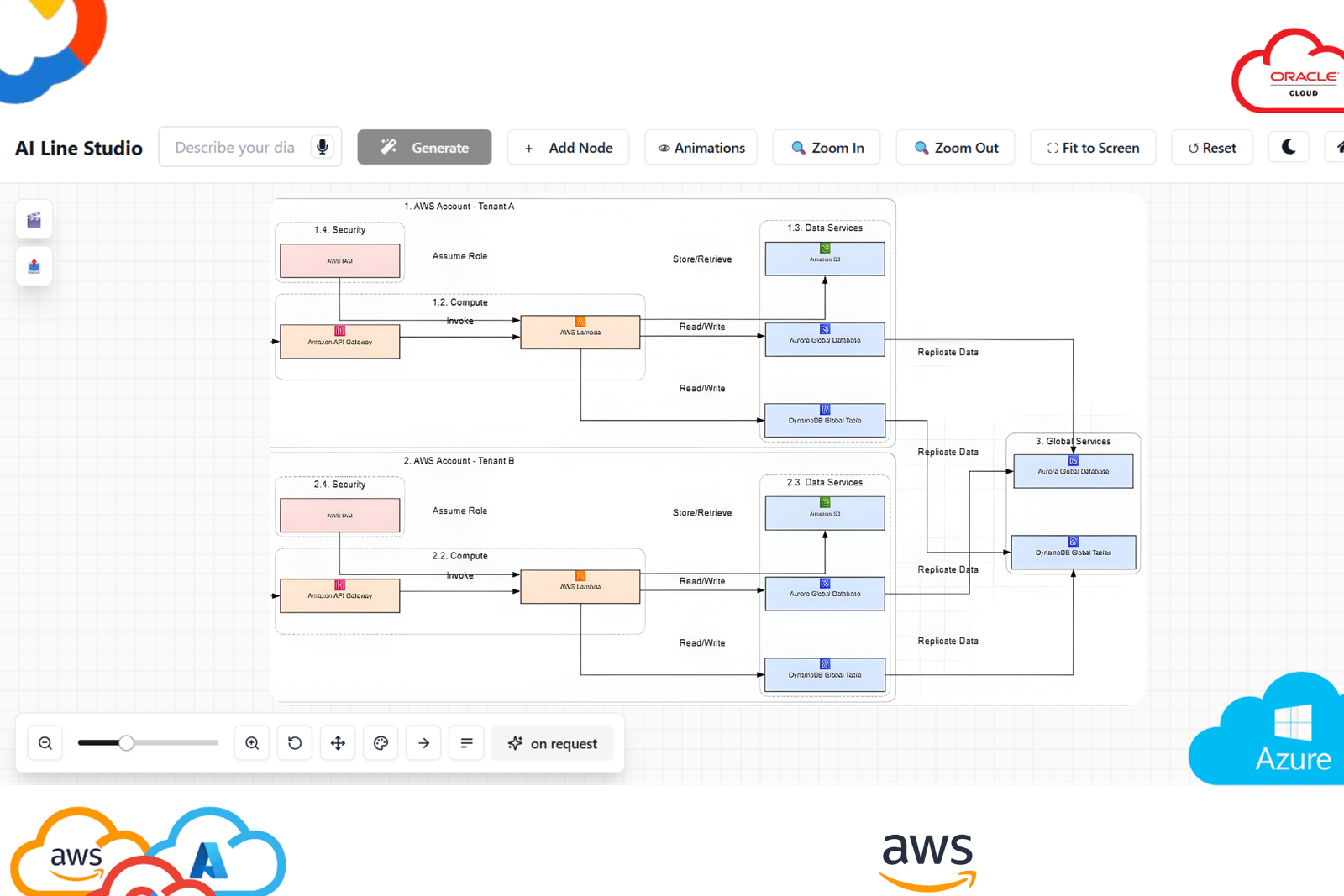
Click Cloud Architecture to open AI Line Studio and generate diagrams from natural language in seconds.
What Is a Cloud Architecture Diagram?
A cloud architecture diagram is a visual representation of an application or infrastructure environment running on a cloud platform such as AWS, Microsoft Azure, or Google Cloud.
It typically shows:
- Compute resources
- Databases and storage
- Virtual networks and subnets
- Load balancers and gateways
- APIs and application services
- Containers and Kubernetes clusters
- Security controls
- Monitoring and logging
- External users and systems
- Data and request flows
Think of it as a technical blueprint for your cloud infrastructure.
A house blueprint shows rooms, entrances, utilities, and relationships between spaces. A cloud architecture diagram does something similar for infrastructure: it shows where major services belong and how they communicate.
The goal is not to represent every configuration setting. The goal is to make the architecture understandable to the people who need to design, build, operate, review, or approve it.
Why Cloud Architecture Diagrams Matter
Cloud environments can become difficult to understand as applications add services, environments, regions, databases, queues, APIs, and security controls.
A well-structured diagram provides a shared mental model.
Architecture design and reviews
Architects can use diagrams to evaluate:
- Scalability
- Availability
- Network topology
- Security boundaries
- Service dependencies
- Failure points
- Data flows
- Operational complexity
Technical documentation
A diagram gives engineers a visual reference alongside written documentation and infrastructure code.
This is particularly useful when onboarding engineers or explaining an existing production environment.
Stakeholder communication
Not every stakeholder needs to understand every cloud service.
A high-level architecture diagram can communicate the major components and relationships without requiring someone to read Terraform, Kubernetes manifests, or application code.
Migration planning
During a cloud migration, diagrams can document the current environment and proposed target architecture.
Teams can compare:
Current state → Migration stages → Target state
This helps identify dependencies, network requirements, data movement, and services that need to be redesigned.
Security and compliance reviews
Architecture diagrams can make security boundaries easier to review by showing elements such as:
- Public and private subnets
- Firewalls
- Identity boundaries
- Network gateways
- Internet-facing components
- Database isolation
- External integrations
A diagram should support a security review, but it should not be treated as a replacement for detailed security documentation or configuration analysis.
Core Components of Cloud Architecture
Although implementations differ between providers, most cloud architecture diagrams contain several recurring categories.
1. Clients and Entry Points
The front end represents how users or external systems access the application.
Examples include:
- Web browsers
- Mobile applications
- Desktop applications
- APIs
- Partner systems
- IoT devices
A typical request flow might begin with:
User → DNS → CDN → Load Balancer → Application
The exact services depend on the architecture.
2. Compute
Compute resources execute application code and workloads.
Common examples include:
- Virtual machines
- Containers
- Kubernetes
- Serverless functions
- Managed application platforms
For example:
- AWS EC2
- Amazon ECS
- Amazon EKS
- AWS Lambda
- Azure Virtual Machines
- Azure Kubernetes Service
- Google Compute Engine
- Google Kubernetes Engine
- Google Cloud Run
The diagram should make the role of compute resources clear rather than simply displaying a collection of provider icons.
3. Storage
Cloud applications commonly use several storage models.
Object storage
Used for files, media, backups, logs, and other unstructured data.
Examples include Amazon S3, Azure Blob Storage, and Google Cloud Storage.
Block storage
Typically attached to compute resources for workloads that require persistent volumes.
Examples include Amazon EBS and Google Persistent Disk.
File storage
Provides shared filesystem-style access for applications that need it.
The architecture diagram should show storage according to its role in the application rather than treating all storage services as interchangeable.
4. Databases
Databases form a critical part of many production architectures.
Depending on workload requirements, an architecture might use:
- Relational databases
- NoSQL databases
- Distributed databases
- In-memory caches
- Data warehouses
- Search systems
Examples include Amazon RDS, DynamoDB, Azure SQL Database, Cosmos DB, Cloud SQL, and BigQuery.
The diagram should communicate important relationships such as:
Application → Database
or:
Application → Cache → Database
5. Networking
Networking connects the different parts of the architecture.
Typical components include:
- Virtual networks
- VPCs or VNets
- Subnets
- Route tables
- Load balancers
- NAT gateways
- Internet gateways
- VPN connections
- Firewalls
- Private endpoints
Network boundaries are particularly important when the diagram is being used for production architecture reviews.
6. Security and Identity
Security should not be treated as a single box placed somewhere in the corner.
It is an architectural concern that crosses the entire system.
Depending on the architecture, a diagram may show:
- Identity and access management
- Security groups
- Network ACLs
- Firewalls
- WAF
- Encryption boundaries
- Private networking
- Secrets management
- Authentication services
A useful diagram makes security boundaries visible without turning the architecture view into a complete security configuration map.
7. Observability and Operations
Production architectures also require visibility into system behavior.
Common observability components include:
- Metrics
- Logs
- Traces
- Alerting
- Monitoring
- Incident management
A production architecture diagram may show observability as an overlay connecting application, infrastructure, and data components.
Cloud Architecture Layers
Cloud architecture can be viewed at several levels of abstraction.
A practical way to organize a diagram is from the underlying infrastructure up to the application.
Infrastructure layer
This represents the foundational cloud resources:
- Virtual machines
- Networks
- Subnets
- Storage
- Load balancers
- Firewalls
This is where concepts such as regions, availability zones, and network boundaries become important.
Platform layer
Managed services sit above the raw infrastructure.
Examples include:
- Managed databases
- Kubernetes services
- Message queues
- Managed application runtimes
- Serverless platforms
The platform layer reduces the amount of infrastructure an engineering team must operate directly.
Application layer
The application layer represents the software that delivers business functionality.
This may include:
- Web applications
- APIs
- Microservices
- Background workers
- Internal services
- Business logic
External systems
Many production systems also depend on services outside the primary cloud environment.
Examples include:
- Payment providers
- Identity providers
- SaaS platforms
- Partner APIs
- Corporate networks
- On-premises systems
Showing these dependencies is often essential when communicating the real architecture.
Common Cloud Architecture Patterns
Architecture patterns provide reusable ways to structure cloud systems.
The correct pattern depends on workload requirements rather than simply following a diagram template.
1. Single-Tier Architecture
A single-tier architecture places major application responsibilities together rather than separating them into independent tiers.
It can be appropriate for:
- Prototypes
- Learning environments
- Small internal applications
- Low-complexity workloads
The simplicity can be useful, but the architecture becomes harder to scale and isolate as requirements grow.
For production systems with demanding availability, security, or scaling requirements, a more structured architecture is usually appropriate.
2. Three-Tier Architecture
Three-tier architecture separates an application into three major tiers:
- Presentation tier
- Application tier
- Data tier
A typical cloud implementation might look like:
Users → Load Balancer → Application Servers → Database
The application tier may run on virtual machines, containers, or managed application services.
The database normally sits behind private network boundaries rather than being directly exposed to the internet.
Example
A simple AWS implementation could contain:
- CloudFront
- Application Load Balancer
- EC2 Auto Scaling Group
- Amazon RDS
- VPC
- Public and private subnets
The diagram should show both the request path and the network boundaries.
3. Hub-and-Spoke Architecture
A hub-and-spoke topology uses a central network or connectivity layer to connect multiple workload networks.
The hub can provide shared services such as:
- Network security
- Firewalling
- VPN connectivity
- Centralized routing
- Shared infrastructure
The spokes can represent:
- Development
- Staging
- Production
- Business units
- Individual applications
This pattern is particularly useful for larger organizations that need centralized networking and governance across multiple environments.
4. Serverless Architecture
Serverless architectures use managed cloud services so teams do not need to manage traditional servers for every application component.
A typical flow might be:
User → API Gateway → Function → Database
Event-driven architectures can also use:
Event → Queue → Function → Database
Serverless can be particularly useful for event-driven workloads, APIs, automation, and applications with variable demand.
However, architecture decisions should still consider execution limits, latency, observability, vendor dependencies, and cost at the expected workload level.
5. Microservices Architecture
Microservices split an application into independently deployable services.
A diagram may show:
API Gateway → Service A → Database A
alongside:
API Gateway → Service B → Database B
and:
Service A → Message Queue → Service C
A microservices diagram should make service boundaries and communication patterns clear.
Simply creating many boxes does not make an architecture microservices-based.
How to Read a Cloud Architecture Diagram
When reviewing a diagram, start with the flow rather than individual icons.
Step 1: Find the entry point
Ask: Where does the request originate?
Look for users, applications, APIs, DNS, CDN services, or external systems.
Step 2: Follow the request path
Trace the arrows.
For example:
User → CDN → Load Balancer → Application → Database
This reveals the primary request flow.
Step 3: Identify network boundaries
Look for:
- Regions
- Availability zones
- VPCs
- VNets
- Subnets
- Private networks
These boundaries tell you where resources are located and how they are isolated.
Step 4: Find stateful components
Databases, object storage, caches, and queues are particularly important because they influence scaling and failure behavior.
Step 5: Identify security controls
Look for:
- IAM
- WAF
- Firewalls
- Security groups
- Private endpoints
- Encryption
- Authentication
Step 6: Look for resilience
Ask:
- Is there redundancy?
- Are multiple availability zones used?
- What happens when a component fails?
- Is the database highly available?
- Where are the potential single points of failure?
Step 7: Look for observability
A production architecture should make it possible to understand how the system behaves.
Look for monitoring, logging, metrics, tracing, and alerting components.
Example: Three-Tier Cloud Architecture
Consider a production web application.
A simplified architecture could look like this:
Users → DNS / CDN → Application Load Balancer → Private Application Subnets → Application Servers / Containers → Private Database Subnet → Managed Database
A more complete architecture may also include:
- WAF
- Auto Scaling
- Cache
- Object storage
- Queue
- Monitoring
- Centralized logging
- CI/CD
- Secrets management
The important part is not the number of services.
The important part is whether the diagram communicates:
- Request flow
- Network boundaries
- Security controls
- Dependencies
- Scaling strategy
- Data storage
- Operational components
AWS, Azure, and GCP Architecture Diagrams
Cloud architecture diagrams become much more useful when they use provider-specific services and recognizable icons.
For example, an AWS architecture might use:
- Amazon VPC
- Availability Zones
- Elastic Load Balancing
- EC2
- RDS
- S3
- Lambda
- CloudFront
- CloudWatch
An Azure architecture could use:
- Virtual Network
- Application Gateway
- Azure App Service
- Azure Kubernetes Service
- Azure SQL Database
- Blob Storage
- Azure Functions
- Azure Monitor
A Google Cloud architecture could use:
- VPC
- Cloud Load Balancing
- Compute Engine
- GKE
- Cloud Run
- Cloud SQL
- Cloud Storage
- Cloud Monitoring
For provider-specific diagramming workflows, you can use an AWS architecture diagram generator, Azure architecture diagram generator, or GCP architecture diagram generator.
Cloud Architecture Diagram Best Practices
1. Start With the System Context
Do not begin by placing every cloud service on the canvas.
Start with:
Users → Application → Core dependencies
Then add detail as needed.
This gives reviewers an understandable high-level view before they encounter implementation details.
2. Use Official Cloud Icons
Use recognizable provider-specific icons where appropriate.
AWS, Azure, and Google Cloud each provide established visual vocabularies for their services.
Consistent icons make diagrams easier for engineers to scan.
3. Group Components by Logical Boundaries
Use containers to communicate boundaries such as:
- Region
- Availability Zone
- VPC
- VNet
- Subnet
- Kubernetes cluster
- Application boundary
The grouping should communicate architecture, not simply improve visual appearance.
4. Make Data Flow Obvious
Arrows should clearly communicate direction.
For example:
User → Load Balancer → Application → Database
For asynchronous workflows, distinguish the flow where appropriate:
Application → Queue → Worker → Database
Avoid crossing lines whenever possible.
5. Label Components Clearly
Do not rely exclusively on icons.
Instead of EC2, use Application Servers, EC2.
Instead of RDS, use Application Database, RDS PostgreSQL.
The label should tell the reader what the component does.
6. Separate Logical and Physical Views
A single diagram cannot always communicate everything.
Consider maintaining different views:
- Context diagram, Shows the system and its external dependencies.
- Logical architecture, Shows major application components and relationships.
- Deployment architecture, Shows regions, networks, subnets, availability zones, and infrastructure placement.
- Detailed architecture, Shows implementation-level services and dependencies.
This approach prevents a single diagram from becoming unreadable.
7. Document Important Decisions
A diagram should communicate more than what exists.
Where useful, annotate why an architectural decision was made.
For example: Database deployed across multiple availability zones for resilience.
Or: Application tier remains private; only the load balancer is internet-facing.
8. Keep Diagrams Current
An outdated architecture diagram can be actively misleading.
Include useful metadata such as:
- Architecture name
- Owner
- Last updated date
- Version
- Environment
Update diagrams when significant infrastructure changes occur.
Common Cloud Architecture Diagram Mistakes
Mistake 1: Showing Everything
A diagram with dozens of services and hundreds of connections can become impossible to understand.
Create multiple views instead.
Mistake 2: Missing Security Boundaries
If the diagram does not show important network boundaries, reviewers may struggle to understand the security architecture.
Mistake 3: Unclear Data Flow
Lines should have direction and meaning.
Mistake 4: Mixing Abstraction Levels
Avoid showing a high-level application box next to extremely detailed infrastructure resources without explaining the relationship.
Mistake 5: No Labels
Icons alone are not enough for many audiences.
Mistake 6: Treating the Diagram as the Source of Truth
A diagram should complement infrastructure-as-code, configuration, monitoring, and technical documentation.
For production environments, compare the diagram with the actual infrastructure and update it when the system changes.
Mistake 7: Overusing Color
Color should communicate meaning.
If every service has a different color, the diagram becomes harder to scan rather than easier.
Tools for Creating Cloud Architecture Diagrams
There are several ways to create cloud architecture diagrams.
Manual Diagramming Tools
Traditional tools such as diagrams.net can work well when you need complete manual control over layout and notation.
They are especially useful when:
- You want to draw from scratch
- You need custom layouts
- You are teaching architecture concepts
- You need precise visual control
Infrastructure-as-Code and Code-Based Diagrams
Teams can also generate diagrams from code or infrastructure definitions using technologies such as:
- Terraform
- Mermaid
- PlantUML
- Infrastructure diagram libraries
This approach can improve repeatability and make diagrams easier to integrate into engineering workflows.
The tradeoff is that code-based diagrams can require additional setup and may not always produce the visual presentation needed for architecture reviews.
AI-Powered Cloud Architecture Diagram Generators
AI diagram generators take a different approach.
Instead of manually placing every component, you describe the architecture in natural language.
For example:
Create a three-tier AWS application with CloudFront, an Application Load Balancer, private EC2 instances across two Availability Zones, and an RDS PostgreSQL database.
The AI can turn that description into a structured architecture diagram that you can review and refine.
AI Line Studio currently positions itself around this prompt-first workflow, with cloud architecture generation, provider-specific icons, editing, exports, and collaboration capabilities.
You can explore the AI architecture diagram generator when you want to turn a system description into a visual architecture.
For broader cloud infrastructure workflows, the cloud architecture diagram generator can be used as a starting point.
How to Create a Cloud Architecture Diagram With AI
AI can reduce the mechanical work involved in creating the first version of an architecture diagram, but the architecture itself still needs engineering judgment.
A practical workflow is:
1. Describe the workload
Start with the application type.
For example: Build an architecture for an e-commerce web application.
2. Specify the cloud provider
Add: Deploy it on AWS.
3. Define major services
For example: Use CloudFront, an Application Load Balancer, EC2 Auto Scaling, RDS PostgreSQL, and S3.
4. Describe network requirements
Add information such as: Place application servers in private subnets across two Availability Zones.
5. Describe data flow
For example: Users access the application through CloudFront. Traffic reaches the load balancer, which routes requests to the application tier. Application servers access RDS privately.
6. Add security and observability
Specify requirements such as: Add WAF, IAM, CloudWatch monitoring, centralized logging, and encrypted database storage.
7. Review the generated architecture
AI-generated diagrams should be reviewed by an engineer or architect.
Check:
- Service selection
- Network placement
- Security boundaries
- Data flow
- Availability
- Scalability
- Dependencies
- Cost implications
8. Refine the diagram
Remove unnecessary components and add missing architecture details.
The result should be an engineering artifact, not simply an AI-generated picture.
When Should You Use an AI Diagram Generator?
AI-powered diagramming is particularly useful when the main bottleneck is turning an architecture idea into a first visual draft.
It can help with:
- Architecture brainstorming
- Design reviews
- Documentation
- Technical presentations
- Cloud migration planning
- System design discussions
- Developer onboarding
- Architecture proposals
Manual diagramming can still be preferable when you need highly controlled layouts or specialized notation.
For complex production systems, the strongest workflow is often:
AI-generated starting point → Engineering review → Manual refinement → Architecture documentation
AI-Generated Diagrams Still Need Engineering Review
AI can accelerate diagram creation, but it should not replace architectural judgment.
A generated diagram may need correction if the prompt is:
- Ambiguous
- Incomplete
- Missing security requirements
- Missing networking requirements
- Missing scaling requirements
- Missing failure scenarios
For production systems, verify the generated architecture against actual infrastructure, Terraform, Kubernetes configuration, application dependencies, and operational requirements.
The diagram should represent the intended or actual system accurately.
Cloud Architecture Diagram: From Simple to Production
A useful way to evolve a diagram is to increase its detail as the architecture matures.
Level 1: Conceptual
Show: Users → Application → Database
Useful for early discussions, learning, and stakeholder presentations.
Level 2: Logical
Add application services, APIs, queues, caches, and external dependencies.
Level 3: Deployment
Add regions, Availability Zones, VPCs/VNets, subnets, load balancers, and security boundaries.
Level 4: Production architecture
Add relevant operational information such as:
- High-availability strategy
- Scaling
- Monitoring
- Logging
- CI/CD
- Backup and recovery
- Failure domains
- Disaster recovery
- Cost-sensitive components
Not every architecture requires Level 4 detail. The appropriate level depends on who will use the diagram and what decision it needs to support.
Create Your Cloud Architecture Diagram
A strong cloud architecture diagram should make a complex system easier to understand, not make the system look more complicated.
Start with the users, major application components, data stores, and primary request flows. Then add the infrastructure, networking, security, availability, and observability details that matter to your audience.
If you want to move from a written architecture description to a visual starting point, try the AI cloud architecture diagram generator.
For broader system designs, use the AI architecture diagram generator.
You can also use the AI diagram workspace to create, refine, and work with architecture diagrams.
Turn your architecture description into a clear visual diagram with AI Line Studio.
Frequently Asked Questions
A cloud architecture diagram visually represents the components, connections, boundaries, and data flows of a system running in a cloud environment.