
AWS Architecture Diagram with Explanation: A Complete Visual Guide to AWS Cloud Infrastructure
AWS architecture diagrams are the visual blueprints of modern cloud infrastructure. They map how AWS services, compute, storage, networking, databases, and security controls, interconnect to deliver applications and data. But a diagram without explanation is just a collection of boxes and arrows.
An AWS architecture diagram shows how a cloud system is structured and how its components interact. It helps teams align early, communicate clearly with stakeholders, and document decisions that matter during implementation, audits, or handoffs. The level of detail depends on who the diagram is for and how it will be used.
This guide walks through what AWS architecture diagrams are, breaks down the core components and services you'll see in every diagram, explains common architecture patterns with detailed explanations of why they're designed that way, and covers the best practices that separate professional diagrams from confusing messes.
Cloud Architecture
Create cloud architecture diagrams for AWS, Azure, GCP, and more. Design scalable infrastructure with professional cloud icons.
A complete visual guide to AWS architecture diagrams with explanations, components, common patterns, best practices, and how to read AWS infrastructure diagrams.
Click Cloud Architecture to open AI Line Studio and generate diagrams from natural language in seconds.
Why AWS Architecture Diagrams Matter
A single role rarely owns cloud systems. Solution architects design them, DevOps engineers operate them, project managers track delivery, and stakeholders evaluate risk and cost. An architecture diagram creates a shared reference point for all of these perspectives.
- Amazon EC2 (Elastic Compute Cloud): Virtual machines in the cloud. You choose the instance type, operating system, and configuration.
- AWS Lambda: Serverless compute that runs code in response to events. No servers to manage, you pay only for compute time consumed.
- Amazon ECS/EKS: Container orchestration services. ECS is AWS's native container service; EKS is managed Kubernetes.
- AWS Fargate: Serverless compute for containers. You define the container, and AWS handles the infrastructure.
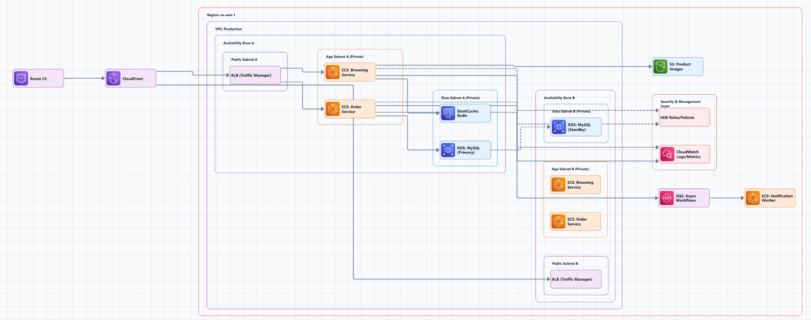
For technical teams, diagrams make relationships visible. You can quickly see how traffic enters the system, which services depend on each other, and where scaling or redundancy has been built in. This makes it easier to identify bottlenecks, security gaps, and performance risks before they surface in production.
For non-engineering stakeholders, diagrams translate complex cloud systems into intuitive visuals. A well-structured diagram explains system behavior without requiring deep knowledge of cloud internals. This is especially useful during reviews, audits, and planning discussions where alignment matters more than implementation detail.
Documenting internal technical diagrams and processes also eases the incident response analyst's job, helping them quickly obtain the institutional knowledge needed to respond to a security event. The AWS Well-Architected Framework emphasizes that you should verify that documentation is up to date and regularly updated in accordance with new architecture patterns.
AWS Architecture Components: The Building Blocks
Every AWS architecture diagram uses a common set of service categories. Understanding these categories is the first step to reading and creating diagrams.
Compute Services
Compute services provide the processing power for your applications:
In diagrams, compute resources are typically shown in the middle tier of a multi-tier architecture, processing requests and executing business logic.
Storage Services
Storage services handle data persistence:
- Amazon S3 (Simple Storage Service): Object storage for static assets, backups, and data lakes. Scales infinitely.
- Amazon EBS (Elastic Block Store): Block storage volumes attached to EC2 instances. Used for databases and file systems.
- Amazon EFS (Elastic File System): Managed file storage for Linux instances. Scales automatically.
- Amazon Glacier: Low-cost archival storage for data that's accessed infrequently.
In diagrams, storage services often appear at the bottom or as separate boxes connected to compute resources.
Database Services
Database services manage structured and unstructured data:
- Amazon RDS (Relational Database Service): Managed relational databases (MySQL, PostgreSQL, SQL Server, Oracle, Aurora). Handles backups, patching, and replication.
- Amazon DynamoDB: Managed NoSQL database with single-digit millisecond latency. Scales automatically.
- Amazon Redshift: Data warehouse for analytics and business intelligence.
- Amazon ElastiCache: In-memory caching for Redis and Memcached. Used to reduce database load and improve performance.
In diagrams, databases are typically shown in a private subnet, often with a primary and standby replica across Availability Zones for high availability.
Networking Services
Networking services connect everything together:
- Amazon VPC (Virtual Private Cloud): Your private network in the AWS cloud. You define CIDR blocks, subnets, route tables, and gateways.
- Subnets: Segments of a VPC's IP address range. Public subnets have internet access; private subnets do not.
- Internet Gateway: The entry point for internet traffic into a VPC.
- NAT Gateway: Allows resources in private subnets to access the internet (for updates, patches) but prevents inbound internet access.
- Elastic Load Balancing (ALB/NLB): Distributes incoming traffic across multiple targets (EC2 instances, containers, Lambda functions).
- Amazon Route 53: DNS and traffic routing service.
- Amazon CloudFront: Content delivery network (CDN) for global content delivery.
In diagrams, networking components are shown as containers (VPCs, subnets) and as connection points (load balancers, gateways) that route traffic.
Security and Management Services
Security and management services protect and monitor your infrastructure:
- AWS IAM (Identity and Access Management): Controls who can access what. Users, groups, roles, and policies.
- AWS CloudTrail: Logs all API calls made in your account. Essential for auditing and security investigations.
- Amazon CloudWatch: Monitoring and observability. Collects metrics, logs, and sets alarms.
- AWS Config: Tracks resource configuration changes and evaluates against desired policies.
- AWS Security Groups: Virtual firewalls that control inbound and outbound traffic to resources.
- Network ACLs: Stateless firewalls at the subnet level.
In diagrams, security services are often shown as an overlay or as "glue" connecting other components.
Common AWS Architecture Patterns with Explanations
Understanding common patterns helps you read and create diagrams faster. Here are the most frequently used AWS architecture patterns, with detailed explanations of each component.
Pattern 1: Single-Tier Architecture
A single-tier architecture runs all three layers of operation, user interface, logic, and database, on one server. This is the simplest pattern, typically used for development, testing, or very low-traffic applications. In a diagram, this appears as a single box containing all components.
When to use: Learning, prototyping, or applications with minimal traffic and no scaling requirements.
When NOT to use: Production workloads, applications with any traffic variability, or systems requiring high availability.
Pattern 2: Two-Tier Architecture
A two-tier architecture separates the web application from the database. The application layer runs on Amazon EC2 instances behind an Application Load Balancer, while the data layer is powered by Amazon RDS.
Layout: Users → Load Balancer → Web Servers (EC2) → Database (RDS)
When to use: Simple production applications that need separation between the application and data layers.
When NOT to use: Applications that need to scale independently across multiple tiers (web, app, data).
Pattern 3: Three-Tier Architecture
The three-tier architecture is the most common pattern for production web applications. It separates an application into three logical layers:
- Presentation Tier (Web Layer): Users interact with this, serves the frontend (React, Angular, or static HTML). Hosted on EC2 instances in Auto Scaling groups behind an Application Load Balancer.
- Application Tier (Logic Layer): Where business logic runs, processes API requests and executes application code. Hosted on EC2 instances in private subnets.
- Database Tier (Data Layer): Where data is stored and managed. Amazon RDS with Multi-AZ deployment for high availability.
A three-tier architecture separates an application's functionality into distinct layers (presentation, business logic, and data) to enable scalability, modularity, and flexibility in software development. This type of architecture is suitable for building a wide range of applications such as web applications, enterprise systems, and mobile apps.
Layout: Users → Internet Gateway → Load Balancer (public) → Web Servers (public subnet) → Internal Load Balancer → Application Servers (private subnet) → Database (private subnet, across multiple Availability Zones).
Why this works: Each layer can be developed, scaled, and maintained independently. You can scale your web servers without touching your database. You can update your application logic without redeploying your web servers. The multi-AZ deployment provides high availability and automatic failover.
When NOT to use: For simple applications where the operational overhead of managing three tiers isn't justified. For teams without DevOps practices to manage the infrastructure.
Serverless Three-Tier Architecture
A serverless three-tier architecture uses AWS managed services instead of EC2 instances. The presentation tier uses S3 + CloudFront for static hosting, the logic tier uses API Gateway + Lambda, and the data tier uses DynamoDB. This eliminates server management entirely, you pay only for what you use.
Layout: S3 + CloudFront → API Gateway → Lambda → DynamoDB
Pattern 4: Microservices Architecture
For organizations adopting microservices, this architecture deploys and manages containerized services independently.
Services shown:
- Route 53: DNS and traffic routing
- CloudFront: CDN for global delivery
- Application Load Balancer (ALB): Distributes incoming traffic to services
- ECS/EKS Cluster: Container orchestration platform
- Multiple services: Each service runs independently
- ElastiCache: In-memory caching for performance
- RDS Aurora: Managed relational database
- ECR: Container image registry
- CloudWatch: Monitoring and logging
Why this works: Each service can be developed, deployed, and scaled independently. Teams can own individual services.
When NOT to use: For small applications where the operational overhead of microservices outweighs the benefits.
AWS Architecture Diagram Best Practices
The goal of any AWS architecture diagram is to clearly communicate structure and intent. Here's what actually works in production.
1. Keep Diagrams Simple and Readable
Focus on the components and relationships that matter for the intended audience. Common architecture patterns serve as templates to reduce design time and support consistency across systems. If a diagram has more than 15 to 20 nodes, it's too complex. Split it into multiple diagrams at different abstraction levels.
2. Use Official AWS Icons
AWS architecture icons are designed to be simple, so you can easily use them in diagrams. Consistent use of official AWS icons makes diagrams easier to read because the visual language is familiar to cloud engineers and architects alike. You can download the official AWS icon toolkit from the AWS Architecture Center.
Important: Architecture icon packages are released on a quarterly basis: Q1 (end of January), Q2 (end of April), and Q3 (end of July). No releases occur in Q4. Always check that you're using up-to-date icons.
3. Use Directional Arrows
Show the flow of data. Lines without arrows are ambiguous, always indicate direction. A strong AWS architecture diagram should include the main services, network boundaries, user entry points, and the core data or request flow.
Layout guidelines recommend 180px horizontal and 120px vertical gaps between service group containers, with group padding of 30px on all sides. For diagrams with 13+ services, increase spacing to 220px horizontal and 160px vertical.
4. Emphasize Network Boundaries
Clearly show VPCs, subnets, and security groups. Show security groups and network ACLs. This visually communicates security and organizational structure. Emphasize VPC, subnets, and network boundaries to make responsibilities and ownership clear.
5. Label Everything
Provide clear, accurate labels for each icon, grouping container, and relationship. Don't assume readers will recognize an icon and know what it means.
6. Include Metadata
Add a title, description, last updated date, author, and version. A diagram without a date is assumed to be outdated.
7. Validate Against AWS Well-Architected
Architecture diagrams should demonstrate the lifecycle phases with the supporting technologies that enable best practices. The AWS Well-Architected Framework consists of six pillars that provide best practices for designing and operating resilient, secure, efficient, cost-effective, and sustainable systems:
- Operational Excellence: The ability to support development and run workloads effectively, gain insight into their operations, and continuously improve supporting processes.
- Security: Protecting information and systems.
- Reliability: The ability of a workload to perform its intended function correctly and consistently.
- Performance Efficiency: Using computing resources efficiently.
- Cost Optimization: Avoiding unnecessary costs.
- Sustainability: Minimizing the environmental impact of running cloud workloads.
Use the AWS Well-Architected Tool in the console to track findings and improvement plans. Revisit every quarter or after significant architectural changes.
8. Document and Centralize Architecture Diagrams
To quickly and accurately respond to a security event, you need to understand how your systems and networks are architected. Documenting internal technical diagrams and processes eases the incident response analyst's job, helping them quickly obtain the institutional knowledge needed to respond to a security event.
You should develop documentation and internal repositories that detail items such as:
- AWS account structure
- AWS service patterns
- Architecture patterns
- AWS authentication patterns
- AWS authorization patterns
- Logging and monitoring
- Network topology
- External infrastructure
Tools for Creating AWS Architecture Diagrams
Several tools can help you create these diagrams:
Manual Tools
- Draw.io (diagrams.net): Free, browser-based, includes AWS shape libraries and templates. No registration required.
- Lucidchart: Professional diagramming with AWS-specific templates, real-time collaboration, and revision history.
- Visual Paradigm Online: Free online diagramming software with support for AWS Architecture Diagrams and many other diagram types.
AI-Powered Tools
AI-powered tools are fundamentally changing the workflow. Instead of dragging boxes, you describe your architecture in natural language, and the tool generates a professional diagram.
AI Line Studio takes this prompt-first approach with AWS support. Describe your system, "a 3-tier web app on AWS with EC2, RDS, and CloudFront", and it generates a structured diagram with official AWS icons in 15 to 20 seconds. The output supports PNG, GIF, and MP4 exports, plus shareable documentation links. For AWS-specific workflows, the dedicated AI cloud diagram generator turns AWS descriptions into production-ready visuals. If you're working across multiple providers, the AI architecture diagram builder covers AWS, Azure, GCP, and OCI with over 3,000 officially licensed icons.
The honest limitation: AI Line Studio is an early-stage product with a smaller install base and fewer third-party integrations than established tools. It's not a general-purpose diagramming tool, if you need org charts, mind maps, or non-technical diagrams, a broader tool is a better fit. And as with any AI-generated output, complex or ambiguous system descriptions may need manual cleanup. It's not a zero-review tool for mission-critical documentation.
Diagram-as-Code Tools
Tools like diagrams-js let you define your architecture diagrams in TypeScript, with support for 17+ cloud providers including AWS, Azure, GCP, and Kubernetes. This approach enables version control, you can track diagram changes in Git alongside your infrastructure code.
Common Mistakes to Avoid
Mistake 1: Using the wrong icons. Generic shapes instead of official AWS icons make diagrams look amateur and confuse readers. Always use the official AWS icon library.
Mistake 2: No arrows on lines. Directionless lines make relationships ambiguous. Always use directional arrows to show data flow.
Mistake 3: No labels. Icons without text labels leave readers guessing which service is which. Include product names close to each icon.
Mistake 4: Outdated diagrams. A diagram without a last-updated date is assumed to be wrong. Include metadata and update regularly.
Mistake 5: Overloading one diagram. Trying to show everything in one diagram creates visual noise. Layer your diagrams by abstraction level.
Mistake 6: Inconsistent notation. Different arrow styles, icon sizes, or colors for similar elements confuse readers. Standardize across all your diagrams.
Mistake 7: Ignoring security boundaries. Not showing VPCs, subnets, or security groups misses a critical part of the architecture story.
Summary
AWS architecture diagrams are essential for design, documentation, and communication. A well-crafted diagram shows how cloud services are organized and connected to support an application, with core components including compute, storage, databases, networking, and security services.
Key takeaways:
- AWS architecture diagrams provide a clear visual way to explain how a cloud solution is structured and how its services relate to one another
- Common patterns, single-tier, two-tier, three-tier, and microservices, serve as templates to reduce design time and support consistency across systems
- Best practices: keep it simple, use official AWS icons, show directional arrows, label everything, emphasize network boundaries, include metadata, and validate against Well-Architected
- Architecture diagrams demonstrate the lifecycle phases with the supporting technologies that enable best practices
- Document and centralize architecture diagrams to support incident response and institutional knowledge
The tooling landscape has shifted. AI-powered generators can now turn natural language descriptions into production-ready AWS diagrams in seconds, changing the workflow from hours of manual dragging to seconds of generation with minutes of review.
If you're ready to move beyond studying examples, try using an AI cloud diagram generator to turn an AWS description into a visual instantly. For broader architecture needs beyond AWS, the AI system architecture generator covers distributed and enterprise systems. And to see how these concepts translate into production-ready templates, explore our AWS architecture diagram tool for practical examples you can adapt.