
Best AWS Architecture Diagram Tools: 2026 Comparison for Cloud Engineers
If you're a cloud engineer, you know the drill. You spend 20 minutes placing boxes in draw.io, another 15 aligning arrows, and by the time you share the diagram, someone has already changed the infrastructure. The diagram that took you an hour to create is outdated before you hit "save."
AWS architecture diagrams are foundational to planning, governance, and team alignment. They accelerate onboarding, improve incident response, and enable architecture reviews. But the value of a diagram depends entirely on its accuracy. A diagram that's outdated by even a few weeks can become misleading, or worse, dangerous.
This guide compares the leading AWS architecture diagram tools available in 2026, covering everything from manual canvas tools to AI-powered generators and live infrastructure scanners. Here's how to choose the right one for your workflow.
Cloud Architecture
Create cloud architecture diagrams for AWS, Azure, GCP, and more. Design scalable infrastructure with professional cloud icons.
Compare the best AWS architecture diagram tools in 2026, AI Line Studio, Draw.io, Lucidchart, Cloudcraft, Terravision, and more.
Click Cloud Architecture to open AI Line Studio and generate diagrams from natural language in seconds.
Quick Comparison: Best AWS Architecture Diagram Tools
| Tool | Input Method | AWS Support | Export Formats | Key Differentiator | Starting Price |
|---|---|---|---|---|---|
| AI Line Studio | Natural language prompt | Full (AWS, Azure, GCP, OCI) | PNG, GIF, MP4, shareable links | Animated diagrams from text in 15 to 20 seconds | Free tier available |
| Draw.io (diagrams.net) | Manual drag-and-drop | Full AWS icon library | PNG, SVG, PDF, XML, HTML | Completely free, massive icon library, works offline | Free |
| Lucidchart | Manual + AI assist | Full AWS, Azure, GCP | PNG, PDF, Visio, SVG | Enterprise collaboration + Cloud Agent AI (beta) | $7.95+/mo |
| Cloudcraft | Live AWS scan + manual | AWS only | PNG, SVG, 3D isometric | 3D views + cost estimation from live infrastructure | $49+/mo |
| Holori | Live AWS scan + manual | AWS, Azure, GCP | 2D, 3D, diff diagrams | Daily sync + diff detection + cost management | Paid |
| Hava.io | Live cloud scan | AWS, Azure, GCP | PNG, SVG | Change tracking + historical diagrams | $49+/mo |
| AWS Workload Discovery | Live AWS scan | AWS only | Interactive HTML, PNG | First-party AWS tool, self-hosted | Free |
| Terravision | Terraform code | AWS (200+ services), GCP, Azure | PNG, HTML, draw.io XML | CI/CD-ready automation from IaC | Free (open source) |
| Visual Paradigm AI | Natural language + guided discovery | AWS, Azure, GCP, Alibaba, IBM, Oracle, Huawei | SVG, PDF, Markdown | Enterprise modeling ecosystem + report generation | Enterprise pricing |
| SketchMyInfra | Natural language prompt | AWS, Azure, GCP | PNG, SVG, PlantUML | Free AI tool, exports editable PlantUML | Free (5 diagrams/day) |
Tool-by-Tool Breakdown
Draw.io (diagrams.net), The Free Workhorse
Draw.io is the most popular free option and for good reason. It has built-in AWS icon libraries, works in the browser, exports to PNG/SVG/PDF, and integrates with Confluence and Google Drive. It also includes AWS templates you can use as starting points.
- AWS Simple Icon library with the official set as designated by Amazon Web Services
- AWS import to save time by importing your AWS architecture directly
- Real-time collaboration with unlimited collaborators
- Lucid AI Cloud Agent (beta) to generate targeted cloud infrastructure diagrams directly inside Lucidchart
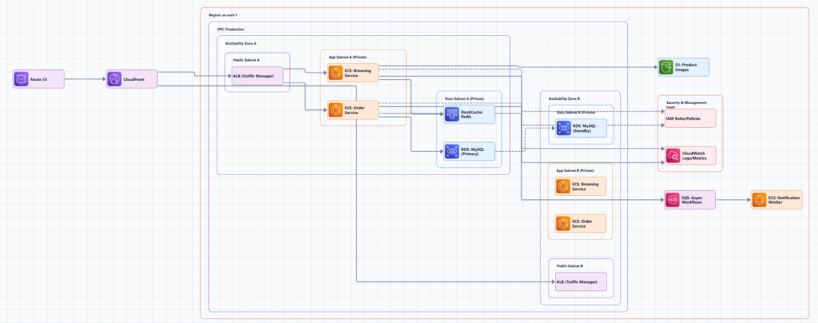
The experience: A simplified Visio. You drag resources onto a canvas, draw connections, and arrange everything manually. For a simple 10-resource diagram, this takes about 15 to 20 minutes. For a complex production environment, you're looking at an hour or more.
The real cost isn't money, it's maintenance. The moment your infrastructure changes, a new subnet, a renamed service, an additional database, your diagram is out of date. Someone has to manually update it, and that someone is usually nobody.
Best for: Solo developers, small teams, and anyone who needs a free, flexible diagramming tool. Great for quick sketches and one-off diagrams.
Limitations: No automation. You pay with your time. Diagrams require manual updates.
Lucidchart, Enterprise Collaboration with AI
Lucidchart adds real-time collaboration on top of Draw.io's feature set. Multiple people can edit the same diagram simultaneously, which is useful for architecture review sessions. It also has better auto-layout and alignment tools.
Key features:
The catch: It's still manual. You're paying $8-15/month per user for a tool that produces diagrams that go stale immediately. The AI Cloud Agent is currently in beta.
Best for: Teams that need real-time collaboration and already use Lucidchart for other purposes.
Tradeoff: Still manual. Still maintenance-heavy. Costs add up.
Cloudcraft, Live Scanning with 3D Isometric Views
Cloudcraft (now owned by Datadog) scans your AWS account and generates both 2D and 3D architecture diagrams. The 3D isometric view looks impressive in presentations. It also includes cost estimation, hover over any resource to see its monthly cost.
Key features:
- Live diagram generation: Reverse-engineers the architecture in your cloud account and auto-generates diagrams
- EKS Cluster visualization: Scan Amazon EKS clusters to visualize deployed workloads and pods
- Smart components for Amazon EC2, ELB, Lambda, RDS, DynamoDB, Kinesis, Redshift, CloudFront
- API access to programmatically access and render diagrams as JSON objects
The catch: You need to give it read access to your cloud account. For many organizations, this is a non-starter, security teams don't want a third-party service scanning production infrastructure. It's also expensive at $49/month for individual use and more for teams.
Best for: Teams that regularly present architecture to executives, clients, or investors where visual quality and cost insights matter.
Tradeoff: Premium pricing. Security concerns with third-party access. AWS-only.
Holori, Automated Discovery with Diff Detection
Holori excels at providing high-level visibility for complex cloud environments. Its primary strength is the automated generation of AWS diagrams directly from cloud accounts, eliminating the need for manual drawing.
Key features:
- Daily sync ensures diagrams reflect the real-time state of your infrastructure
- Diff diagrams merge two versions in a single diagram highlighting added, modified, or deleted resources
- Cost management dashboard showing resource configurations alongside costs and usage
- Manual customization with a vast library of multi-cloud icons
- 2D and 3D diagrams with detailed resource configuration information
Best for: Large organizations with complex, multi-account AWS environments that need automated, always-up-to-date diagrams.
Tradeoff: Paid. More complex setup than browser-based tools.
Hava.io, Automated Diagrams with Change History
Hava takes a similar approach to Cloudcraft but adds change tracking, it records every infrastructure change and lets you view historical diagrams. This is genuinely useful for debugging "what changed?" during an incident. It supports AWS, Azure, and GCP.
Best for: Teams that need audit trails and historical views of infrastructure changes.
Tradeoff: At $49/month, it's specialized. If you don't need change history, you're paying for features you won't use.
AWS Workload Discovery, First-Party AWS Tool
Amazon's own solution, deployed as a CloudFormation stack in your account. It scans your resources and generates interactive diagrams.
Key features:
- First-party AWS tool, avoids security concerns about third-party services scanning your infrastructure
- Interactive HTML output with clickable nodes and search
- Export to PNG, JSON, CSV, or draw.io format
Best for: Teams that need accurate, up-to-date diagrams of their live AWS infrastructure and want to keep data within their AWS account.
Tradeoff: Requires deploying a CloudFormation stack. AWS-only.
Terravision, Diagrams from Terraform Code
Terravision automatically converts your Terraform code into professional-grade cloud architecture diagrams using official AWS icon sets. Your diagrams stay in sync with your infrastructure, no more outdated Visio or Draw.io files.
Key features:
- Always up-to-date: Diagrams generated directly from your Terraform code
- 100% client-side: No cloud access required; your code never leaves your machine
- CI/CD ready: Automate diagram updates on every PR merge
- Free & open source: No expensive diagramming tool licenses
- Multi-cloud: AWS (full support, 200+ services), GCP, and Azure (core services)
- Interactive HTML output: Clickable nodes, pan/zoom, search, animated data flow
- Editable draw.io export: Open in Draw.io, Lucidchart, or any mxGraph editor
Quick start:
pipx install terravision
terravision draw --source ./path-to-your-terraform --show
Best for: Teams using Terraform who want automated, always-accurate diagrams without manual maintenance.
Tradeoff: Requires Terraform and Python setup. Azure and GCP support is partial (core services only).
Visual Paradigm AI, Enterprise Modeling Ecosystem
Visual Paradigm's AI Cloud Architecture Studio is the ultimate AI AWS architecture diagram generator, designed to scale with your team's needs. You describe your requirements in plain English, and the AI builds the entire technical map for you.
Key features:
- Natural language input: Describe your AWS needs in plain English and get detailed diagrams automatically
- AI-Guided Discovery: The AI analyzes your goals and suggests missing pieces
- Multi-cloud flexibility: Compare elastic setups across AWS, Azure, and GCP using a single AI diagram generator
- Ready-Made Cloud Blueprints: Templates for all major cloud providers
- Report Generation: Export complete technical reports as PDF
Best for: Enterprise teams that need a comprehensive modeling ecosystem (UML, SysML, ArchiMate, BPMN, C4) alongside cloud architecture diagrams.
Tradeoff: More complex and expensive than purpose-built cloud diagramming tools.
SketchMyInfra, Free AI Tool with PlantUML Export
SketchMyInfra is a free AI tool that converts natural language descriptions into production-quality infrastructure diagrams using PlantUML. No signup required.
Key features:
- Plain English to diagram: Describe your architecture and get a diagram in under 5 seconds
- Multi-cloud support: AWS, GCP, and Azure with official provider icons
- Editable PlantUML output: Export the PlantUML source code, version-controllable, portable, and editable
- Context-aware iteration: Refine your prompt and the AI uses your previous diagram as context
- Free tier: 5 diagrams/day without an account, more with a free login
Best for: Engineers who want a quick, free, no-commitment way to generate diagrams from text and need PlantUML export for version control.
Tradeoff: No native visual editing. PlantUML output requires familiarity with the format for manual tweaks.
AI Line Studio, Natural Language to Animated AWS Diagrams
AI Line Studio takes a fundamentally different approach from traditional diagramming tools. Instead of a drag-and-drop canvas, the primary input is natural language. You describe a system, "a 3-tier web app on AWS with EC2, RDS, and CloudFront", and the tool generates a structured diagram from that description, typically in 15 to 20 seconds.
The output isn't just static. AI Line Studio supports animated diagrams (GIF, MP4) alongside standard PNG exports, plus shareable documentation links. This makes it genuinely useful for demos, training materials, and investor presentations where static diagrams fall flat. For AWS-specific workflows, the dedicated AI cloud diagram generator turns AWS descriptions into production-ready visuals. If you're working across multiple providers, the AI architecture diagram builder covers AWS, Azure, GCP, and OCI with over 3,000 officially licensed icons.
How AI generation works: Start with a prompt like "a 3-tier web app on AWS with EC2, RDS, CloudFront, and WAF." The AI asks clarifying questions, choosing between relational or NoSQL databases, selecting a deployment strategy like High Availability or Low Cost/MVP. Then it instantly builds a clean, interactive diagram using official AWS icons. Use AI Modify to refine: type "Add ElastiCache and CloudWatch monitoring," and the diagram updates automatically.
The honest limitation: AI Line Studio is an early-stage product with a smaller install base and fewer third-party integrations than established tools like Lucidchart. It's not a general-purpose diagramming tool, if you need org charts, mind maps, or non-technical diagrams, a broader tool is a better fit. And as with any AI-generated output, complex or ambiguous system descriptions may need manual cleanup. It's not a zero-review tool for mission-critical documentation.
Best for: Engineers who value speed and want to generate diagrams from descriptions rather than spending time on manual placement. Also ideal for teams creating presentation-ready, animated architecture visuals.
Tradeoff: Less control over fine-grained layout compared to manual tools. Not suitable for non-technical diagram types.
How to Choose the Right AWS Architecture Diagram Tool
Ask yourself these questions:
1. How often does your infrastructure change?
- Daily/weekly → Automated tool (Cloudcraft, Holori, Hava.io, Terravision, AI Line Studio)
- Rarely → Manual tool (Draw.io, Lucidchart)
2. Do you use infrastructure-as-code?
- Yes (Terraform) → Terravision
- No → Any tool works
3. Do you need live infrastructure accuracy?
- Yes → Cloudcraft, Holori, Hava.io, AWS Workload Discovery
- No → AI Line Studio, Draw.io, Lucidchart
4. Do you need animated diagrams for presentations?
- Yes → AI Line Studio (GIF/MP4 exports)
- No → Any tool works
5. What's your budget?
- $0 → Draw.io, SketchMyInfra, Terravision, AWS Workload Discovery
- $8-15/user/mo → Lucidchart
- $49+/mo → Cloudcraft, Hava.io
6. Do you need multi-cloud support?
- Yes → AI Line Studio, Holori, Hava.io, Visual Paradigm AI
- AWS-only → Cloudcraft, AWS Workload Discovery
The Pragmatic Workflow
Here's what I actually use for AWS architecture diagramming:
For rapid ideation and iteration: AI Line Studio. Describe the system in 30 seconds, get a diagram in 20 seconds. The animated exports are invaluable for presentations where static diagrams fall flat.
For documentation that needs to stay accurate: Terravision (if using Terraform) or AWS Workload Discovery (if you want first-party accuracy). Generate diagrams directly from code or live infrastructure.
For final polish and presentation: Take the AI-generated diagram and refine it in Draw.io if needed. But increasingly, the AI output is good enough to use as-is.
For version-controlled diagrams: Use SketchMyInfra to export PlantUML or Terravision to export draw.io format, and check it into Git alongside your infrastructure code.
This workflow separates ideation (fast, AI-generated) from accuracy (code-driven, automated). Trying to do both in one tool usually means compromising on either speed or quality.
Common Mistakes to Avoid
Mistake 1: Outdated diagrams. The biggest problem with any tool is maintenance. If you're using Draw.io manually, set a reminder to update diagrams when infrastructure changes. Better yet, use an automated or AI tool that lets you regenerate in seconds.
Mistake 2: Using the wrong icons. Always use official AWS icons. Draw.io provides them built-in. AI tools like AI Line Studio use real AWS icons automatically.
Mistake 3: No labels. Every icon should have a clear label. Don't assume readers will recognize an icon.
Mistake 4: No directional arrows. Lines without arrows are ambiguous. Always show the flow of data.
Mistake 5: Overloading one diagram. If your diagram has more than 15 to 20 nodes, it's too complex. Split it into multiple diagrams at different abstraction levels.
Summary
AWS architecture diagram tools have come a long way. You no longer need to choose between expensive enterprise software and clunky free options. The best tools in 2026 offer AI-powered generation, live infrastructure scanning, or real-time collaboration, often with generous free tiers.
Key takeaways:
- If you need a free, reliable manual tool, Draw.io remains the people's champion.
- If you value speed and natural language input, AI Line Studio is the fastest path from description to diagram.
- If you need live infrastructure accuracy, Cloudcraft, Holori, or AWS Workload Discovery eliminate manual maintenance.
- If you use Terraform, Terravision keeps diagrams in sync with your infrastructure automatically.
- If you need change history and audit trails, Hava.io tracks every infrastructure change.
Stop spending hours on diagrams that will be outdated next week. Start documenting your AWS architectures in a way that actually keeps pace with your infrastructure.