
What Are Common Mistakes in AWS Architecture Diagrams?
AWS architecture diagrams are the universal language of cloud engineering. They communicate how systems are built, how data flows, and where security boundaries exist. Yet many engineers and architects, even experienced ones, produce diagrams that confuse rather than clarify.
A weak or vague architecture diagram is one of the top reasons for delays or rejections in AWS Foundational Technical Reviews (FTRs), Co-Sell engagements, and Marketplace submissions. The problem isn't lack of effort, it's that most people don't know what they're doing wrong. Here's what AWS reviewers actually look for and the mistakes that get diagrams rejected.
Cloud Architecture
Create cloud architecture diagrams for AWS, Azure, GCP, and more. Design scalable infrastructure with professional cloud icons.
Top mistakes in AWS architecture diagrams that cause FTR and review rejections, vague labels, disconnected resources, master diagrams, missing security boundaries, and how to fix them.
Click Cloud Architecture to open AI Line Studio and generate diagrams from natural language in seconds.
The One-Sentence Truth
Your diagram is a technical blueprint, not a piece of art. AWS reviewers don't want something "pretty", they want something clear that tells a story about how your product actually runs on AWS.
- Logical view: System components and their relationships (cloud-agnostic)
- Deployment view: How components map to AWS infrastructure
- Process view: How data flows through the system
- Security view: IAM, VPCs, encryption, and compliance boundaries
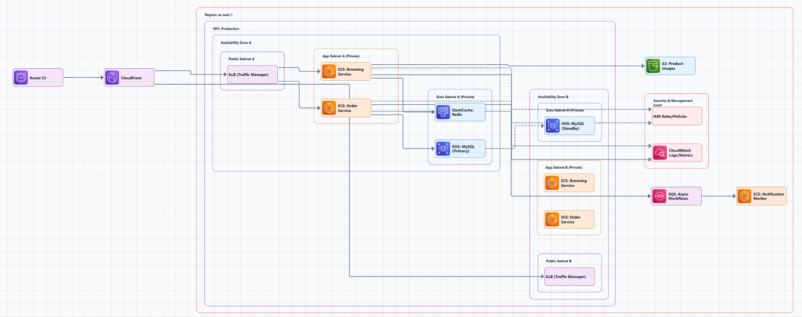
Mistake #1: Labels That Say Nothing
The most common mistake is labeling resources by type but not by name. An icon with "DB" underneath tells you it's a database, but what database? Which specific instance? What does it do?
What reviewers see: "DB," "Queue," "Bucket," "Lambda"
What they need to see: "Amazon RDS for PostgreSQL (Orders DB)," "Amazon SQS (Order Processing Queue)," "Amazon S3 (Customer Uploads Bucket)"
Write "Amazon RDS (PostgreSQL)", not just "DB". The icon already tells them the type. The label should tell them the purpose and specific service. And avoid buzzwords like "Data Engine", use real, technical terms.
Mistake #2: Disconnected Resources
A diagram is about relationships. Every resource should be connected to something else in a meaningful way. If you've placed Amazon Route 53 in the corner with no arrows pointing to or from it, you've failed.
Why this happens: The diagram author knows the resource is part of the system but can't figure out how to show its relationship clearly. This usually means you're trying to cram too much into one diagram (see Mistake #3).
The fix: Every component should have at least one connection showing how data flows to or from it. If you can't show the relationship clearly, that's a sign to split the diagram.
Mistake #3: The "Master Diagram" Trap
The "master diagram" tries to show the entire system in one view. It's driven by a misguided desire to "see everything at once." It is almost always a mistake.
What it looks like: Runtime dependencies, DNS configuration, CDN setup, source code, and deployment-time dependencies all crammed into a single visual. The viewer is overwhelmed.
The solution: Split it into multiple views. Most systems are complex enough that they need multiple diagrams, each telling a coherent story without interfering with the others.
What to split by:
Mistake #4: The "Conveyor Belt" Oversimplification
This is a subtle but dangerous mistake. You draw a diagram that makes the system look like an assembly line: data flows neatly from one resource to the next, each step passing its output to the next. It looks clean. It's also wrong.
The reality: Real systems have back-and-forth interactions. Services call each other, retry, handle failures, and orchestrate complex workflows. A conveyor-belt diagram misleads viewers, especially less experienced engineers, into thinking the system is simpler than it is.
The solution: Use sequence diagrams for detailed interactions. Sequence diagrams (originally specified in UML) are designed to show detailed back-and-forth interactions between resources. They reveal the actual complexity rather than hiding it.
Mistake #5: Only Showing Internal Infrastructure
AWS reviewers want to know how users interact with your system, not just what's inside your VPC. A diagram that only shows internal services misses half the story.
What's missing: End users, clients, external systems, entry points, authentication flows, and public/private boundaries.
The fix: Every diagram should make it clear who is using the solution and from where, public internet, private network, or both.
Mistake #6: No Security Boundaries
Security boundaries, VPCs, subnets, availability zones, IAM boundaries, should be visually obvious.
What reviewers expect: Components should be visually boxed into VPCs, subnets, and availability zones to show network isolation. Security controls like IAM roles, encryption, and WAF should be labeled. If your diagram doesn't show where security controls live, it's incomplete.
Mistake #7: Static Outdated Diagrams
AWS diagrams are static by nature, they capture a moment in time. But infrastructure changes constantly, and diagrams that aren't updated become worse than useless.
The problem: An outdated diagram gives people false confidence. They make decisions based on what they think is running, not what's actually there.
The fix: Make diagram maintenance part of your workflow, not an afterthought. Use tools that make updates easy. Automate diagram generation where possible.
Mistake #8: Inconsistent Icons and Visual Language
Using the wrong icons, mixing icon versions, or inconsistent visual styling makes diagrams harder to read. AWS has an official icon set for a reason.
What reviewers see: Icons from different eras, inconsistent colors, no AWS Cloud boundary, non-standard abbreviations.
The fix: Always use the latest official AWS Architecture Icons. The official set is made available for many diagramming tools. Consistency is key, don't represent the same service with different icons in the same diagram.
Mistake #9: Overcomplicated Data Flows
Too many lines showing relationships or data flows makes diagrams unreadable. When every service connects to every other service, the diagram becomes a tangled mess.
The fix: Use different strategies to manage complexity:
- Use different colored lines for different types of flows
- Group related flows
- Skip non-essential connections
- Create separate diagrams for different flow types
Mistake #10: No Labels on Data Flows
Arrows without labels don't tell you what's actually happening. Is it an API call? A data stream? A read operation? A write?
The fix: Every arrow should have a label explaining what flows across it, read, write, API call, event, or data transfer. This is especially important for non-technical reviewers who need to understand the system's behavior.
What a Good AWS Architecture Diagram Actually Looks Like
AWS reviewers expect diagrams that answer these questions:
| Question | Why It Matters |
|---|---|
| Is your deployment single-tenant or multi-tenant? | Explains isolation and scaling model |
| How is data secured between services? | Shows you've thought about security |
| Which services are responsible for availability/scaling? | Demonstrates operational maturity |
| Can this architecture scale across AZs or regions? | Validates resilience design |
| Where do logs, backups, and failover processes happen? | Shows operational readiness |
The anatomy of a good diagram:
- Official AWS icons, every service labeled with official icons
- Data flow arrows, showing movement of data between components
- Security overview, covering identity, access, data protection, and compliance
- Security boundaries, VPCs, subnets, AZs visually boxed
- Everything labeled, every box, flow, and icon with purpose and function
- End users or clients, clear indication of who uses the solution and from where
- Multi-tier view, presentation, application, and data layers clearly separated
Tools That Help Avoid These Mistakes
Creating good diagrams manually is time-consuming and error-prone. Modern tools help avoid these common mistakes:
AI Line Studio turns plain-language descriptions into production-ready architecture diagrams in 15 to 20 seconds, using 3,000+ officially licensed AWS icons. It automatically applies proper spacing (180px horizontal / 120px vertical gaps between service group containers) and follows layout guidelines that prevent overlap and ensure readability.
The AI cloud diagram generator helps you iterate faster during design sessions. The AI architecture diagram builder enables production-ready designs with collaboration features. For end-to-end system design, the AI system architecture generator creates complete architectures. The cloud architecture diagram tool provides editable templates with official icons for common deployment patterns.
The honest limitation: AI Line Studio is an early-stage product. Complex descriptions may need manual cleanup, it's not a zero-review tool for mission-critical documentation.
Other tools: Lucidchart, draw.io, and Miro all support AWS shape libraries. AWS also provides the official AWS Architecture Icons set for use in any diagramming tool.
Quick Checklist: Review Your Diagram Before Sharing
- Every resource has a meaningful name label (not just a type)
- Every resource has at least one connection showing relationship
- You're not trying to show everything in one diagram
- Data flows show back-and-forth interactions (not just conveyor belts)
- End users and external systems are clearly shown
- Security boundaries (VPCs, subnets, AZs) are visually boxed
- All icons are from the latest official AWS set
- Data flow arrows are labeled with what's flowing
- The diagram answers: how does this actually run on AWS?
- Environments (prod/staging/dev) are clearly separated
External Resources
- AWS Architecture Icons (Official), official source for AWS product icons
- AWS Architecture Center, reference architectures and best practices
- AWS Well-Architected Framework, guidance for designing reliable, secure, efficient workloads
- AWS Architecture Diagrams Guidelines, community-curated best practices
- diagram-as-code Best Practices, AWS Labs guidelines for effective diagrams
Final Thoughts
Most AWS architecture diagrams fail because they try to do too much or not enough. The key is clarity over completeness. A diagram that answers the right questions for its audience is worth more than a diagram that shows everything but communicates nothing.
The best architects don't just draw diagrams, they design them with intent. They know their audience, use official icons consistently, label everything clearly, show security boundaries, and keep diagrams updated. They split complex systems into multiple views rather than cramming everything into one. And they review their diagrams against checklists before sharing them with stakeholders.
A great architecture diagram isn't just required, it's a shortcut to trust. It shows that you know what you're doing, you've built your product with best practices in mind, and you're ready for scale.