
GCP Architecture Diagram Template: Ready-to-Use Blueprints for Google Cloud
Architecture diagrams are the difference between a system that runs reliably and one that fails in ways nobody understands. But starting from a blank canvas every time you design a GCP workload wastes hours, hours you could spend actually building things.
Templates change that. They give you a proven starting point, enforce best practices, and dramatically shorten the time from idea to diagram. After years of designing GCP architectures, from three-tier web apps to global data pipelines, I've learned that the right template saves more time than almost any other tool in your workflow.
This guide covers the essential GCP architecture diagram templates you need, where to find them, and how to adapt them for your specific workloads.
Cloud Architecture
Create cloud architecture diagrams for AWS, Azure, GCP, and more. Design scalable infrastructure with professional cloud icons.
Ready-to-use GCP architecture diagram templates, three-tier, GKE microservices, serverless, BigQuery pipelines, event-driven, and multi-region DR patterns with customization guidance.
Click Cloud Architecture to open AI Line Studio and generate diagrams from natural language in seconds.
What Makes a Good GCP Architecture Template?
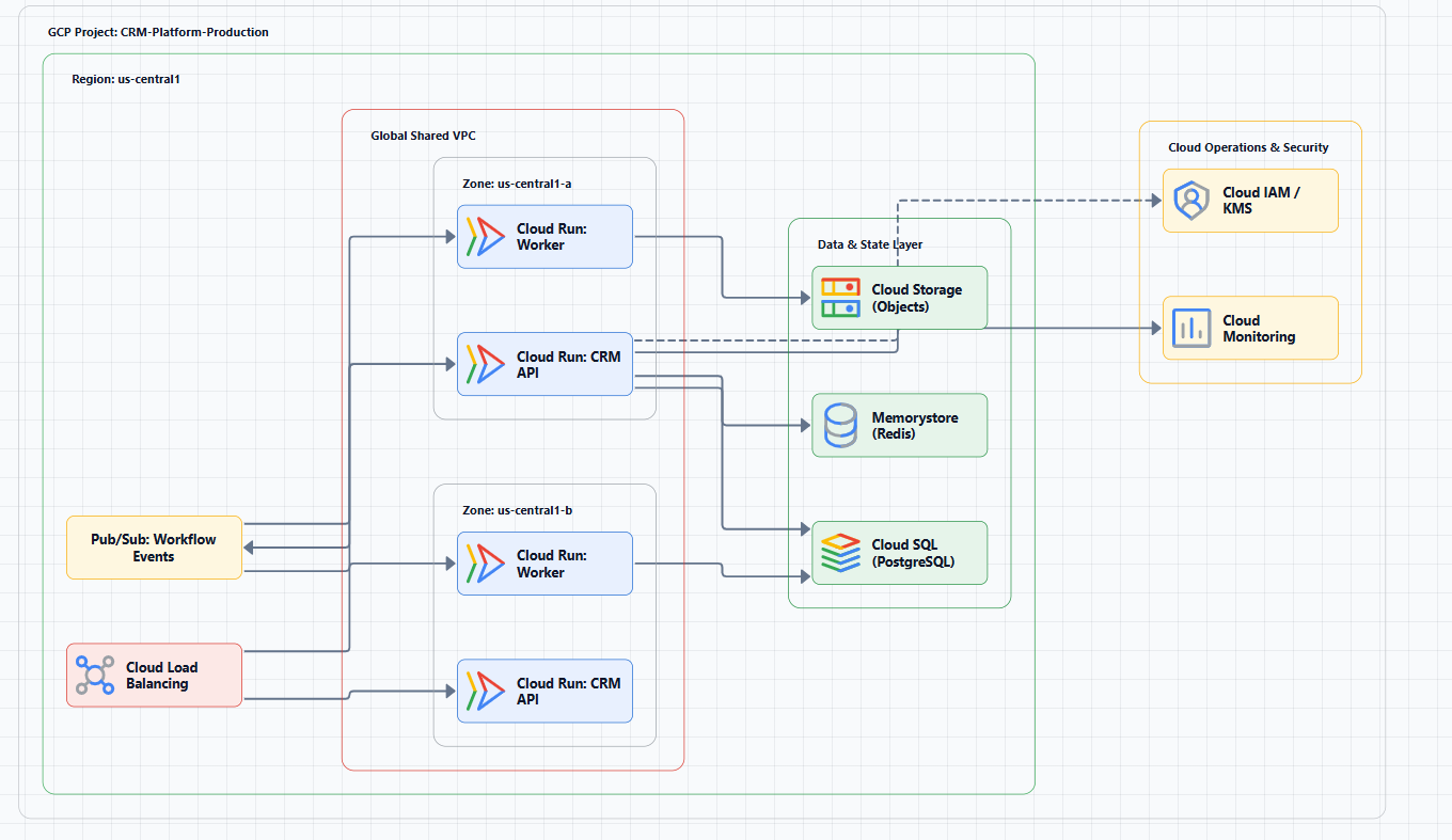
Not all templates are created equal. A good GCP architecture template should include:
Official GCP icons. Google provides a comprehensive set of architecture icons. Templates that use these icons ensure your diagrams match Google's own documentation and are instantly recognizable to anyone familiar with GCP.
Logical service grouping. Services should be organized by function, compute, storage, networking, data analytics, with clear visual boundaries like VPC containers.
Data flow representation. Arrows and connections should show how data moves between services, not just that services exist.
Layer separation. The template should distinguish between tiers (presentation, application, data) and failure domains (zones, regions).
Customizability. A good template is a starting point, not a straightjacket. You should be able to add, remove, or rearrange components without breaking the visual logic.
Essential GCP Architecture Templates
Here are the templates you'll use most often, organized by pattern.
1. Three-Tier Web Application Template
The three-tier pattern separates presentation, application, and data layers. This is the default choice for most customer-facing web applications.
Core components:
- Web tier: Cloud Storage (static assets) + Cloud CDN, or Cloud Run
- Application tier: Cloud Run (serverless) or GKE (container orchestration)
- Data tier: Cloud SQL (PostgreSQL/MySQL), Memorystore (Redis) for caching
- Networking: Global Cloud Load Balancer, VPC with public/private subnets
When to use: E-commerce platforms, SaaS applications, internal dashboards, anything with a user interface and persistent data.
When to avoid: Event-driven workloads, batch processing, or simple CRUD apps that could run entirely on serverless.
Template structure:
Internet → Cloud Load Balancer → [Web Tier: Cloud Run/GKE]
                                    ↓
                              [Application Tier: Cloud Run/GKE]
                                    ↓
                              [Data Tier: Cloud SQL + Memorystore]
                              (within VPC, private subnets)
2. GKE Microservices Template
When your application has multiple teams owning different services, GKE provides the orchestration layer while you manage the nodes.
Core components:
- GKE cluster with multiple node pools
- Istio service mesh for traffic management and observability
- Cloud Armor for WAF protection
- Artifact Registry for container images
- Cloud SQL or AlloyDB for database
When to use: Multiple teams deploying independently, existing Kubernetes investment.
When to avoid: Small teams with monolithic applications, the operational overhead isn't justified.
Template structure:
Internet → Cloud Armor → Global Cloud Load Balancer
                              ↓
                         [GKE Cluster]
                    ┌─────────┼─────────┐
              [User API] [Order Service] [Worker Pods]
                    └─────────┼─────────┘
                         [Cloud SQL]
3. Serverless Application Template
Serverless eliminates infrastructure management entirely. Cloud Run runs containers on demand, scaling to zero when not in use.
Core components:
- Cloud Run for containerized HTTP services
- Cloud Functions (Gen 2) for event-driven functions
- Pub/Sub for asynchronous communication
- Cloud Storage for file uploads and static assets
- Firestore or Cloud SQL for data persistence
When to use: Low-traffic applications, event-driven workflows, APIs with unpredictable traffic.
When to avoid: Long-running computations (over 60 minutes), stateful workloads.
Template structure:
[HTTP Request] → Cloud Run (frontend)
                       ↓
                 [Pub/Sub Topic]
                       ↓
         Cloud Functions (processor)
                       ↓
              [Cloud SQL / Firestore]
4. Data Analytics Pipeline Template
GCP's data analytics stack handles petabytes. BigQuery is the serverless data warehouse. Dataflow (Apache Beam) processes streams and batches.
Core components:
- Pub/Sub for event ingestion (streaming)
- Cloud Storage for batch data landing
- Dataflow for transform and enrich
- BigQuery for storage and analysis
- Cloud Composer (Apache Airflow) for orchestration
- Looker or Data Studio for visualization
When to use: Real-time analytics, ETL/ELT, machine learning feature engineering.
When to avoid: Small datasets (under 100 GB), BigQuery's minimum storage costs make it uneconomical.
Template structure:
[Data Sources] → Pub/Sub (streaming) ──┐
                Cloud Storage (batch) ──┼→ Dataflow → BigQuery → Looker
                                        │
                              [Cloud Composer orchestrates]
5. Event-Driven Architecture Template
Event-driven architectures decouple producers and consumers, improving resilience and scalability.
Core components:
- Pub/Sub topics for durable message queues
- Cloud Run or Cloud Functions as consumers
- Eventarc for routing events from Google Cloud sources
- Dead-letter topics for failed message handling
When to use: Order processing, log ingestion, IoT data pipelines, decoupling microservices.
When to avoid: Request-response patterns where low latency is critical.
Template structure:
[Event Producer] → Pub/Sub Topic → [Subscription] → Cloud Run/Function
                                            ↓
                                   [Dead-Letter Topic]
6. Multi-Region Disaster Recovery Template
High availability and disaster recovery are built on deployment archetypes: zonal, regional, multi-regional, or global.
Core components:
- Global Cloud Load Balancer for traffic routing
- Cloud SQL replicas or Spanner for data replication
- Cloud DNS for failover routing
- Cloud Storage with multi-regional replication
When to use: Mission-critical applications with strict SLAs.
When to avoid: Development or staging environments, the cost isn't justified.
Template structure:
                    [Global Cloud Load Balancer]
                           /              \
              [Primary Region]      [Secondary Region]
              (Active)              (Warm Standby)
                   │                      │
              [Cloud SQL] ← replication → [Cloud SQL replica]
Where to Find GCP Architecture Templates
You don't need to build these from scratch. Several resources provide ready-to-use templates:
Google Cloud Architecture Center
Google's own Architecture Center provides reference architectures and deployment archetypes for common patterns. These are the most authoritative source, if Google publishes it, you can trust the pattern.
What you'll find: Enterprise foundations blueprints, hybrid and multicloud patterns, deployment archetypes (zonal, regional, multi-regional, global).
Best for: Enterprise-grade architectures, compliance-heavy workloads, and anything that needs to follow Google's own best practices.
Lucidchart Templates
Lucidchart offers reference architecture templates for common Google Cloud scenarios. These include network diagrams, machine learning web apps, Jenkins on Kubernetes, and hybrid cloud frameworks.
What you'll find: Pre-built templates with GCP shape libraries, customizable to your use case.
Best for: Teams already using Lucidchart for diagramming and collaboration.
Creately GCP Templates
Creately provides pre-built GCP reference architectures and templates for common cloud solutions. The platform includes standards-compliant GCP components, logically grouped for faster diagramming.
What you'll find: Drag-and-drop interface, infinite canvas, real-time collaboration.
Best for: Teams that need collaboration features and don't want to manage shape libraries manually.
Miro GCP Template
Miro's Google Cloud Architecture Diagram template lets you visually represent and manage application development, deployment, and documentation. You can build a GCP diagram from scratch using Miro's design tools and icons, or use the template and customize it.
What you'll find: Whiteboard-style diagramming with GCP icons, real-time collaboration.
Best for: Workshops, brainstorming sessions, and early-stage design exploration.
Cacoo Template
Cacoo provides a Google Cloud Architecture Diagram template that highlights a content management system built on GCP services. The template includes common Google Cloud icons so you can assemble components in minutes.
What you'll find: Structured template with pre-placed GCP icons and connection arrows.
Best for: Quick, structured diagrams without starting from scratch.
Cloudairy GCP Template
Cloudairy offers an editable GCP architecture diagram template that can be tailored for small-scale projects or enterprise-scale deployments. It includes service icons, pre-designed formats for cloud-native techniques, and pre-built architecture patterns for serverless apps, data pipelines, and multi-region deployments.
What you'll find: Comprehensive template with compute, database, networking, and IAM components.
Best for: Teams that need a complete, customizable starting point with official GCP icons.
GitHub Repositories
Several open-source repositories provide GCP diagram templates and assets:
- gcp-icons-for-plantuml: PlantUML sprites and macros for GCP services
- gcp-icons-for-mermaid-js: Sample diagrams demonstrating GCP architectures with Mermaid
- gcp_diagram_tools: Presentation templates and downloadable digital assets from Google
Best for: Teams using diagrams-as-code workflows with PlantUML or Mermaid.
Tools for Creating GCP Architecture Templates
Creating templates manually is time-consuming. Several tools can help you generate and customize them faster:
AI Line Studio
AI Line Studio generates GCP architecture diagrams from natural language descriptions in 15 to 20 seconds, supporting 3,000+ officially licensed Google Cloud icons. It's prompt-first, describe your architecture and get a structured diagram, rather than dragging and dropping shapes.
For rapid iteration during design sessions, the AI cloud diagram generator lets you refine descriptions and regenerate instantly. You can also build production-ready diagrams with the AI architecture diagram builder and reuse them as templates. The GCP architecture diagram template workspace provides editable templates with official GCP icons for common deployment patterns, while the AI system architecture generator creates complete Google Cloud system architecture templates for enterprise, AI, microservices, and cloud-native applications.
The tool exports animated diagrams (GIF, MP4) for presentations and training material, which most static-only tools don't support. However, it's an early-stage product with a smaller install base, and complex descriptions may require manual cleanup, it's not a zero-review tool for mission-critical documentation.
Best for: Rapid prototyping, design iteration, creating templates for presentations and demos.
MockFlow IdeaBoard
MockFlow's AI GCP diagram generator recognizes 40+ GCP services natively, maps them to official icons, and organizes them into VPC networks with Google's four-color brand system. You describe your architecture in plain text, and AI produces the diagram with correct icons, VPC groupings, and labeled connections.
The catch: You connect your own Claude or ChatGPT API key, generation runs on your AI account.
Best for: Teams that already have AI API access and want unlimited generation.
Visual Paradigm AI Cloud Architecture Studio
Visual Paradigm's AI tool generates Google Cloud diagrams from natural language prompts. You describe your infrastructure, select an architecture goal (High Availability, Enterprise Grade, Low Cost), and the AI renders a professional diagram with official GCP icons.
Best for: Teams wanting a structured AI-assisted workflow with strategy-based design.
Template Customization Checklist
When you adapt a template for your specific workload, work through this checklist:
Service selection. Remove services you don't need. Add services the template doesn't include. Every service in your diagram should serve a purpose.
Network boundaries. Draw VPC boundaries clearly. Label subnets (public, private, data). Show VPN or Interconnect connections for hybrid setups.
Data flow. Add arrows showing data direction. Label protocols (HTTP, gRPC, TCP) where relevant. Show both synchronous and asynchronous flows.
Failure domains. Indicate zones within a region. Show multi-region replication if applicable. Document failover paths.
Security controls. Mark IAM boundaries. Show where Cloud Armor, Cloud KMS, or VPC Service Controls are applied.
Cost annotations. Add estimated costs for each major service. This turns your diagram into a budgeting tool.
Common Template Mistakes
Mistake 1: Using a template without customizing it. Templates are starting points, not finished products. Every workload has unique requirements.
Mistake 2: Overcomplicating. Start with the simplest template that meets your requirements. Add complexity only when you need it.
Mistake 3: Ignoring the data flow. A diagram that shows services but not how they communicate is incomplete. Add arrows and labels.
Mistake 4: Forgetting failure domains. Every production diagram should show at least one failure domain (zone, region) and a recovery path.
Mistake 5: Using outdated icons. Google updates its icon set regularly. Always use the latest official icons.
External Resources
- Google Cloud Architecture Center, reference architectures, diagrams, and best practices
- Google Cloud Architecture Framework, comprehensive guidance for designing secure, reliable, cost-efficient GCP architectures
- Google Cloud Icons, official GCP icon set for use in any design tool
- Google Cloud Enterprise Foundations Blueprint, prescriptive guidance for building a secure GCP foundation
- 101 real-world gen AI use cases with technical blueprints, architectural blueprints for AI workloads
Final Thoughts
GCP architecture diagram templates are force multipliers. They encode best practices, reduce design time, and ensure consistency across your team. Start with a proven template, customize it for your specific workload, and validate it against the Google Cloud Well-Architected Framework.
The best template is the one your team actually uses. Choose tools that fit your workflow, not the other way around. And remember: a template that sits unused is worthless, share it, review it, and iterate.