
How Do I Present My AWS Architecture to Stakeholders?
An architecture diagram is one thing. Presenting it to a room full of stakeholders with different priorities and technical backgrounds is entirely another.
Most architects make the same mistake: they treat the presentation as an opportunity to show off their technical expertise. They cram every service, every connection, every detail into a single diagram, and then wonder why stakeholders glaze over.
A successful architecture presentation is not about showing everything. It's about showing the right things to the right people.
Cloud Architecture
Create cloud architecture diagrams for AWS, Azure, GCP, and more. Design scalable infrastructure with professional cloud icons.
Practical guide to presenting AWS architecture to stakeholders, know your audience, design for clarity, structure your presentation, common mistakes, and tools to accelerate diagram creation.
Click Cloud Architecture to open AI Line Studio and generate diagrams from natural language in seconds.
1. Know Your Audience
Before you open any diagramming tool, answer this question: who is in the room?
- One for AWS reviewers, detailed, with every service labeled and connected
- One for sales decks and partner enablement, simplified, with business benefits highlighted
| Stakeholder Type | What They Care About | What to Show |
|---|---|---|
| Technical teams (engineers, DevOps) | Implementation details, service interactions, dependencies, scalability | Detailed diagrams with service names, data flows, security boundaries, and failure points |
| Business stakeholders (product managers, finance) | Cost, timeline, business value, risk | High-level diagrams with cost annotations, business benefits, and trade-offs |
| Executives (CTO, VP, CEO) | Strategic impact, ROI, competitive advantage, risk mitigation | Simplified visuals focusing on business outcomes, not technical details |
| AWS reviewers (FTR, Co-Sell, Marketplace) | Compliance, security, deployment structure, best practices | Detailed diagrams with labeled AWS services, clear data flows, and security boundaries |
A single diagram rarely works for all audiences. Create multiple versions of your diagram:
2. Before You Present: Design Your Diagram for Clarity
The quality of your presentation depends on the quality of your diagram. A cluttered, confusing diagram can't be saved by a great explanation.
Use Official AWS Icons, and Label Them
Official AWS icons provide a consistent visual language that cloud engineers and architects recognize instantly. But the icon alone isn't enough. Never leave a service unlabeled.
What reviewers see: A database icon with "DB" underneath.
What they need to see: "Amazon RDS for PostgreSQL (Orders DB)"
The icon tells them the type. The label tells them the purpose.
Use Consistent Layout and Spacing
AWS Labs provides specific layout guidelines for effective diagrams:
- 180px horizontal / 120px vertical gaps between service group containers
- Group padding: 30px on all sides
- Align all positions to grid multiples of 10
For complex diagrams with 13+ services, increase spacing to 220px horizontal / 160px vertical. This prevents overlap and keeps the diagram readable.
Show the Six Key Elements
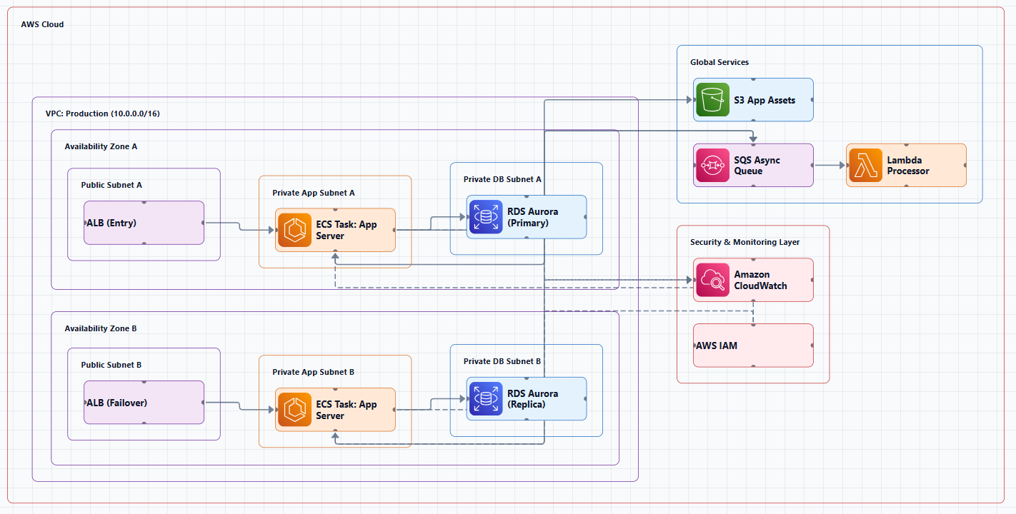
A reviewer-friendly AWS architecture diagram should include:
| Element | What to Include |
|---|---|
| Labeled AWS Services | Official AWS icons with names (e.g., "Amazon RDS," not just "DB") |
| Clear Data Flow Arrows | Show direction of requests, storage, and responses |
| User Entry Points | Label where users or customers interact (e.g., UI, API Gateway) |
| Security Boundaries | Boxes for VPCs, subnets, IAM scopes |
| Simplified Tiers | Application, database, and infrastructure layers logically separated |
| Text Annotations | Short callouts explaining what each component does |
A well-structured AWS architecture diagram should include the main services, network boundaries, user entry points, and the core data or request flow.
Avoid the "Conveyor Belt" Trap
Too many diagrams make the system look like an assembly line: data flows neatly from one resource to the next. Real systems don't work that way. Services call each other, retry, handle failures, and orchestrate complex workflows.
If you're presenting to a technical audience, use sequence diagrams for detailed interactions, they reveal the actual complexity rather than hiding it.
3. Structure Your Presentation
Start with the Business Problem, Not the Technology
Executives and business stakeholders don't care about EC2 instances or VPCs. They care about business outcomes.
Bad opening: "We're using EC2 with Auto Scaling groups behind an Application Load Balancer..."
Good opening: "Our current system can't handle peak traffic during sales events. We're losing revenue. This architecture scales automatically during traffic spikes and reduces our infrastructure costs by 30%."
Frame the business challenge first. Show measurable impact. Think storytelling, not architecture diagrams.
Use the "Before and After" Structure
One of the most effective presentation techniques is showing the current state and the proposed state side by side. This makes the value of your architecture immediately visible:
- Before: Pain points, bottlenecks, manual processes, high costs
- After: Automated scaling, reduced latency, lower costs, improved reliability
Use the Right Visuals for the Right Audience
For technical stakeholders, detailed infrastructure diagrams work well, emphasizing VPCs, subnets, and network boundaries, showing security groups and network ACLs, and using a North-South orientation (external at top, internal at bottom).
For non-technical stakeholders, use simplified analogies and high-level diagrams, focus on business benefits and outcomes, avoid jargon, and use interactive demos and Q&A sessions.
Don't Use Your Diagram as a Script
Your diagram is a visual aid, not a teleprompter. The most effective presentations use the diagram to illustrate points, not to list them.
Instead of: "This is our VPC. This is our public subnet. This is our private subnet. This is our NAT Gateway..."
Try: "This architecture is designed for security. All application servers run in private subnets with no direct internet access. The only way in is through the load balancer and API Gateway, which handle authentication and rate limiting."
4. Common Presentation Mistakes
Mistake 1: Overcrowding the Diagram
The most common mistake is trying to show everything in one view. Keep diagrams simple and readable. Focus on the components and relationships that matter for the intended audience. Avoid overcrowding the diagram with unnecessary detail.
Mistake 2: Using Jargon
When you present to non-technical stakeholders, skip the jargon about EC2 instances and VPCs. Instead, focus on outcomes. Create a communication cadence that keeps stakeholders informed without overwhelming them with technical details.
Mistake 3: Making the Diagram a Black Box
"Data Orchestration Layer" as a label explains nothing. If a component is important enough to include, it's important enough to explain. Use short callouts to explain what each component does, not just what it is.
Mistake 4: Not Showing User Entry Points
Every diagram should make it clear who is using the solution and from where, public internet, private network, or both.
Mistake 5: Letting the Diagram Go Stale
Outdated diagrams are worse than no diagrams at all. They give people false confidence. Make diagram maintenance part of your workflow, not an afterthought.
5. Leverage AI to Accelerate Diagram Creation
Traditional diagramming approaches present several challenges: they're time-consuming, have a steep learning curve, and suffer from inconsistent styling. Creating detailed architecture diagrams manually can take hours or even days.
AI Line Studio turns plain-language descriptions into production-ready architecture diagrams in 15 to 20 seconds. Instead of manually drawing boxes and arrows, you describe your system and get a structured, professional-grade visual instantly. It supports 3,000+ officially licensed icons across AWS, Azure, GCP, and OCI, and exports animated GIFs and MP4s for presentations.
The AI cloud diagram generator helps you iterate faster during design sessions. The AI architecture diagram builder enables production-ready designs with collaboration features. For end-to-end system design, the AI system architecture generator creates complete architectures. The cloud architecture diagram tool provides editable templates with official icons for common deployment patterns.
The honest limitation: AI Line Studio is an early-stage product with a smaller install base. Complex descriptions may need manual cleanup, it's not a zero-review tool for mission-critical documentation.
By using generative AI through natural language prompts, architects can now generate professional diagrams in minutes rather than hours while adhering to AWS best practices.
Quick Checklist: Before Your Presentation
- Do you know who is in the room and what they care about?
- Does your diagram use official AWS icons with meaningful labels?
- Are your data flow arrows labeled with what's flowing?
- Are user entry points clearly shown?
- Are security boundaries (VPCs, subnets) visually boxed?
- Does your presentation start with the business problem, not the technology?
- Have you prepared different versions of your diagram for different audiences?
- Can a non-technical reviewer look at your diagram and understand how it works?
External Resources
- AWS Architecture Icons (Official), official source for AWS product icons
- AWS Architecture Center, reference architectures and best practices
- AWS Well-Architected Framework, guidance for designing reliable, secure, efficient workloads
- AWS Architecture Diagrams Guidelines, community-curated best practices
- diagram-as-code Best Practices, AWS Labs guidelines for effective diagrams
- Atlassian Guide to AWS Architecture Diagrams, comprehensive guide with step-by-step instructions
Final Thoughts
Presenting AWS architecture to stakeholders is not about showing how much you know. It's about helping your audience understand what matters to them.
Technical teams need implementation details, service interactions, and failure points. Business stakeholders need cost, timeline, and business value. Executives need strategic impact and ROI. AWS reviewers need compliance, security, and deployment structure.
The most effective architects don't just create diagrams, they design presentations that tell a story. They start with the business problem, show the solution visually, and tailor every detail to their audience.
A diagram that a non-technical reviewer can look at and say, "Ah, I get how this works and why it matters", that's the goal. Because the best diagrams don't impress. They clarify.