
AI Cloud Architecture Tool Comparison: AI Line Studio vs Eraser, Lucidchart, Miro & Cloudairy
When an Instagram follower challenged the creator to test the same AWS scenario across five platforms, the results were immediately obvious. This AI cloud architecture tool comparison pits Eraser.io, Cloudairy, Miro, Lucidchart, and AI Line Studio against a real-world prompt: design an active-active multi-region SaaS platform on AWS. Only one tool produced a diagram that was readable, accurate, and architecturally complete.
YouTube Tutorial
This free ai tool when compared to eraser.io, lucidchart, cloudairy and miro shocked everyone
The Challenge: A Real-World Multi-Region SaaS Scenario
The test was simple but demanding. Each platform received the identical prompt: build a SaaS platform that needs to be active in multiple regions on AWS. This is not a toy example. Active-active multi-region setups require correctly integrated security layers, key management, load balancing, and regional data stores. A diagram that misses these connections is not just sloppy, it is misleading for system architects who rely on visual documentation to plan infrastructure and communicate designs to stakeholders.
An active-active configuration means both regions handle traffic simultaneously, not merely that one stands by as a backup. That requirement introduces complexity: data replication, global traffic management, consistent security policies, and monitoring across boundaries. Any tool claiming to generate cloud diagrams should understand those relationships well enough to draw them correctly. If the diagram cannot represent those connections, it becomes a liability during design reviews or compliance audits.
What This AI Cloud Architecture Tool Comparison Revealed
The differences between outputs were dramatic. Here is how each platform performed when given the same scenario.
Eraser.io
Eraser.io generated a diagram that was extremely difficult to view clearly. When scaled to full screen, the diagram went completely out of the viewable frame. More critically, crucial architecture components like KMS (Key Management System) and IAM were left completely disconnected. That is a major design flaw, since an active-active multi-region cloud setup cannot function without properly integrated security and key management. A diagram with orphaned security services implies a secure system that does not actually exist. For a deeper look at how these two tools differ, see our Eraser.io comparison.
Cloudairy
Cloudairy produced a massive, bloated diagram based on the multi-region active-active prompt. However, the output was completely illegible, making it incredibly difficult to read, follow, or understand what the architecture was actually doing. Scale without clarity is not a feature, it is a liability when you are presenting infrastructure to a team or reviewing it during an incident. A diagram that fills the screen but cannot be parsed fails the most basic test of visual communication. When every service is crammed into a single view with no logical grouping, the reader must reconstruct the hierarchy manually, defeating the purpose of using a generator in the first place.
Lucidchart
Lucidchart designed an excessively large diagram where everything was crowded together. The overall structure became an unclear hotchpotch where individual elements could not be distinguished. When stakeholders cannot separate one component from another, the diagram fails its primary purpose. Density is not depth. Crowding services into a small visual space does not convey complexity; it conceals it.
Miro
Miro failed to provide standard cloud-specific icons entirely. The final output resembled a basic, generic flow chart rather than a professional cloud architecture diagram. For teams that need to communicate with AWS-native vocabulary, generic shapes remove the precision that architecture diagrams are supposed to provide. When a diagram uses generic rectangles instead of recognized service icons, every reader must mentally translate labels into services, adding friction and raising the risk of misinterpretation. In a field where API Gateway, Application Load Balancer, and Network Load Balancer serve different roles, visual distinction matters.
AI Line Studio
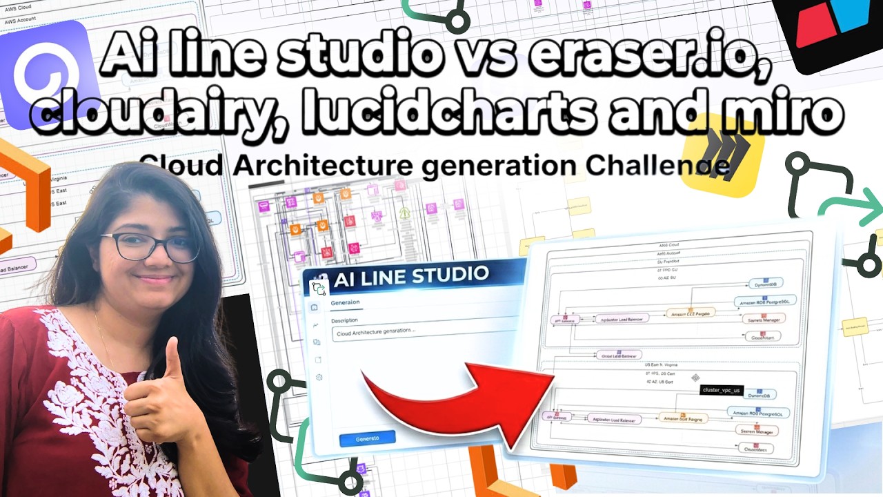
This tool delivered a highly accurate, clear, and structured diagram. It recognized the multi-region requirement by creating two separate, dedicated regions, EU and US-East. To build out a viable SaaS environment, it automatically and accurately connected necessary components including API Gateways, Load Balancers, Fargate, RDS, and monitoring tools. It then tied both regional infrastructures together with a Global Load Balancer. The result was a cloud architecture diagram generator output that actually reflected how AWS infrastructure is built, not how a marketer imagines it.
The distinction is worth emphasizing. AI Line Studio did not merely place services on a canvas. It wired them together in a way that respects how AWS services interact. API Gateways front the compute layer. Load balancers distribute traffic. Fargate runs containerized workloads. RDS provides managed relational databases. Monitoring tools observe the stack. And a Global Load Balancer sits above the regions to route users to the nearest healthy endpoint. That is the difference between a drawing and a blueprint.
Why Technical Accuracy Separates Useful Diagrams from Noise
A diagram is not decoration. It is a communication tool. When KMS and IAM are floating unconnected, or when regional services lack a global load balancer, the diagram tells the wrong story. Teams reviewing that document might miss security gaps or overlook single points of failure. The test showed that generating a box with a label is easy; generating a box that is correctly wired to the rest of the system is what separates a sketch from engineering documentation.
Incorrect diagrams also create maintenance debt. If a new engineer joins the team and references a diagram where security services are disconnected, they may build or audit against a false model. The cost of fixing that misunderstanding downstream is always higher than generating the right diagram at the start.
How Prompt Precision Affects Output Quality
The identical prompt was used across all five platforms, which means the variance in results came from the tools themselves, not from user skill or prompt engineering. If you want to get the most out of any generator, our input guide covers how to write prompts for diagrams that produce usable results on the first attempt. Clear requirements, named services, and stated constraints all help the model understand what you are actually building.
Key Takeaways
- Eraser.io failed on basic usability, the diagram went out of frame and left KMS and IAM disconnected, which breaks the security model for any multi-region setup.
- Cloudairy generated a bloated, illegible diagram that could not be read or followed, making it useless for team communication.
- Lucidchart crowded all elements into an unclear hotchpotch where individual services were indistinguishable from one another.
- Miro produced a generic flow chart with no AWS-specific icons, stripping away the visual precision that cloud teams depend on.
- AI Line Studio was the only platform that created two distinct regions (EU and US-East), correctly wired API Gateways, Load Balancers, Fargate, RDS, and monitoring, and tied everything together with a Global Load Balancer.
Tired of diagrams that miss connections, hide services in clutter, or treat cloud architecture like generic clip art?
Try it free and see what an accurate, structured diagram looks like when the tool actually understands AWS.
Try It FreeFrequently Asked Questions
Each tool was given the same prompt: design a SaaS platform that needs to be active in multiple regions on AWS. This is an active-active multi-region setup, which requires integrated security, key management, load balancing, and regional data stores.