
Visualizing EC2 Network Architecture: Components, Best Practices, and Tools
Visualizing EC2 instances and their surrounding network architecture is a core skill for any cloud engineer. A well-crafted diagram turns a complex, abstract system into a clear, shareable blueprint that everyone on the team can understand. It's the first step toward designing, documenting, and troubleshooting effectively.
Here's a practical guide to visualizing your EC2 instances and network architecture, from the essential components you need to show, to the best practices for drawing them, and the tools that make the job easier.
Cloud Architecture
Create cloud architecture diagrams for AWS, Azure, GCP, and more. Design scalable infrastructure with professional cloud icons.
Practical guide to visualizing EC2 instances and network architecture, VPC, subnets, gateways, security groups, best practices, and tools like AI Line Studio and draw.io.
Click Cloud Architecture to open AI Line Studio and generate diagrams from natural language in seconds.
1. Why Visualize Your EC2 Network Architecture?
A diagram is more than just a picture; it's a critical tool for communication and planning.
- It Documents Your Design: It captures the decisions you've made about network segmentation, security, and high availability, providing a single source of truth for your team.
- It Facilitates Communication: It's a universal language that helps you explain your architecture to developers, stakeholders, and security teams.
- It Enables Troubleshooting: When an issue arises, a clear diagram helps you quickly trace the path of network traffic and identify the failing component.
- It's a Prerequisite for Security: You can't secure what you can't see. A diagram forces you to visualize network boundaries, security groups, and IAM roles, helping you spot potential weaknesses.
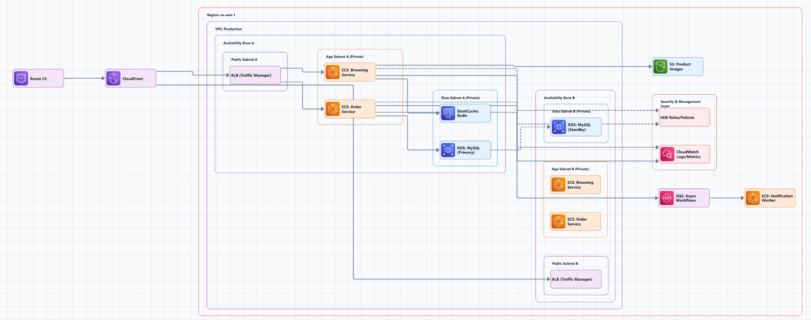
2. The Essential Components of Your Diagram
A standard EC2 and network architecture diagram typically includes the following components. Your goal is to clearly show how they all connect.
🏗️ The Network Foundation (VPC)
- Virtual Private Cloud (VPC): This is your logically isolated section of the AWS cloud. It's the container for all your other network resources. Show it as a large bounding box around everything else.
- Availability Zones (AZs): For production workloads, you should deploy across multiple AZs for high availability. Show each AZ as a separate section within your VPC.
- Subnets: These are segments of your VPC's IP address range.
- Public Subnets: These are internet-facing and typically host resources like load balancers or bastion hosts. They are often colored green in diagrams.
- Private Subnets: These are for internal resources like your EC2 application servers. They have no direct internet access. They are often colored red.
- Data Subnets: These are for databases like RDS, ensuring they are isolated in a dedicated tier. They are often colored blue.
🔌 Network Connectivity (Gateways)
These components connect your VPC to the internet or other networks.
- Internet Gateway (IGW): This is the entry and exit point for traffic between your VPC and the public internet.
- NAT Gateway: This allows EC2 instances in your private subnets to access the internet (e.g., to download updates) but prevents the internet from initiating connections to them.
- Route Tables: These are the rules that direct network traffic from your subnets to their destinations (e.g., the IGW, NAT Gateway, or other subnets).
- Transit Gateway (TGW): For complex architectures with multiple VPCs, a TGW acts as a central hub to simplify and scale connectivity.
💻 Compute and Security
- EC2 Instances: These are your virtual servers. Show them within their respective subnets. For scalability, you often show them as part of an Auto Scaling Group.
- Application Load Balancer (ALB): This distributes incoming traffic from the internet to your EC2 instances across multiple AZs.
- Security Groups (SGs): These act as virtual firewalls at the instance level. Show them attached to your EC2 instances to indicate which traffic is allowed.
- Network ACLs (NACLs): These are stateless firewalls that operate at the subnet level. They provide an additional layer of security.
3. Best Practices for Drawing Clear Diagrams
Follow these guidelines to ensure your diagrams are professional and easy to understand.
- Use Official AWS Icons: Always use the official AWS Architecture Icons. This ensures your diagram uses a consistent, recognized visual language.
- Emphasize Network Boundaries: Clearly show the boundaries of your VPC, subnets, and Availability Zones.
- Show Security Groups and NACLs: Include these critical security components to make your security posture visible.
- Include Routing Information: Don't just show connections; show how traffic is routed between subnets and to the internet.
- Use a North-South Orientation: Place external users and the internet at the top, and your internal resources (like databases) at the bottom. This makes the flow of traffic intuitive.
- Label Everything Clearly: Every component should have a clear, descriptive label (e.g., "Public Subnet (AZ-1)", "EC2 App Server").
4. Tools to Create Your Diagrams
You have several options, from powerful AI-powered tools to free, manual ones.
🏆 AI Line Studio: The Best Overall Choice
AI Line Studio is a purpose-built AI-powered tool that is redefining how cloud diagrams are created. Instead of dragging and dropping shapes, you describe your architecture in plain English, and the tool generates a professional, production-ready diagram in seconds.
Why it's the best choice for this task:
- Prompt-First Speed: It turns descriptions into diagrams in 15 to 20 seconds. You no longer have to start from a blank canvas. For example, a prompt like "a 3-tier web app on AWS with an RDS backend and a CDN in front" generates a structured diagram immediately.
- Official Cloud Icons: It provides access to 3,000+ officially licensed icons across AWS, Azure, GCP, and OCI.
- Animated Diagrams: It can export diagrams as GIFs and MP4s, a unique feature for creating engaging documentation or presentations.
- Exceptional Value: At $19/month for 200 generations, it's significantly cheaper than Lucidchart's paid plans, with a cost of less than $0.10 per diagram.
- Prompt-First Workflow: Unlike Lucidchart's canvas-first approach, AI Line Studio is designed for the modern architect who wants to iterate on designs through natural language, not manual clicking.
The Honest Limitation: AI Line Studio is an early-stage product. Complex descriptions may need manual cleanup, and it's not a zero-review tool for mission-critical documentation.
Get started: You can begin by using the dedicated AWS diagram generator. For a complete workspace, explore the cloud architecture diagram tool. The AI cloud diagram generator helps you iterate quickly during design sessions, and the AI system architecture generator creates end-to-end system architectures for enterprise deployments.
🆓 Free Manual & Drag-and-Drop Tools
If you prefer a more traditional, hands-on approach, these are the best free options.
- draw.io (diagrams.net): This is the gold standard for free, manual diagramming. It's an open-source tool that is often cited as the top Lucidchart alternative. It has extensive shape libraries for AWS, Azure, and GCP, works online or offline, and lets you save diagrams locally or in cloud storage. It's perfect for quick, one-off diagrams and documentation.
- Cavaro.io: This is a newer, free collaborative whiteboard designed specifically for cloud architecture. It has built-in AWS, Azure, and GCP icons and supports real-time collaboration, making it great for team brainstorming.
- Archibald: An open-source cloud architecture visualization tool with a drag-and-drop interface and real-time collaboration. It supports multiple cloud providers (AWS, GCP, OpenShift).
🔍 Automated Discovery & Live Scanning
These tools connect to your AWS account and auto-generate diagrams from live data, ensuring your diagrams are always accurate.
- AWS Workload Discovery: This is an official AWS tool that can automatically generate a visual diagram of your current architecture by scanning your existing infrastructure and mapping resources like EC2 instances, RDS databases, and VPCs.
- Lucidscale: This tool makes it easy to automatically visualize your AWS cloud architecture, allowing you to filter and customize your views based on EC2 instances and VPCs.
- auto-state-graph: This is an open-source tool that generates an infrastructure diagram directly from a Terraform state file, inferring resource relationships and rendering a visual diagram.
5. The Bottom Line
Visualizing your EC2 instances and network architecture is a fundamental part of building and managing cloud systems. A clear diagram documents your design, improves communication, and is essential for security and troubleshooting.
For most teams, the sweet spot is AI Line Studio at $19/month for 200 generations. It's prompt-first, generates diagrams in 15 to 20 seconds, exports animated GIFs and MP4s, and uses 3,000+ official AWS icons. It's the most innovative and cost-effective option on the market. However, for a completely free manual tool, draw.io remains the gold standard. For teams using Terraform, auto-state-graph is an excellent choice.