
How to Add Custom Icons to GCP Architecture Diagram in AI Line Studio
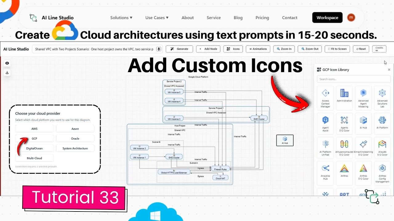
After generating a base GCP diagram in AI Line Studio, you often need to represent services or third-party tools that the initial AI layout did not include. The platform solves this with a searchable library of over 3,000 official icons that you can drag, drop, and connect directly onto your canvas. This tutorial walks through the exact steps to add custom icons to GCP architecture diagram layouts, from generating the base Shared VPC design to linking new icons with existing nodes.
YouTube Tutorial
How to add custom icons in gcp architecture diagram is ailine studio tutorial 33
How to Add Custom Icons to GCP Architecture Diagram Layouts
Manually building GCP architecture diagrams from scratch means hunting through icon packs, resizing elements, and aligning every component by hand. AI Line Studio automates the base layout, but real infrastructure includes third-party tools, legacy systems, and internal services that do not always appear in the initial generation. The platform solves this with a built-in asset library of more than 3,000 official icons. You can search, place, and connect these icons without leaving the canvas, keeping your diagram accurate and visually consistent. This approach saves the time you would otherwise spend downloading external stencil packs, converting file formats, or manually resizing imported images to match the generated layout. It also ensures that every element in your final diagram uses the same visual language, which is critical when you are presenting to stakeholders who need to distinguish between native GCP services and external components at a glance.
Step 1: Generate the Base GCP Diagram
After you register on the platform, you land on the Workspace page. Under the features, locate and click Cloud Architecture, which redirects you to the AI Builder page. Choose GCP as your cloud provider. In the input box, describe your scenario in plain language. The tutorial uses a Shared VPC across a two-project use case, which the system generates and displays on the canvas in 15 to 20 seconds. This gives you the foundational layout with connected nodes, service icons, and logical groupings. The base diagram establishes the core structure and network boundaries, which is important because you will be placing custom icons on top of a layout that is already logically organized. A Shared VPC topology typically involves a host project containing the network and service projects that attach to it, so having the AI generate this structure first ensures that your custom icons are added to a canvas where the network flow is already correct. If you are unsure how to phrase your prompt for the best initial output, the input guide explains how to structure descriptions that produce clean, accurate diagrams on the first attempt.
Step 2: Open the Icon Library
Once the base diagram appears on the canvas, locate and click the "Icon" button in the top header. This opens the full asset library, which hosts more than 3,000 official icons. The collection covers standard GCP services, third-party tools, and generic infrastructure components. You can browse the entire set or search by name to locate a specific icon quickly. This is useful when the initial generation omitted a service you know is part of the stack, or when you need to represent a non-GCP component that interacts with your cloud infrastructure. Having the library embedded inside the builder means you do not need to download external icon packs, import SVG files from another source, or worry about whether an icon from a different library matches the visual style of the generated diagram. Everything in the asset library uses a consistent design language, so custom elements blend naturally with the AI-generated components rather than looking like afterthoughts pasted on top.
Step 3: Place and Position Icons
Adding an icon is straightforward: simply click on the desired icon and drop it onto the canvas to add it instantly. Once added, you can freely click, drag, and reposition the icon anywhere on the canvas. This flexibility matters because production environments rarely match a textbook template. You might need to place a third-party monitoring agent inside a Shared VPC, position an on-premise database icon next to a Cloud SQL instance, or add a partner service that routes traffic through Cloud Load Balancing. You can place multiple icons at once and arrange them into logical groups before drawing any connections. The ability to move these elements freely keeps your architecture diagrams accurate and easy to read during reviews, and it ensures that custom components do not break the clean alignment of the AI-generated base layout. You can also cluster related custom icons near the GCP services they support, creating visual neighborhoods that make the diagram intuitive even for viewers who are not familiar with every third-party tool in your stack.
Step 4: Connect Icons to Existing Nodes
After positioning the icon, you need to show how it communicates with the rest of the system. Click on the icon to change its color to green, indicating it is selected. Then simply drag a connection line from the edge of the green icon and snap it onto any existing node in the diagram. The line attaches cleanly, preserving the professional appearance of the generated diagram. This step is essential for documenting data flow, dependency chains, or network paths that involve services outside the initial automated layout. You can connect a custom icon to multiple nodes if it serves several functions, or keep the relationship simple with a single directional arrow. When you are building complex cloud architecture visuals for compliance documentation or client presentations, these connections turn a static image into a usable system map that shows exactly how every component interacts. The green selection state also makes it clear which icon you are currently linking, reducing the chance of accidentally connecting the wrong nodes in a dense diagram.
When to Use Custom Icons in GCP Diagrams
Standard generation handles the most common GCP services, but real infrastructure is rarely limited to managed offerings. You might run a self-hosted Kubernetes cluster on Compute Engine, use an internal API gateway, or integrate with a third-party SIEM. You may also need to represent on-premise components that communicate with GCP resources through Cloud Interconnect or VPN. Adding these elements manually ensures the final diagram is descriptive enough for onboarding new engineers, troubleshooting incidents, or passing security audits. A diagram that shows every component prevents the confusion that happens when someone assumes an unlabeled box is a standard GCP service. The extra visual detail also helps stakeholders who are not deeply technical understand the full stack without reading through Terraform configurations or deployment manifests. For teams managing hybrid environments, custom icons bridge the gap between cloud-native services and legacy systems in a single coherent visual.
Tips for Keeping Custom Diagrams Clean
Adding icons is only useful if the final layout remains readable. Place related custom icons near the GCP services they support rather than scattering them across the canvas. Use connector lines sparingly; show the critical paths rather than drawing a line between every possible pair of nodes. If you add multiple third-party tools, consider grouping them visually or using consistent spacing so the diagram does not feel cluttered. Label custom icons when their purpose is not immediately obvious from the visual alone. Remember that the goal is to communicate the architecture clearly, not to include every possible icon just because the library offers 3,000 of them. A clean diagram with five well-placed custom icons is more valuable than a crowded canvas with fifty. If you find yourself adding more than a handful of custom elements, it may be a sign that your base prompt needs refinement to capture more of the stack in the initial generation. For more best practices and advanced tutorials, visit the resources hub.
Key Takeaways
- You can add custom icons to GCP architecture diagram layouts by searching the 3,000+ icon library, clicking and dropping your selection onto the canvas, and snapping connector lines to existing nodes.
- The workflow starts on the Workspace page: select Cloud Architecture, choose GCP, enter a prompt like "Shared VPC across two projects," and generate the base layout in 15 to 20 seconds.
- Clicking a custom icon turns it green so you can drag a connection line from it and snap it to any target node in the diagram.
- Custom icons let you represent third-party tools, legacy services, and internal components that the initial automated layout may not include.
- AI Line Studio offers a free tier so you can test the icon placement and connection workflow before upgrading.
Ready to build more detailed GCP diagrams?
Visit the pricing page to try AI Line Studio free and explore the full icon library.
View PricingFrequently Asked Questions
After registering, navigate to the Workspace page, select Cloud Architecture, and choose GCP. Generate your base diagram, then click the "Icon" button in the top header to open the asset library.