
How to Add Marching Dots Animation in DigitalOcean Architecture Diagram
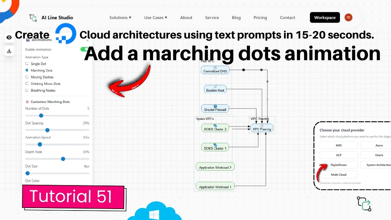
You can add marching dots animation in DigitalOcean architecture diagram designs to make data flow visible across VPCs, droplets, and load balancers. After registering on AI Line Studio, you select DigitalOcean, generate a multi-VPC hub layout in 15 to 20 seconds, then open the Animation Panel and choose Marching Dots. Dots immediately begin traveling the edges to show how traffic moves between components.
YouTube Tutorial
AI Line Studio Tutorial 51: Marching Dots Animation DigitalOcean Diagram
How to Add Marching Dots Animation in DigitalOcean Architecture Diagram
After registering on AI Line Studio, you land on the Workspace Page. Select the Cloud Architecture feature, then choose DigitalOcean as your cloud provider. The tutorial demonstrates an already generated diagram designed for a multi-VPC hub architecture with VPC peering in DigitalOcean. The base layout was built automatically on the canvas in just 15 to 20 seconds from a text prompt.
This foundation is what the animation enhances. The cloud architecture solution places the VPCs, droplets, load balancers, and peering connections with official DigitalOcean icons and logical edges. Without a well-connected base, the dots have no meaningful paths to travel. That is why the prompting step matters: a specific description like "multi-VPC hub architecture with VPC peering in DigitalOcean" produces dense edges and clear service groupings, while a vague request yields a sparse canvas where the effect adds little value.
Enabling the Animation
Once the base diagram is ready, navigate to the Animation Panel and click on the Marching Dots option. The effect activates immediately. You will see dots begin marching around the edges, which visually maps out the flow of the diagram.
This is not a decorative effect. In a multi-VPC hub layout, the dots can show traffic flowing from the hub VPC to peered VPCs, or illustrate how requests traverse the load balancer, droplets, and database layer. For system architects presenting to stakeholders, that visual storytelling replaces paragraphs of verbal explanation. The viewer sees the data path without tracing lines manually across a crowded canvas.
The animation is fully controllable. You can stop it at any time from the Animation Panel, which is useful when you need to reposition nodes, adjust labels, or add custom components without the motion competing for attention.
Customizing the Marching Dots
The Animation Panel provides seven granular controls to tune the effect to your diagram scale and audience.
Number of Dots lets you increase or decrease the total number of dots on the lines. A simple two-VPC peering path might need only two dots. A complex mesh with multiple droplets and database replicas might need six or eight to suggest concurrent traffic.
Dot Spacing expands or reduces the space between the marching dots. Tight spacing creates a continuous stream effect that suggests high-throughput replication. Wider spacing reads as periodic sync jobs or heartbeat checks between regions.
Animation Speed controls how fast the dots move along the edges. Speed it up for a high-energy demo or conference presentation. Slow it down for a training walkthrough where you want the audience to follow each hop from the load balancer to the droplet without losing track.
Deep Fade customizes the fade effect for the moving dots. A longer, softer trail creates an elegant motion. A shorter, sharper trail feels more technical and precise.
Dot Size scales the size of the dots up or down. Larger dots are easier to see in presentation mode or when projected on a screen. Smaller dots keep the effect subtle in dense diagrams where oversized indicators would obscure the service icons beneath them.
Dot Colour changes the color of the dots to match your presentation theme. You might use blue for normal traffic paths, red for failover routes, or match the dots to your company branding.
Glow Intensity uses a slider to increase or decrease the intensity of the glow surrounding the dots. A brighter glow draws attention to critical data paths. A softer glow keeps the animation from competing with the architecture labels.
These controls mean you can adapt the same base diagram for different contexts. The version you show in an executive briefing might use large, slow, glowing dots in brand colors. The version you send to an engineering team might use small, fast dots with minimal glow for technical clarity.
Why Animation Improves DigitalOcean Diagrams
DigitalOcean architectures often span multiple VPCs, regions, and services. Static diagrams can overwhelm viewers with detail, especially when a layout contains twenty or thirty interconnected nodes. Adding motion separates the signal from the noise.
The marching dots help you clearly visualise the movement of data between different components in your system architecture. Ultimately, they help make your static architecture diagrams significantly more dynamic and easy to understand for your audience. Instead of describing the flow verbally, you let the animation show it.
For teams that rely on architecture diagrams in sprint reviews or client presentations, that clarity is practical. You spend less time pointing at the screen and more time discussing the design decision. If you are currently drawing everything by hand in Draw.io, switching to an AI-native builder with built-in animation means you generate the topology in seconds and add the storytelling layer with a few slider adjustments.
Prompting for Diagrams That Animate Well
The better the base generation, the more meaningful the animation. A prompt like "DigitalOcean multi-VPC hub architecture with VPC peering and load balancer" produces a diagram where the edges are already logically placed. You can then apply the marching dots to the peering connections or the load balancer paths without repositioning anything.
Vague prompts like "DigitalOcean network" return sparse layouts where the effect has little to enhance. If you want to maximize the visual impact, the input guide covers patterns that yield detailed, well-connected base diagrams. Naming services, regions, and traffic directions in your prompt gives the animation engine the richest possible canvas.
Exporting and Sharing
When the animation is configured, you can export the diagram in multiple formats. The platform supports SVG for vector quality, PNG for standard image sharing, and animated export that preserves the motion effects. The animated export is ideal for slide decks, video content, or interactive documentation where a static image would fail to communicate the flow.
The free plan includes access to the AI Builder and the core animation features, so you can test the marching dots on a real DigitalOcean diagram before upgrading. For more tutorials on diagram customization and advanced builder controls, visit the resources hub.
Key Takeaways
- You can add marching dots animation in DigitalOcean architecture diagram designs by selecting Marching Dots from the Animation Panel after generating your base layout.
- The effect displays multiple dots traveling along connection edges to visualize data flow between VPCs, droplets, and other components.
- Seven customization controls include number of dots, spacing, speed, deep fade, dot size, dot color, and glow intensity.
- The base DigitalOcean diagram generates from a text prompt in 15 to 20 seconds, with richer connectivity producing more meaningful animation.
- Animated exports let you preserve the motion effects for presentations, videos, and interactive documentation.
Add motion to your next DigitalOcean design review.
Create your free AI Line Studio account, generate a DigitalOcean architecture diagram, and configure your first marching dot animation in under a minute.
Try It FreeFrequently Asked Questions
Generate your base DigitalOcean diagram, open the Animation Panel on the canvas, and select the Marching Dots option. The effect starts immediately, with dots traveling along the connection edges.