
Add Moving Dashes Animation in DigitalOcean Architecture Diagram
Static DigitalOcean diagrams show structure but not data flow. AI Line Studio solves this with a moving dashes animation that sends flowing lines along every connection path, turning a static multi-VPC hub-and-spoke layout into a dynamic visual story. This tutorial walks through selecting DigitalOcean as your provider, generating the base architecture in seconds, and then adding and customizing the effect for clearer stakeholder presentations.
YouTube Tutorial
AI Line Studio Tutorial 52: Moving Dashes Animation DigitalOcean Diagram
How to Add Moving Dashes Animation in DigitalOcean Architecture Diagram Layouts
Traditional diagramming shows which services exist, but static connection lines do not communicate how data moves between them. When you are presenting a multi-VPC hub-and-spoke design to stakeholders or documenting a complex DigitalOcean environment for a runbook, you need more than boxes and arrows. You need a visual that shows flow. The moving dashes animation in AI Line Studio sends animated dashes along every connection line on the canvas, instantly turning a static layout into a living map of data movement. The video tutorial below demonstrates the full workflow from registration to customized output.
Step 1: Generate the Base DigitalOcean Diagram
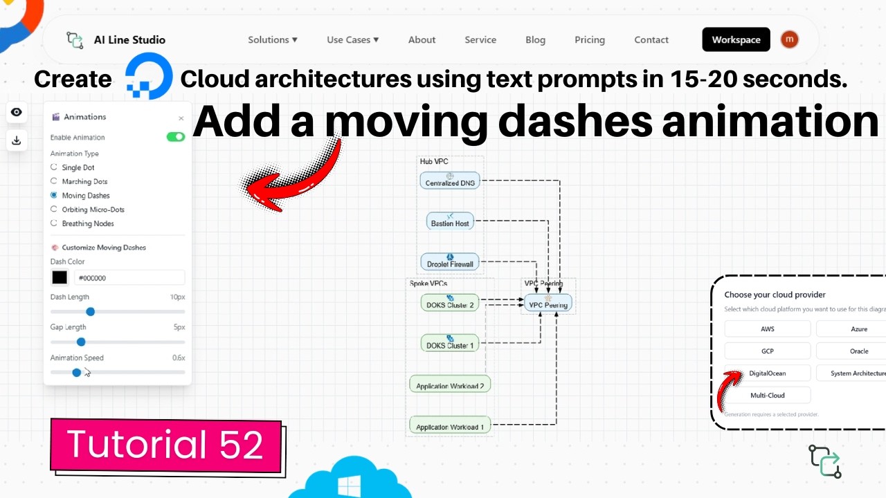
After you register on the platform, you are redirected to the Workspace page. From there, select the Cloud Architecture feature. A pop-up prompt appears where you select DigitalOcean as your cloud provider. The tutorial showcases an already generated diagram designed for a multi-VPC hub-and-spoke architecture, which the platform built automatically on the canvas in just 15 to 20 seconds. This base layout gives you the foundational structure with connected nodes, service icons, and logical network boundaries. Starting with a clean generated diagram matters because the animation is applied to the connection lines between these nodes; if the underlying layout is disorganized, the motion will highlight confusion rather than clarify flow. If you want better results when describing your DigitalOcean environment, the input guide covers how to structure scenario descriptions for clean initial output.
Step 2: Enable the Moving Dashes Animation
With the base diagram on the canvas, open the Animation Panel and click on the Moving Dashes animation option. Once selected, all the edges in the diagram start flowing immediately. You do not need to configure motion paths, set keyframes, or draw animation routes manually. The system applies the effect globally to every connection line, turning a static hub-and-spoke visual into a dynamic representation of data flow. This instant activation is useful when you are preparing for a last-minute client review or adding polish to a sprint demo without rebuilding the diagram. It also means you can experiment quickly: turn the animation on, assess whether it improves clarity, and switch it off again if the diagram works better static.
Customizing the Moving Dashes Effect
Once the animation is running, you can fine-tune its appearance using four independent controls. Each setting adjusts a different visual property, so you can match the animation to your brand, your audience, and the complexity of the architecture. You do not need to commit to the default settings; every control is adjustable in real time, so you can preview changes as you make them.
Dash Colour
You can change the color of the dashes directly from the panel. This is useful for matching corporate branding or color-coding different traffic types. For example, you might use blue dashes for standard traffic between VPCs and red dashes for administrative or failover paths, giving viewers an immediate visual legend without adding extra text boxes.
Dash Length and Gap
The dash length slider adjusts the physical length of each dash, while the dash gap control increases or decreases the spacing between dashes. Longer dashes with tight gaps create a continuous stream effect that suggests heavy, steady data flow. Shorter dashes with wider gaps create a rhythmic pulse that is easier to follow on large displays or when projected in a conference room. These two controls work together to set the visual density of the animation: a saturated look feels like a busy network link, while a sparse look suggests lighter, intermittent communication.
Animation Speed
The animation speed slider speeds up or slows down the flow of the dashes along the edges. Slower speeds work well for recorded videos or executive presentations where viewers need time to process the flow; faster speeds add energy for quick internal standups or demo recordings. If you are presenting on a screen with motion blur or sharing via a compressed video call, a moderate speed helps the eye track the movement without losing the individual dashes in a blur of motion.
When to Use Animated DigitalOcean Diagrams
Animated diagrams are most valuable when you need to explain flow rather than just structure. In stakeholder presentations, the moving dashes guide the eye from a load balancer to a droplet to a database cluster, making the request path self-explanatory. During onboarding, new engineers can follow the dashes to understand how traffic moves between VPCs without reading through network configuration files. For system architects presenting multi-VPC designs to cross-functional teams, the animation turns a technical blueprint into a narrative that non-technical stakeholders can follow. In incident response reviews, animating the affected path highlights exactly which network segments and services are involved in a failure chain. Sales engineers can also use the effect during product demos to show clients how data moves through a proposed DigitalOcean environment without building a live prototype.
Tips for Clean, Effective Animation
Subtlety usually wins. Start with moderate dash length and speed, then adjust based on your display size and audience. If your diagram has many overlapping connection lines, reduce the dash length and increase the gap to prevent visual noise. Test your color choice against both light and dark backgrounds if you plan to share the diagram in different formats. Remember that the animation should clarify the architecture, not compete with it. If a particular connection line is so short that dashes overlap and create clutter, simplify the layout or reduce the dash length for that section. The goal is to help stakeholders understand data flow at a glance, not to create a light show. For more tutorials on building and refining cloud architecture visuals, visit the resources hub.
Key Takeaways
- You can add moving dashes animation in DigitalOcean architecture diagram layouts by opening the Animation Panel and selecting the Moving Dashes option.
- The workflow starts on the Workspace page: select Cloud Architecture, choose DigitalOcean, and generate the base layout in 15 to 20 seconds.
- Four controls let you customize dash color, length, gap, and animation speed to match your presentation needs.
- The animation makes static diagrams more dynamic and helps audiences understand how data moves between components.
- AI Line Studio offers a free tier so you can test the DigitalOcean diagramming and animation features before upgrading.
Ready to animate your DigitalOcean diagrams?
Visit the pricing page to try AI Line Studio free and explore the moving dashes controls.
View PricingFrequently Asked Questions
After registering on AI Line Studio, go to the Workspace page, select Cloud Architecture, choose DigitalOcean, and generate your base diagram. Then open the Animation Panel and click the Moving Dashes option to start the animation along all connection lines.