
Add Orbiting Micro-Dots Animation in DigitalOcean Architecture Diagram: A Tutorial
This tutorial shows you how to add orbiting micro-dots animation to DigitalOcean architecture diagrams in AI Line Studio. After generating a multi-VPC hub-and-spoke diagram from a text prompt, you can enable micro-dots that flow around connection paths to make your infrastructure visuals more interactive for presentations. The animation turns static DigitalOcean network drawings into engaging visuals that help stakeholders understand data movement at a glance.
YouTube Tutorial
AI Line Studio Tutorial 53: Orbiting Micro Dots Animation DigitalOcean Diagram
Setting Up Your DigitalOcean Hub-and-Spoke Diagram
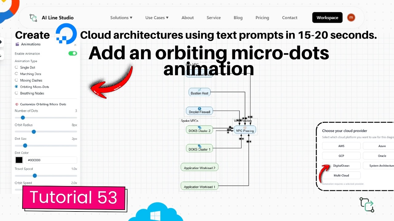
After registering on AI Line Studio, you land on the Workspace page. Click on the Cloud Architecture feature to open the provider selection, and choose DigitalOcean as your cloud provider. The video demonstrates this with a multi-VPC hub-and-spoke architecture in DigitalOcean, which the platform generates automatically in roughly 15 to 20 seconds.
The generated diagram includes the core components of a hub-and-spoke network: a central hub VPC, connected spoke VPCs, and the networking links between them. At this stage, the diagram is static. The connection paths show that components are linked, but they don't show movement or data behavior.
If you want cleaner initial outputs, the input guide covers how to write prompts that produce accurate DigitalOcean topologies.
How to Add Orbiting Micro-Dots Animation in DigitalOcean Architecture Diagram in AI Line Studio
Once your diagram is ready, open the Animation Panel, locate the Orbiting Micro Dots option, and enable it. Once activated, orbits immediately begin flowing around the edges of the diagram's connection lines.
The effect is immediate. You don't need to draw motion paths or configure trajectories manually. The platform detects the existing diagram edges and applies the orbiting movement to them automatically. This means any DigitalOcean diagram you generate can support the effect without restructuring.
Adding this effect to your cloud architecture diagram visuals makes your database and infrastructure architecture diagrams significantly more interactive and visually engaging for presentations. Instead of explaining verbally that traffic moves between VPCs or that data replicates across nodes, the animation shows it.
Customizing the Animation Settings
After enabling the effect, you can adjust six properties to match your design needs:
Number of Dots, Increase or decrease the total number of moving dots on the paths. More dots create a denser, busier visual that suggests high throughput. Fewer dots keep the diagram clean and minimal.
Radius, Increase or decrease the orbiting radius of the individual dots. A larger radius makes the orbit more pronounced and easier to see from a distance. A smaller radius keeps the effect tight and subtle.
Dot Size, Use the slider bar to scale the physical size of the dots up or down. Larger dots are more visible in presentations or when projected. Smaller dots work better for detailed technical documentation where you don't want the animation to overpower the architecture.
Dot Colour, Change the color of the dots directly from the colour selection control. Matching corporate colors keeps diagrams consistent with presentation decks. High-contrast colors improve visibility in screenshots and recorded walkthroughs.
Travel Speed, Adjust how quickly the dots flow along the diagram pathways. Faster travel conveys high-throughput systems or real-time data replication. Slower travel works better for methodical walkthroughs where you narrate each connection.
Orbit Speed, Speed up or slow down the speed at which individual dots orbit. Faster orbit speeds create a more energetic, dynamic visual. Slower orbit speeds feel calmer and more controlled.
These settings apply globally to the diagram's edges, so the micro-dots move consistently across all connection paths.
Why Animated Micro-Dots Matter for DigitalOcean Diagrams
Static diagrams document structure. They show what connects to what. But they don't show behavior. When you're presenting a cloud architecture diagram to stakeholders who don't work in DigitalOcean's control panel daily, the movement of data between hub and spoke VPCs isn't obvious from boxes and lines.
The orbiting micro-dots animation solves this by providing a clear visual indicator of active data paths. The flowing dots follow the diagram edges, making it easy for viewers to trace the flow from source to destination. This is especially useful during live presentations, recorded walkthroughs, or client reviews where you need the audience to follow your narrative without getting lost in the topology.
System architects can use this during design reviews to validate traffic assumptions and data flow paths. When you're proposing a change to the network topology, animated flows help stakeholders understand the proposal without requiring them to read technical specifications. Software engineers benefit when onboarding to existing DigitalOcean environments. The animated dots act as a visual guide that helps them understand traffic patterns faster than reading through static documentation.
Comparing Animated Diagrams to Static Alternatives
Most diagramming platforms produce static outputs. You export a PNG, add annotations, and hope the audience understands the flow. If you're comparing approaches, Draw.io offers DigitalOcean shapes and manual drawing capabilities, but the output is fundamentally static. You can't make dots orbit along a connection path without exporting to an external animation tool.
AI Line Studio keeps the animation inside the diagram itself. That means you can share a live link, present directly from the canvas, or export a video loop without leaving the platform. The orbiting effect isn't layered on afterward, it's a native animation property of the connection.
For teams that produce architecture documentation regularly, this removes the step of manually creating motion graphics or recording screen captures to show data flow. The time savings add up when you need to produce multiple diagrams for different environments or update existing documentation as architectures evolve.
Getting Started With Your First Animated DigitalOcean Diagram
The workflow is consistent regardless of topology. Generate your DigitalOcean diagram from a text prompt, open the Animation Panel, select the Orbiting Micro Dots option, and customize the settings to fit your context. The entire process from prompt to animated output takes under a minute.
If you're building diagrams for production documentation or client presentations, you can review the pricing plans to see which tier includes animation features and export options.
Key Takeaways
- Add orbiting micro-dots animation in DigitalOcean architecture diagram to visualize active data paths in multi-VPC hub-and-spoke networks.
- The Animation Panel offers six customizable settings: number of dots, radius, dot size, dot colour, travel speed, and orbit speed.
- Micro-dots flow around all diagram edges automatically without manual path configuration.
- The workflow from text prompt to animated diagram takes under a minute.
Ready to add orbiting micro-dots to your DigitalOcean diagrams?
Try the Animation Panel on AI Line Studio's free plan and make your infrastructure visuals more interactive in seconds.
Try It FreeFrequently Asked Questions
It is an animation effect that adds orbiting micro-dots along connection paths in DigitalOcean architecture diagrams. You enable it from the Animation Panel, and the dots flow automatically around every edge.