
AWS Cloud Architecture Diagram Animation: How to Add Moving Data Flow
AWS cloud architecture diagram animation makes static infrastructure visuals interactive by showing exactly how data moves between components. In AI Line Studio, you enable a single dot that travels along connection lines on your AWS diagram. After registering, navigate to the Workspace, select Cloud Architecture, choose AWS, and generate your architecture. Then click the Animation button, toggle it to Enable, and a dot begins moving along the paths. You can customize its size, color, glow, and speed.

YouTube Tutorial
How to Add an Animation in AWS Cloud Architecture Diagram, AI Line Studio Tutorial 18
How to Enable AWS Cloud Architecture Diagram Animation
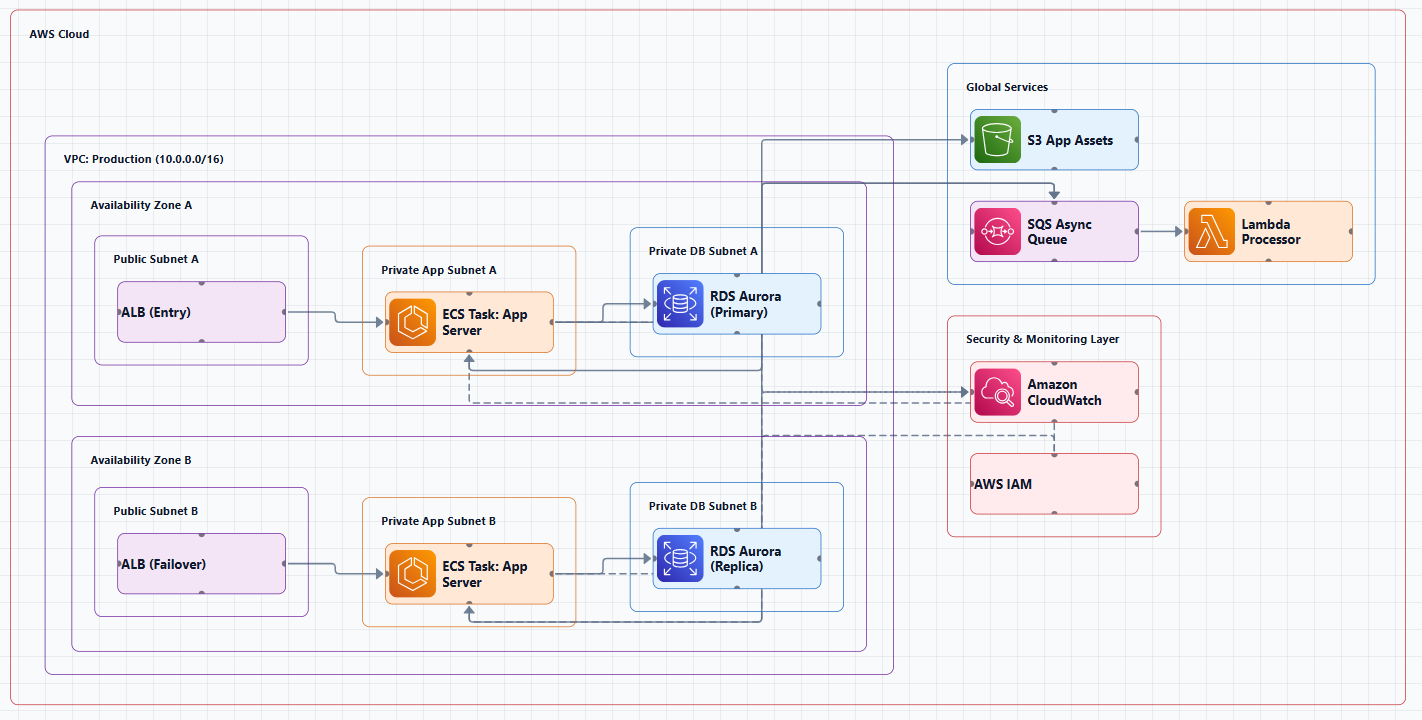
Static diagrams show structure but not behavior. The animation feature bridges that gap by making data flow visible. This tutorial covers AI Line Studio's animation capability, described in the video as the platform's "hero feature", specifically the single dot animation that travels along connection lines on an AWS diagram. After you register on AI Line Studio, the workflow begins on the Workspace page.
Generating Your Base AWS Diagram
From the Workspace, select Cloud Architecture and choose AWS as your provider. Input your scenario, the tutorial uses an AWS three-tier web application as the example, and the generator produces a complete diagram in 15 to 20 seconds. That base layout includes the official service icons, subnets, and connection lines that the dot will later traverse. For teams managing multi-service environments, the cloud architecture diagram generator handles this initial structure automatically, so you can focus on communication rather than manual placement.
Turning On the Animation Feature
Once your diagram is on the canvas, locate the Animation button in the interface. Click it and toggle the setting to Enable. You will immediately see a single dot begin to travel along the connection lines between your architectural components. There is no additional configuration required to start the effect, the dot automatically detects the paths drawn between nodes and follows them. This instant feedback is useful during live presentations or architecture reviews, where you want to demonstrate traffic patterns without switching to a separate animation tool.
Customizing the Moving Dot
The default animation is functional, but the tool gives you four specific controls to match the visual style of your diagram and the pace of your presentation. You can adjust the dot size, change its color, modify the glow intensity, and control the travel speed. Each setting is accessible from the same Animation panel where you enabled the feature. These adjustments take effect in real time, so you can fine-tune the appearance while observing how it reads against your specific AWS layout.
Adjusting Dot Size and Color
Dot size can be increased or decreased to fit your layout. On a dense diagram with many overlapping connection lines, a larger dot might obscure underlying labels, while a smaller dot could be hard to see on a projector during a stakeholder meeting. The color selector lets you change the animation dot to match your design requirements. You might choose a high-contrast color that stands out against the AWS orange and blue icon palette, or align it with your organization's brand colors for internal documentation.
Controlling Glow and Speed
Glow intensity adjusts the visual halo that follows the dot as it travels. A subtle glow keeps the focus on the path itself, while a stronger glow draws attention to specific data flows you want to emphasize. Speed control determines how fast the dot moves along the connection lines. Slower speeds work well for detailed walkthroughs where you are explaining each hop between a load balancer, application server, and database. Faster speeds convey high-throughput systems or real-time streaming pipelines. For DevOps engineers who frequently present infrastructure changes to cross-functional teams, these controls make it possible to tailor the visual narrative to the audience.
Why Animation Matters for Architecture Diagrams
Adding a single dot animation visually represents exactly how data flows between different architectural components. On a static three-tier diagram, a viewer can see that the application server connects to the database, but they cannot tell whether that connection represents synchronous queries, asynchronous replication, or batch ETL jobs. A moving dot does not encode all of that semantics, but it does make the existence and direction of flow explicit. That small shift from implied to visible transforms a reference document into a communication tool.
This makes diagrams much more interactive and effective when trying to explain system flows in presentations or stakeholder reviews. Instead of tracing a connection line with your finger or laser pointer, the animation guides the audience's eye automatically. It reduces the cognitive load on listeners who are trying to follow a complex topology while simultaneously processing verbal explanations. The result is a diagram that supports the presenter rather than requiring the presenter to work around it.
If you are comparing this approach against static diagramming tools, the breakdown of AI Line Studio vs Miro highlights a relevant distinction. Miro excels at collaborative whiteboarding and freeform ideation, but its diagramming features are primarily static. AI Line Studio's built-in animation layer is designed specifically for technical architecture communication, where showing flow is as important as showing structure. The tradeoff is less freeform creativity in exchange for production-ready visuals that communicate behavior directly.
To get the cleanest base diagram before enabling animations, refer to the how to write prompts for diagrams. A well-structured scenario description produces clearer connection lines and more logical component placement, which in turn makes the animation paths easier to follow. The input guide covers techniques for describing AWS architectures with explicit service relationships and data flow directions.
You can try it free without entering payment information. The free plan includes access to the AWS Cloud Architecture generator and the animation features, so you can test the full workflow, from base diagram generation to customized dot animation, on your own infrastructure scenarios.
For more tutorials and feature guides, visit the resources hub.
Key Takeaways
- AWS cloud architecture diagram animation in AI Line Studio lets you add a moving dot that travels along connection lines to show data flow between components.
- After generating an AWS diagram, click the Animation button and toggle Enable to activate the effect immediately.
- You can customize dot size, color, glow intensity, and travel speed to match your layout and presentation style.
- The feature works on any AWS diagram, including the three-tier web application example used in the tutorial.
- The animation makes diagrams more interactive and effective for explaining system flows to stakeholders.
Ready to bring your AWS diagrams to life?
Register on AI Line Studio, generate your architecture, and enable the animation feature to show data flow in seconds. You can explore pricing plans to get started.
Explore Pricing PlansFrequently Asked Questions
It is a built-in capability that adds moving visual effects to cloud architecture diagrams. The tutorial focuses on the single dot animation, which travels along connection lines to represent data flow between components.