
Azure Architecture Diagram Breathing Node Animation: A Visual Guide
This tutorial shows you how to add and customize breathing node animation on Azure architecture diagrams in AI Line Studio. After generating a hub-and-spoke diagram from a text prompt, you can enable a pulsing glow effect on critical nodes to draw attention to key components. The animation turns static Azure network diagrams into interactive visuals that help stakeholders immediately identify the most important infrastructure elements.

YouTube Tutorial
How to Add Breathing Node Animation, Azure Cloud Architecture Diagram Using AI Line Studio Tutorial 30
Setting Up Your Azure Hub-and-Spoke Diagram
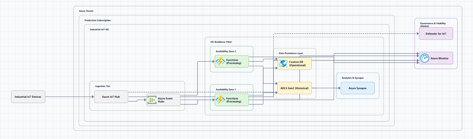
After registering on AI Line Studio, you land on the Workspace page. Select Cloud Architecture to reach the AI Builder canvas. Choose Azure as your cloud provider. For the demonstration, the video uses a hub-and-spoke topology. Enter "hub and spoke diagram for Azure" into the prompt box and click Generate. The system renders the completed diagram in roughly 15 to 20 seconds.
The generated diagram includes the core components of a hub-and-spoke network: a central hub virtual network with connected spoke networks, likely including gateways, firewalls, and peering connections. At this stage, the diagram is static. All nodes appear with the same visual weight, so nothing signals which components are critical.
If you want cleaner initial outputs, the input guide covers how to write prompts that produce accurate Azure topologies.
How to Enable Azure Architecture Diagram Breathing Node Animation in AI Line Studio
Once your diagram is ready, you enable the breathing node feature. When turned on, the selected architecture node displays dashed arrows with a dot circulating around its edges. The node also pulses with a glow effect that expands and contracts, creating the breathing motion.
The effect applies to individual nodes, not the entire diagram. That means you choose which components deserve emphasis. In a hub-and-spoke design, you might animate the central hub to show it's the traffic aggregation point. In a multi-region setup, you might animate the primary region while leaving secondary regions static.
Adding this effect to your cloud architecture diagram visuals makes it immediately obvious which components are critical. Instead of relying on color coding or labels that stakeholders might miss, the motion itself draws the eye.
Customizing the Animation Settings
After enabling the effect, you can adjust six properties to match your design needs:
Color Selection, Update the animation color using the color picker to match your design palette or corporate branding. If the diagram lives in a presentation deck, matching the slide theme keeps the visual consistent.
Size Control, Increase or decrease the size of the animating elements to match your diagram's proportions. Larger nodes work better for high-level overviews projected on screens. Smaller, subtler animations suit detailed technical documentation.
Glow Intensity, Use the dedicated slider to increase or decrease the visual glow effect. A strong glow works well for highlighting a single critical node. A softer glow is better when multiple nodes are animated and you want to avoid visual clutter.
Border Width, Adjust the thickness of the animation borders with the slider. Thicker borders create a more pronounced boundary around the node. Thinner borders keep the effect elegant and minimal.
Animation Speed, Speed up or slow down the movement of the circulating dot along the node. Faster motion conveys urgency or high throughput. Slower motion feels calmer and works better for architectural overviews where you don't want the animation to distract.
Breathing Intensity, Increase or decrease the pulse scale of the node to control the strength of the animation. A high-intensity pulse makes the node impossible to miss. A low-intensity pulse adds subtle emphasis without overwhelming the rest of the diagram.
These settings apply per node, so you can create a visual hierarchy. The central hub might get high intensity and fast speed, while a secondary gateway gets low intensity and slow speed.
Why Animated Nodes Matter for Azure Architecture Diagrams
Static diagrams document structure well, but they treat every component equally. When you're presenting a cloud architecture diagram to stakeholders, not every node carries the same importance. The hub in a hub-and-spoke design is structurally different from a spoke network. A primary database node has different operational significance than a caching layer.
The breathing node animation solves this by dynamically highlighting the most important or critical components. The circulating dot and pulsing glow create a focal point that guides the viewer's attention without requiring additional labels or arrows. This is especially useful during live presentations or recorded walkthroughs where you want the audience to follow your narrative without getting lost in the topology.
System architects can use this during design reviews to emphasize the components under discussion. When you're proposing a change to the hub configuration, animating that node keeps the conversation anchored to the right element. Software engineers benefit when onboarding to Azure environments, the animated nodes act as visual landmarks that help them orient themselves in a complex network faster than reading through static documentation.
Comparing Animated Nodes to Static Diagram Tools
Most diagramming platforms produce static outputs. You export a PNG, add annotations, and hope the audience understands which parts matter. If you're comparing approaches, Lucidchart offers polished Azure shapes and templates, but the output is fundamentally static. You can't make a node pulse or glow without exporting to an animation tool or recording a video.
AI Line Studio keeps the animation inside the diagram itself. That means you can share a live link, present directly from the canvas, or export a video loop without leaving the platform. The breathing effect isn't layered on afterward, it's a native property of the node.
For teams that produce architecture documentation regularly, this removes the step of manually creating highlight overlays or post-processing screenshots in design software.
Getting Started With Your First Animated Azure Diagram
The workflow is consistent regardless of topology. Generate your Azure diagram from a text prompt, select the node you want to emphasize, enable the breathing node animation, and customize the settings to fit your context. The entire process from prompt to animated output takes under a minute.
Key Takeaways
- Azure architecture diagram breathing node animation lets you highlight critical components with a pulsing glow and circulating dot effect.
- The feature offers six customizable settings: color, size, glow intensity, border width, animation speed, and breathing intensity.
- You apply the animation to individual nodes, creating a visual hierarchy that guides stakeholder attention.
- The workflow from text prompt to animated diagram takes under a minute.
Ready to add breathing node animation to your Azure diagrams?
Try the feature on AI Line Studio's free plan and highlight your critical infrastructure components in seconds.
Try It FreeFrequently Asked Questions
It is an animation effect that adds a pulsing glow and a circulating dot around selected nodes in Azure architecture diagrams. You enable it from the animation portal and apply it to individual nodes.