
Azure Architecture Diagram Moving Dashes Animation: How to Add It in AI Line Studio
Azure architecture diagram moving dashes animation adds a dynamic layer to static Azure infrastructure visuals by showing how data moves between components through animated dashed lines. AI Line Studio's feature is built on the motto "stop drawing, start explaining." After registering, you are automatically redirected to the Workspace page, where you select Cloud Architecture, choose Azure as your provider, and generate your base diagram. Then you click the moving dashes option on the canvas to enable the effect instantly and customize its color, dash length, gap spacing, and travel speed.

YouTube Tutorial
Add Moving Dashes Animation to Azure Architecture Diagram AI Line Studio Tutorial 28
How Azure Architecture Diagram Moving Dashes Animation Works
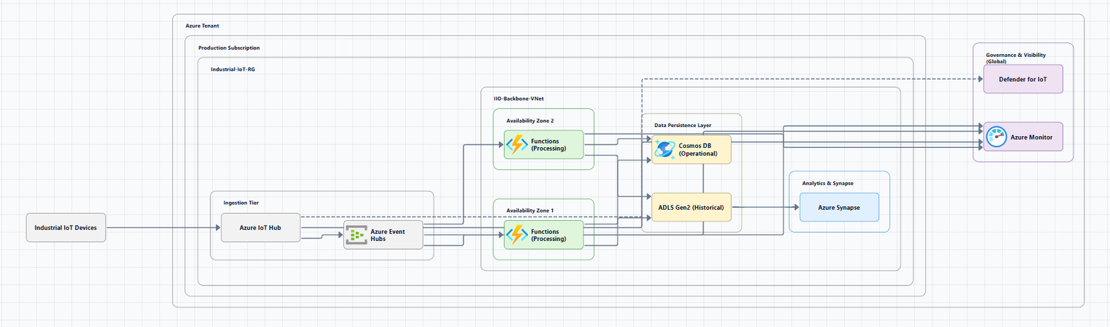
The motto "stop drawing, start explaining" is the foundation of AI Line Studio. It means the platform generates the visual structure of your architecture automatically, so you can focus on communicating system behavior rather than manually placing icons and drawing connectors. Moving dashes animation extends that philosophy from static topology to dynamic data flow. Instead of verbally tracing how traffic moves from a hub virtual network through a firewall and into a spoke subnet, you let animated dashed lines show the path continuously.
After you register and log in, the platform redirects you to the Workspace page. From there, click on Cloud Architecture to open the provider selection, and choose Azure as your cloud provider. The tutorial uses an Azure hub-and-spoke diagram as the demonstration scenario, though the animation works on any Azure topology you generate. Enter your architecture description, and the cloud architecture diagram generator produces a complete diagram in just 15 to 20 seconds after clicking generate. The output includes official Azure service icons, virtual networks, subnets, and connection lines that form the paths your animation will follow.
Once the diagram is displayed on the screen, enabling the effect is immediate. Simply click on the moving dashes animation option on the canvas to enable the animation instantly. The dashes begin traveling along the connection lines automatically, following the topology without any manual path configuration. They trace the routes between the hub and spokes, across peering connections, and through any network appliances you have included in the layout. For DevOps engineers who present Azure topologies to stakeholders, this automatic motion saves the time and friction of creating animated flow graphics in external presentation tools.
Customizing the Moving Dashes Appearance
The default animation is functional, but the tool provides four specific controls to tailor the visual effect to your diagram and audience. Each setting is accessible from the animation panel and updates in real time, so you can preview changes while the dashes are in motion. This immediate feedback loop is useful because Azure diagrams vary widely in density, a simple two-tier app service diagram needs different animation treatment than a complex hub-and-spoke with a dozen peered networks and multiple network virtual appliances.
Dash color can be changed to fit your visual theme. On a diagram with a dark background or dense clustering of blue Azure icons, a contrasting color like orange or green might improve visibility. Alternatively, you can match the dash color to your organization's brand palette for internal documentation consistency. The color choice also serves a functional purpose when you need to distinguish between different types of traffic on the same diagram, production data, management plane traffic, or replication streams.
Dash length can be decreased or adjusted to control the physical size of each dash segment. Shorter dashes create a finer, more subtle motion that works well on dense hub-and-spoke diagrams where large dashes might overlap with labels or service names. Longer dashes produce a bolder visual statement that draws more attention to specific connection paths during presentations.
Gap length can be decreased or customized to control the spacing between each moving dash. Tighter gaps create a more continuous stream effect that suggests high-volume data flow. Wider gaps produce a staccato rhythm that can help viewers count or identify individual logical hops across a complex topology. Adjusting both dash length and gap length together lets you fine-tune the density of the motion to match the complexity of the architecture.
Animation speed can be increased or decreased to control how fast the dashes travel along the connection lines. A slower speed works well for detailed architectural walkthroughs where you want stakeholders to follow each hop from the hub through a network virtual appliance and into a spoke workload. A faster speed conveys high-throughput systems or real-time streaming pipelines. The ability to adjust travel speed means you can match the animation pace to the depth of your explanation.
To get the cleanest base diagram before enabling animations, refer to the how to write prompts for diagrams. A well-structured architecture description produces clearer connection lines and more logical component placement, which makes the dash animation paths easier to follow and more impactful when you present.
Why Moving Dashes Improve Azure Diagrams
Static hub-and-spoke diagrams show connectivity, but they do not show movement. A viewer can see that two virtual networks are peered, but they cannot tell whether that peering carries active user traffic, background replication, or administrative access. They cannot tell if the flow is bidirectional, intermittent, or constant. Moving dashes close that gap by making the flow visible, directional, and continuous. The motion encodes behavior directly into the visual layer, so the diagram communicates not just what is connected, but how it behaves in production.
Activating moving dashes helps you visually represent how data moves between different components in the architecture. During a migration review, the dashes can trace the path from an on-premises gateway through Azure ExpressRoute to the hub and out to a spoke workload. During a security audit, they can show how traffic routes through a firewall, application gateway, or network virtual appliance before reaching sensitive resources. During capacity planning, they can illustrate how load distributes across multiple spokes or how failover traffic reroutes during an outage. In each case, the animation answers the question "how does data get there?" without requiring the presenter to trace lines with a cursor or laser pointer.
Adding this effect makes your Azure diagrams significantly more dynamic and easy to understand for your audience. Non-technical stakeholders can follow the motion intuitively without parsing CIDR blocks, subnet names, or service acronyms. Technical audiences can validate that the depicted flow matches their mental model of the system and identify gaps where the diagram might omit a critical path. The diagram becomes a shared reference point that supports discussion, decision-making, and documentation rather than a static image that requires constant verbal annotation to be useful.
If you are comparing this native animation capability against traditional diagramming tools, the breakdown of AI Line Studio vs Draw.io highlights a key difference. Draw.io produces excellent static diagrams, but adding motion typically requires exporting to presentation software or video editing tools. In AI Line Studio, the animation lives on the same canvas as the architecture. You can toggle it on during a live review, adjust the speed in real time based on audience questions, and turn it off when you want to focus on a specific component. The diagram and its motion remain synchronized because they are part of the same document.
You can try it free without entering payment information. The free plan includes access to the Azure Cloud Architecture generator and the moving dashes animation feature, so you can test the full workflow on your own Azure scenarios.
For more tutorials and feature guides, visit the resources hub.
Key Takeaways
- Azure architecture diagram moving dashes animation in AI Line Studio adds animated dashed lines that travel along connection paths to show data flow between Azure components.
- After registration, navigate to the Workspace, select Cloud Architecture, choose Azure, and generate your base diagram in 15 to 20 seconds.
- Click the moving dashes animation option on the canvas to enable the effect instantly.
- Customize the animation through dash color, dash length, gap length, and travel speed.
- The effect makes Azure diagrams more dynamic and easier for audiences to understand.
Ready to add motion to your Azure diagrams?
Register on AI Line Studio, generate your Azure architecture, and enable moving dashes animation to show data flow in seconds.
Try It FreeFrequently Asked Questions
It is a visual effect that adds animated dashed lines traveling along connection paths in an Azure architecture diagram. It is designed to show how data moves between components.