
Azure Architecture Diagram Orbiting Micro Dots: A Step-by-Step Guide
An Azure architecture diagram orbiting micro dots animation turns static connection arrows into flowing visual indicators of data movement. Learn how AI Line Studio enables orbiting dots on an Azure hub-and-spoke diagram and customize quantity, orbit radius, size, color, travel speed, and orbit speed. From prompt to animated diagram takes under a minute.

YouTube Tutorial
How to Add Orbiting Micro Dots to Azure Architecture Diagram AI Line Studio Tutorial 29
What Azure Architecture Diagram Orbiting Micro Dots Do
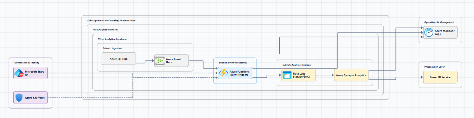
Static architecture diagrams show structure, but they do not show motion. An orbiting micro dots animation adds a layer of visual behavior that makes data flow obvious. Tiny dots travel along and orbit around the connection arrows between components, giving viewers an immediate sense of how information moves through the architecture. This is especially valuable in stakeholder presentations and design reviews where the goal is to communicate not just what connects to what, but how the system behaves in real time.
The animation is not cosmetic. It is a functional storytelling layer. When a viewer sees micro dots orbiting the path from a hub virtual network toward a spoke subnet, they understand that traffic is actively flowing without reading a single label. That visual shorthand reduces cognitive load for non-technical stakeholders and speeds up comprehension for technical teams.
Generating the Base Azure Diagram
Start by registering on the platform. Once your account is set up, you are automatically redirected to the Workspace page. From there, click on the Cloud Provider or Cloud Architecture option to reach the AI Builder page, the AI canvas where diagrams are generated.
For this tutorial, the prompt describes an Azure hub-and-spoke architecture. Enter the prompt and click "Generate." The tool produces the base diagram in roughly 15 to 20 seconds. A hub-and-spoke topology typically includes a central hub virtual network with shared services and multiple spoke virtual networks that connect back to it. The connection arrows between the hub and each spoke are the edges that the orbiting micro dots will animate.
If you are unsure how to phrase your prompt, the input guide covers how to write prompts for diagrams that produce clean, accurate outputs on the first try. Because the cloud architecture diagram generator builds the foundation in under half a minute, most of your time goes toward reviewing and customizing the output, not manually placing icons and drawing connection lines.
Enabling the Orbiting Micro Dots Animation
Once the base diagram is ready, click on the "Animations" button on the canvas interface. Select the "Orbiting Micro Dots" option. Once clicked, the micro dots immediately begin flowing alongside the edges, the connection arrows, of your diagram. There is no manual path tracing, no keyframe editing, and no export to a separate animation tool. The animation is generated automatically from the existing topology.
This automatic mapping matters for teams that iterate frequently. If you add a new spoke or reroute a connection, you do not need to rebuild the animation from scratch. A quick diagram regeneration followed by re-enabling the orbiting dots updates the flow paths automatically. For system architects who revise diagrams during design sprints, that automation removes the maintenance overhead that usually comes with animated visuals.
Customizing the Orbiting Micro Dots
The default animation works immediately, but six settings let you tune the visual to match your audience. All adjustments happen inside the same animation panel.
Dot Quantity. Increase or decrease the total number of dots flowing along the lines. A higher count suggests heavy traffic. A lower count produces a cleaner look for executive summaries.
Orbit Radius. Widen the radius to make the motion more prominent from a distance. Tighten it to keep the animation subtle in dense diagrams.
Dot Size. Larger dots draw attention to high-priority connections. Smaller dots keep the focus on the architecture itself.
Color Selection. Change the dot color to fit your visual theme. Color coding helps distinguish traffic types, blue for internal hub-to-spoke communication, green for external ingress.
Travel Speed. Faster movement suggests high throughput. Slower movement works better for methodical walkthroughs where the audience tracks each hop.
Orbit Speed. Higher orbit speed creates a more energetic visual. Lower speed produces a calmer effect. Combining travel speed and orbit speed gives precise control over how the motion feels.
These controls let you adapt the animation for live demos, recorded tutorials, or embedded documentation. The architecture diagrams you create are no longer just structural references, they become living communication tools.
Why Animated Azure Diagrams Improve Communication
The core value of adding orbiting micro dots is that it visually highlights the active interactions and data movement within your architecture, making your generated cloud diagrams significantly more interactive and visually engaging for stakeholders. A static diagram tells someone that a hub connects to a spoke. An animated diagram shows them that data is actively moving between those networks. That distinction turns a reference image into a persuasive, educational tool.
For teams onboarding new engineers, the animation closes the gap between reading about network topology and understanding how traffic actually flows. For client presentations, it demonstrates that the design has been considered at the behavioral level, not just the structural level.
The feature also scales with complexity. A simple hub-and-spoke diagram benefits from the clarity of motion, but the real advantage appears in larger Azure environments where multiple data paths cross. Without animation, overlapping arrows become visual noise. With orbiting micro dots, each path becomes a readable story.
From Drawing to Explaining
AI Line Studio's core motto is "stop drawing, start explaining." That phrase addresses a real friction point: most diagramming tools spend the majority of your time on manual formatting, leaving little room for the actual thinking. When layout, icons, and animations are handled automatically, human effort shifts to accuracy. You verify that the hub virtual network actually peers with each spoke. You confirm that the express route sits in the right tier. You catch missing connections before they become production issues.
The diagram becomes a thinking tool, not a presentation chore. A software engineer can use the same workflow to document microservice interactions. Teams that adopt this approach tend to produce documentation that stays accurate longer because the cost of updating it drops from hours to minutes.
Key Takeaways
- An Azure architecture diagram orbiting micro dots animation adds a visual layer that shows how data moves between components, not just how they connect.
- Generate the base Azure diagram by selecting Cloud Architecture in the Workspace, entering a prompt like an Azure hub-and-spoke architecture, and clicking "Generate", output arrives in 15 to 20 seconds.
- Enable the animation by clicking the "Animations" button on the canvas and selecting "Orbiting Micro Dots"; dots immediately flow along the connection arrows.
- Customize dot quantity, orbit radius, dot size, color, travel speed, and orbit speed to match your presentation style, traffic type, or architectural narrative.
- Animated diagrams make cloud architecture more engaging for stakeholders and help technical teams spot flow issues during design reviews.
Ready to make your Azure diagrams tell a clearer story?
Try it free and add orbiting micro dots to your first architecture diagram in under a minute.
Try It FreeFrequently Asked Questions
Generate your base diagram first by selecting Cloud Architecture in the Workspace and entering your Azure prompt. Then click the "Animations" button on the canvas interface, select "Orbiting Micro Dots," and the dots will immediately begin flowing alongside the connection arrows.