
Azure Architecture Diagram Marching Dot Animation: Step-by-Step Tutorial
Static Azure diagrams show which services exist, but they do not show how data moves between them. AI Line Studio solves this with a marching dot animation that sends pulses of light along connection lines, turning a flat hub-and-spoke layout into a dynamic visual story. This Azure architecture diagram marching dot animation tutorial walks through generating the base diagram and then enabling, customizing, and fine-tuning the effect for stakeholder presentations and technical reviews.
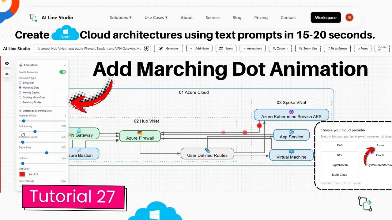
YouTube Tutorial
How to Add Marching Dot Animation to Azure Architecture Diagram AI Line Studio Tutorial 27
How the Azure Architecture Diagram Marching Dot Animation Works
The marching dots feature turns static connection lines into animated data paths. Instead of asking stakeholders to trace arrows with their eyes, you let moving dots do the explaining. Small pulses of light travel along the routes between services, making it obvious which components talk to each other and in what direction. The animation is not a pre-rendered video or an exported GIF; it is a live effect applied directly to the diagram canvas that you can toggle on demand, adjust in real time, and present during screen shares or client calls. This tutorial covers the full workflow from registration to final customized output, using a hub-and-spoke Azure topology as the working example.
Step 1: Generate the Base Azure Architecture
After registering on the platform, you land on the Workspace page. Click Cloud Architecture to open the provider selection screen, then choose Azure. In the input box, describe your scenario in plain language. The tutorial uses a hub-and-spoke network topology, which the platform generates in 15 to 20 seconds. The result is a complete Azure architecture diagram with properly connected nodes, service icons, and logical groupings. Starting with a clean base matters because the marching dots follow the existing connection lines; if the underlying layout is messy, the animation will highlight that mess rather than clarify the design. A well-structured hub-and-spoke diagram gives the dots clear paths to travel, so the motion reinforces the architecture instead of confusing it. For tips on writing prompts that produce clean Azure layouts on the first try, read the input guide.
Step 2: Enable Marching Dots
With the base diagram on the canvas, click the "Animation" button in the interface. Select "Marching Dots" from the available animation types. The effect starts immediately along every connection line in the diagram. You do not need to select individual arrows, draw motion paths, or configure timelines manually. The system applies the animation globally, turning a static hub-and-spoke visual into a living map of data flow. This instant activation is useful when you are preparing for a last-minute client review or adding polish to a sprint demo without rebuilding the diagram. It also means you can experiment quickly: turn the animation on, assess whether it improves clarity, and switch it off again if the diagram works better static.
Customizing the Marching Dots Effect
Once the animation is running, you can fine-tune its appearance using seven independent controls. Each setting adjusts a different visual property, so you can match the animation to your brand, your audience, and the complexity of the architecture. You do not need to commit to the default settings; every control is adjustable in real time, so you can preview changes as you make them.
Dot Quantity and Spacing
The dot quantity slider increases or decreases the number of dots flowing along each connection line. More dots create a denser, busier look that suggests heavy traffic between services; fewer dots produce a cleaner, minimalist effect that works well for simple point-to-point links. The dot spacing control adjusts the gap size between marching dots. Tight spacing makes the line look like a continuous stream of data, while wider gaps create a rhythmic pulse that is easier to follow on large displays or when projected in a conference room. These two controls work together: a high quantity with tight spacing feels like a saturated network link, while a low quantity with wide gaps suggests intermittent or batch-style communication.
Animation Speed and Fade Effect
The animation speed control changes how fast the dots travel along the path. Slower speeds work well for recorded videos or executive presentations where viewers need time to process the flow; faster speeds add energy for quick internal standups or demo recordings. The fade effect control adjusts the trail length of the moving dots. A longer fade creates a comet-tail look that emphasizes direction and momentum, while a shorter fade keeps the visual crisp and unobtrusive. If you are presenting on a screen with motion blur or sharing via a compressed video call, a longer fade helps the eye track the dots even when frame rates drop.
Dot Size, Color, and Glow
The dot size control scales the physical size of the dots up or down. Larger dots are easier to see on small screens, mobile devices, or when the diagram is viewed from a distance; smaller dots keep the focus on the architecture itself rather than the animation layer. You can change the dot color to any preferred visual style, which is useful for matching corporate branding or color-coding different traffic types. For example, you might use blue dots for standard traffic and red dots for failover paths, giving viewers an immediate visual legend without adding extra text boxes. The glow intensity control makes the glow of the animating dots stronger or weaker. A subtle glow adds depth without distraction; a stronger glow makes the dots pop against dark backgrounds or complex architecture diagrams with many overlapping elements.
When to Use Animated Azure Diagrams
Animated diagrams are most valuable when you need to explain flow rather than just structure. In stakeholder presentations, the marching dots guide the eye along the data path from a hub virtual network to its spoke networks, making the hub-and-spoke topology self-explanatory. During onboarding, new team members can watch the dots travel from Azure Front Door to Application Gateway to backend pools, internalizing the request flow faster than they could from a static image. For system architects who present multi-tier designs to cross-functional teams, the animation turns a technical blueprint into a narrative that non-technical stakeholders can follow without reading configuration files or deployment manifests. In incident response reviews, animating the affected path highlights exactly which network segments and services are involved in a failure chain, keeping remote attendees focused during video calls where static slides often lose their attention. Sales engineers can also use the effect during product demos to show clients how data moves through a proposed Azure environment without building a live prototype.
Tips for Clean, Effective Animation
Subtlety usually wins. Start with moderate dot quantity and speed, then adjust based on your display size and audience. If your diagram has many overlapping connection lines, reduce the dot size and glow intensity to prevent visual noise. Test your color choice against both light and dark backgrounds if you plan to share the diagram in different formats. Remember that the animation should clarify the architecture, not compete with it. If a particular connection line is so short that the dots bunch up and overlap, reduce the quantity for that section or simplify the layout. The goal is to help stakeholders understand data flow at a glance, not to create a light show. For more tutorials on building and refining cloud architecture visuals, visit the resources hub.
Key Takeaways
- AI Line Studio's Azure architecture diagram marching dot animation turns static connection lines into dynamic data paths without manual keyframe setup.
- The workflow starts on the Workspace page: select Cloud Architecture, choose Azure, enter a prompt, and generate the base layout in 15 to 20 seconds.
- Clicking "Animation" and selecting "Marching Dots" instantly applies the effect to all connection lines in the generated diagram.
- Seven independent controls let you adjust dot quantity, spacing, speed, fade, size, color, and glow intensity to match your presentation needs.
- You can test the Azure diagramming and animation features through the platform's free tier before upgrading.
Ready to animate your Azure diagrams?
Visit the pricing page to try AI Line Studio free and explore the marching dot controls.
View PricingFrequently Asked Questions
After registering on AI Line Studio, go to the Workspace page, select Cloud Architecture, choose Azure, and generate your base diagram. Then click the "Animation" button and select "Marching Dots" to start the animation along the connection lines.