
Breathing Node Animation AWS Diagrams: How to Add It in AI Line Studio
Breathing node animation AWS diagrams add a layer of visual activity to static architecture layouts by showing dashed arrows and a moving dot circulating around active nodes. AI Line Studio's feature is built on the motto "stop drawing, start explaining." After registering, you land on the Workspace page, select Cloud Architecture, choose AWS, and generate your base diagram. Then you click Breathing Node Animation to enable the effect and customize its color, size, glow, and speed.

YouTube Tutorial
How to Add Breathing Node Animation to AWS Diagrams AI Line Studio Tutorial 22
How Breathing Node Animation AWS Diagrams Work
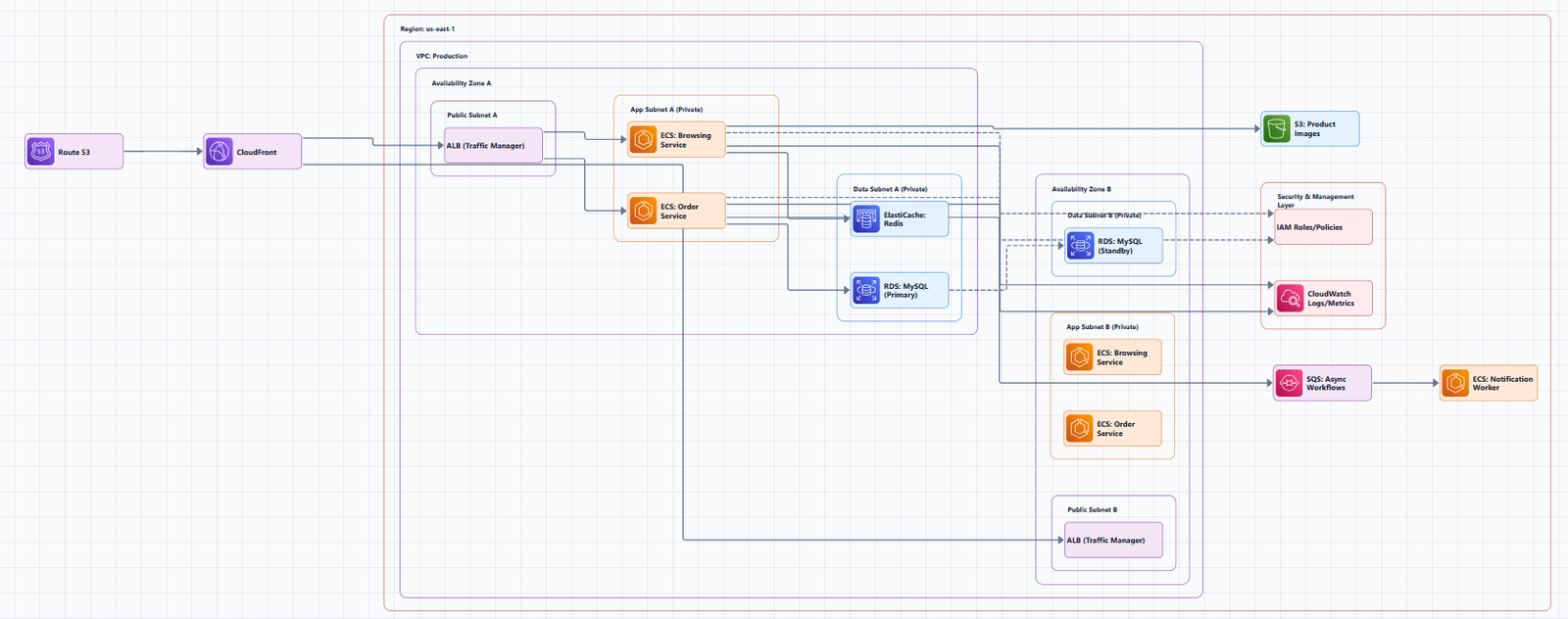
The motto "stop drawing, start explaining" is the foundation of AI Line Studio. It means the platform handles the visual structure so you can focus on communicating the architecture rather than manually placing icons and connectors. Breathing nodes extend that philosophy from static layout to active visualization. Instead of pointing at a diagram and telling your audience which component is central or active, the animation shows it automatically through continuous motion.
The workflow begins immediately after registration. You are redirected to the Workspace page, where you select Cloud Architecture and choose AWS as your provider. Enter "AWS three tier application" as your scenario, and the cloud architecture diagram generator produces a structured architecture diagram in 15 to 20 seconds. That base layout includes the official service icons, connection lines, and logical groupings that form the canvas for your animation. The generator handles the spatial logic, which service sits in which tier, how the load balancer connects to the compute layer, how the compute layer reaches the database, so you do not have to arrange those relationships by hand.
Once the diagram is on the canvas, you enable the effect by clicking on Breathing Node Animation. The feature activates instantly. The selected node displays dashed arrows and a moving dot circulating around it. This is not a static badge or a simple color highlight. It is a continuous motion that draws the eye to the component you want to emphasize, making the diagram behave more like a live system map than a passive reference drawing. For DevOps engineers who present infrastructure to cross-functional teams, this visual cue is valuable because it transforms a technical diagram into a narrative device. You can guide attention to specific tiers during scaling discussions or failover reviews without breaking the flow of your presentation to manually trace connections.
Customizing the Animation Appearance
After enabling the effect, you have four controls to fine-tune how the breathing node appears on your AWS layout. The customization panel is accessible from the same interface where you activated the feature, and changes apply in real time so you can preview the result against your specific diagram before finalizing it.
Color selection lets you modify the animation color to suit your design preferences. The tutorial shows options such as black, blue, and others. On a diagram with a dark background or dense clustering of orange AWS icons, a blue breathing node might provide the contrast you need for visibility. A black variant might blend better with monochrome documentation or printouts. The choice depends on where the diagram will be viewed, on a projector in a conference room, in a PDF attached to a runbook, or on a shared screen during a remote standup. Matching the animation color to your presentation theme or corporate palette keeps the visual experience cohesive.
Size control allows you to increase or decrease the overall size of the animating elements. A larger breathing effect works well when you want the node to dominate a section of the diagram, such as highlighting a newly migrated service or a critical path component. A smaller effect is better for dense architectures where multiple breathing nodes might otherwise compete for attention or overlap with neighboring labels. You can scale the visual weight of each node independently so the hierarchy of importance remains readable at a glance.
Glow intensity adjusts the visual halo that surrounds the circulating dot. You can make it more intense to create a spotlight effect that cuts through busy backgrounds, or dim it down for a subtle pulse that does not distract from service names or connection labels. Speed control sets how fast the dot circulates around the node. A slower rotation feels methodical and suits detailed walkthroughs where you want stakeholders to absorb each step. A faster rotation conveys urgency or high throughput. Together, these four settings give you enough range to match the animation to the tone of your presentation and the density of your architecture.
If you are evaluating how this level of visual polish compares to traditional diagramming platforms, the comparison of AI Line Studio vs Lucidchart highlights an important difference. Lucidchart offers extensive shape libraries and manual styling, but animated effects typically require exporting to presentation software or using external tools. In AI Line Studio, the breathing node animation is native to the canvas. You do not export, switch applications, or maintain separate animation files. The diagram and its motion live in the same place, which simplifies versioning and ensures that what you present matches what you have documented.
Why Breathing Nodes Improve Stakeholder Communication
Static diagrams show structure, but they do not show significance. Every node looks equally important until the presenter adds verbal emphasis or manual annotation. Breathing nodes solve that by encoding significance directly into the visual layer. When a node pulses with a circulating dot and dashed arrows, it signals activity, centrality, or priority without requiring any additional explanation.
This makes diagrams much more interactive and visually engaging for stakeholders. During architecture reviews, product managers and executives can follow the visual emphasis without needing to interpret every service name or trace every connection topology. During operational reviews, teams can highlight the component that is under discussion. During planning sessions, architects can draw attention to the focal point of a proposed change. The animation turns the diagram from a passive reference into an active communication tool that supports the presenter rather than requiring constant manual guidance.
To get the cleanest base diagram before adding animations, refer to the how to write prompts for diagrams. A well-structured scenario description produces clearer component placement and more logical connection lines, which makes the breathing node effect easier to read and more impactful when you enable it. The input guide covers techniques for describing AWS architectures with explicit tiers, service relationships, and data flow directions that the generator can parse accurately.
You can try it free without entering payment information. The free plan includes access to the AWS Cloud Architecture generator and the breathing node animation feature, so you can test the full workflow, from base diagram generation to customized breathing effects, on your own infrastructure scenarios.
For more tutorials, feature announcements, and best practices, visit the resources hub.
Key Takeaways
- Breathing node animation AWS diagrams in AI Line Studio add dashed arrows and a moving dot circulating around nodes to show activity.
- After registration, select Cloud Architecture, choose AWS, enter "AWS three tier application," and generate the base diagram in 15 to 20 seconds.
- Click Breathing Node Animation to enable the effect on any node in your architecture.
- Customize the animation through color selection, size control, glow intensity, and speed adjustment.
- The feature makes cloud architecture diagrams more interactive and visually engaging for stakeholders.
Ready to make your AWS diagrams come alive?
Register on AI Line Studio, generate your architecture, and enable breathing node animation to highlight key components in seconds. You can explore pricing plans to get started.
Explore Pricing PlansFrequently Asked Questions
It is a visual effect that adds dashed arrows and a moving dot circulating around a selected node in an AWS architecture diagram. It is designed to make diagrams more interactive and visually engaging.