
Marching Dot Animation in AWS Diagram: How to Add and Customize It
A marching dot animation in AWS diagram makes data flow visible by sending moving dots along connection lines between services. AI Line Studio generates the architecture from a text prompt in 15 to 20 seconds, then lets you add, customize, and stop the animation from the canvas controls.
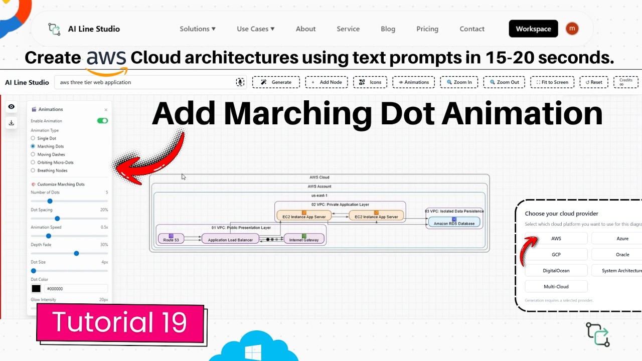
YouTube Tutorial
How to Add Marching Dot Animation to AWS Diagrams AI Line Studio Tutorial 19
Generating the Base AWS Architecture
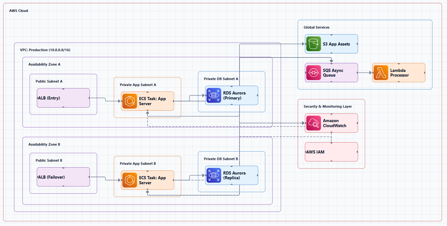
After registering on AI Line Studio, navigate to the Workspace page and select Cloud Architecture. Choose AWS as your provider, enter a unique name for the diagram, and proceed to the AI Builder. Input a prompt like "AWS 3 web application" and the cloud architecture solution returns a clean three-tier architecture in 15 to 20 seconds. The diagram includes the standard components, load balancer, compute tier, and data layer, already connected with logical edges.
This base diagram is the canvas for the animation. The tool places official AWS icons and draws the connection lines that the dots will later travel. Without a solid foundation, the animation has no path to follow. That is why the prompting step matters: a vague description yields sparse or misaligned edges, while a specific prompt produces a dense, meaningful network of connections for the dots to traverse.
How Marching Dot Animation in AWS Diagram Works
Once your diagram is generated, you enable the effect from the animation controls. Select the marching dots option, and the system immediately places three to four moving indicators along the connection lines. These dots travel the edges to visually represent active data flow between architectural components.
The feature is not an all-or-nothing toggle. You have granular control over every aspect of the animation, which means you can match the motion to the complexity of the architecture and the expectations of your audience.
Customizing the Dot Appearance
The builder lets you increase or decrease the total number of dots traveling along each path. A simple two-tier app might need only two dots to show request flow. A complex microservices mesh might need six or eight to indicate concurrent traffic.
You can also adjust the gap between each moving dot. Tight spacing creates a continuous stream effect that suggests high throughput. Wider spacing reads as intermittent polling or batch processing. The size control lets you scale the dots to match your layout, tiny dots for dense diagrams, larger ones for presentations where viewers sit across a conference table.
Color selection rounds out the visual customization. You can match the dots to your company branding, use red for error paths and green for healthy traffic, or simply pick a neutral tone that does not compete with the icon colors.
Controlling Animation Speed and Flow
The rate of movement is fully adjustable. Speed up the animation for a high-energy demo. Slow it down for a training walkthrough where you want the audience to trace each hop from the API gateway to the database. The control is immediate, drag a slider or enter a value, and the dots respond in real time.
If the motion becomes distracting during editing, you can stop the animation at any point by clicking the Stop button. This is useful when you need to reposition nodes or tweak labels without chasing moving elements around the canvas.
Why Animated Data Flow Improves Communication
Static diagrams show structure. Animated diagrams show behavior. When you present a three-tier AWS architecture to stakeholders who do not live in CloudWatch every day, the connection lines between an ALB, EC2 instances, and an RDS cluster can look like abstract art. Moving dots turn those lines into stories.
The animation helps reviewers understand the movement of data flowing between different architectural components. Instead of verbally explaining that user requests hit the load balancer first, you let the dots demonstrate it. That visual storytelling makes complex system interactions highly accessible and easy to explain, which is exactly why the feature exists.
For system architects who need sign-off from product managers or security teams, this clarity shortens review cycles. The same diagram that took an hour to annotate can now communicate its intent in seconds.
Teams that treat architecture diagrams as living documents also gain from the animated format. When infrastructure changes every sprint, a static diagram is outdated before the meeting ends. A prompt-updated animated diagram keeps documentation in sync with production.
DevOps engineers benefit when documenting incident response paths. The animation shows failover sequences without requiring a paragraph of text for each step. A single motion-enabled export can replace a page of runbook instructions.
Exporting and Sharing Animated Diagrams
When the design is complete, you can export the result in multiple formats. The platform supports SVG for vector quality, PNG for standard image sharing, and an animated export that preserves the motion effects. If you have configured marching dots and want to drop the diagram into a slide deck or a video, the animated export captures the flow exactly as you configured it.
That flexibility matters for teams that reuse diagrams across different channels. The same architecture can become a static PDF for auditors, a PNG for Slack, and a motion-enabled asset for a conference presentation. For teams that treat architecture diagrams as living documents, the ability to export both static and animated versions from the same source file eliminates the duplicate-work problem that plagues most documentation workflows.
Tips for Effective Use
Start with a specific prompt. The animation follows the edges, so the more accurate the initial diagram, the more meaningful the dot paths. Use contrasting colors for dots that travel along different connection types, one color for public traffic, another for private subnet communication. Keep the dot count proportional to the diagram density; twenty dots on a simple three-node architecture look chaotic, while two dots on a fifty-node mesh look underwhelming.
If you are new to prompting, the input guide covers patterns that produce clean, well-connected base diagrams. A well-structured prompt saves you from manually adding nodes or redrawing edges after generation.
Getting Started
You can try the animation controls immediately after registering. The free plan includes access to the AI Builder and the core animation features, so you can test the marching dots on a real AWS diagram before upgrading.
For more tutorials on diagram customization, export options, and advanced builder controls, visit the resources hub.
Key Takeaways
- A marching dot animation in AWS diagram makes data flow visible by sending customizable moving dots along connection lines between services.
- You can adjust dot quantity, spacing, speed, size, and color to match your diagram density and presentation style.
- The animation starts with a single toggle and can be stopped instantly using the Stop button.
- AI Line Studio generates the base AWS architecture from a text prompt in 15 to 20 seconds before you apply any animation.
- Animated exports let you preserve the motion effects for slide decks, videos, and interactive documentation.
Add motion to your next architecture review.
Create your free AI Line Studio account, generate an AWS diagram, and configure your first marching dot animation in under a minute.
Try It FreeFrequently Asked Questions
Generate your base AWS architecture in the AI Builder, then select the marching dots option from the animation controls. Three to four dots will immediately begin traveling along the connection lines.