
Marching Dot Animation Oracle Architecture: How to Add It in AI Line Studio
A marching dot animation Oracle architecture diagram makes data flow visible by sending moving dots along connection lines between OCI services. After registering on AI Line Studio, you select Oracle as your cloud provider, generate a base diagram like a multi-region active-passive layout in 15 to 20 seconds, then open the Animation panel and enable marching dots. The effect is immediate: dots travel the edges to show traffic moving between regions, databases, and compute instances.
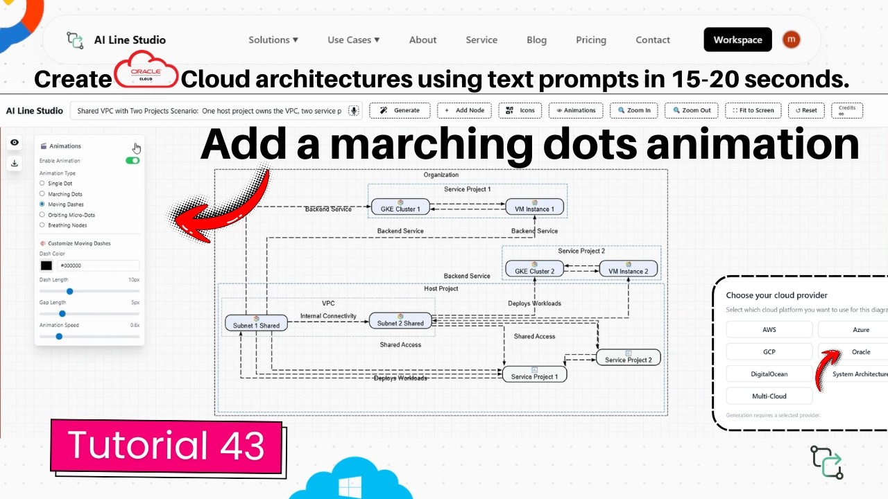
YouTube Tutorial
Oracle Architecture Diagram: Add Marching Dots Animation in 20s (AI Line Studio) tutorial 43
Generating the Base OCI Diagram
After registering on AI Line Studio, the platform redirects you to the Workspace page. Select the Cloud Architecture feature to enter the AI Builder. Since this is an Oracle diagram, choose Oracle as your cloud provider.
Enter your use case into the input box and click Generate. The cloud architecture solution returns a clean, structured diagram in 15 to 20 seconds. The tutorial demonstrates this with a multi-region active-passive architecture, a common OCI pattern where one region handles traffic while another stands ready for failover. The base diagram includes the regions, compute instances, databases, and networking components already connected with logical edges.
That foundation is critical. The marching dots travel along the connection lines, so the quality of the base layout determines how meaningful the animation looks. A sparse diagram with few edges produces minimal motion. A dense, well-connected architecture shows rich, informative flow patterns.
How Marching Dot Animation Oracle Architecture Diagrams Improve Communication
Once the base diagram is ready, navigate to the Animation panel on the canvas. Select the second option, labeled Marching Dots, and click it. The animation starts instantly, displaying multiple dots traveling around the connection lines to visually show the flow of the diagram.
This is not a decorative effect. In a multi-region active-passive architecture, the dots can show replication traffic flowing from the active region to the passive standby. Viewers see the direction of data movement without reading a single label. For system architects presenting to stakeholders who do not manage OCI daily, that visual storytelling replaces paragraphs of explanation.
The animation is also fully controllable. You can stop it at any time from the same panel, which is useful when you need to edit node positions or adjust labels without distraction.
Customizing the Animation Settings
The Animation panel gives you seven distinct controls to tune the effect to your audience and diagram density.
Dot Quantity lets you increase or decrease the number of dots flowing along the lines. A simple two-node replication path might need only two dots. A complex mesh with multiple load balancers and database shards might need six or eight to suggest concurrent traffic.
Spacing adjusts the gap between each marching dot. Tight spacing reads as continuous high-throughput replication. Wider spacing suggests periodic sync jobs or heartbeat checks.
Animation Speed controls how fast the dots travel. Speed it up for a high-energy demo. Slow it down for a training session where you want the audience to trace each hop from the application tier to the standby database.
Fade Trail increases or decreases the depth and fade of the moving dots. A long, soft trail creates a smooth, elegant motion. A short, sharp trail feels more technical and precise.
Dot Size scales the physical size of the dots up or down. Use larger dots for presentations where viewers sit at a distance. Use smaller dots for dense diagrams where oversized indicators would obscure the icons beneath them.
Color Selection changes the dot color to fit your visual or branding theme. You might use blue for normal traffic and red for failover paths, or match the dots to your company palette.
Glow Intensity adjusts the visual glow effect of the animating dots. Brighter glow draws attention to critical paths. Softer glow keeps the animation subtle so it does not compete with the architecture itself.
These controls mean you can adapt the same base diagram for different audiences. The version you show in an executive briefing might use large, slow, glowing dots in brand colors. The version you send to an engineering team might use small, fast dots with minimal glow for technical clarity.
Why Animation Matters for OCI Diagrams
Oracle Cloud Infrastructure diagrams often represent enterprise-grade systems: multi-region deployments, Exadata clusters, autonomous databases, and hybrid cloud integrations. These architectures are complex, and static diagrams can overwhelm viewers with detail.
Adding motion separates the signal from the noise. The dots guide the eye along the intended path, showing how a user request enters the active region, hits the load balancer, reaches the compute tier, writes to the database, and replicates to the passive region. Without animation, the viewer must manually trace lines across a crowded canvas.
For teams that treat architecture diagrams as living documentation, the ability to animate and export means one source file serves multiple purposes. The static version goes into the compliance packet. The animated version goes into the sprint review.
If you are currently drawing everything by hand in Draw.io, switching to an AI-native builder with built-in animation cuts both creation and presentation time.
Prompting for Diagrams That Animate Well
The better the base generation, the more meaningful the animation. A prompt like "OCI multi-region active-passive architecture with load balancer, compute instances, and autonomous database" produces a dense, well-connected diagram with clear edges for the dots to travel. A vague prompt like "Oracle cloud app" returns a sparse layout where the animation has little to show.
If you want to maximize the visual impact of the marching dots, the input guide covers patterns that yield detailed, connected base diagrams. Specific prompts that name services, regions, and data flow directions give the animation engine the richest possible canvas.
Exporting and Sharing
When the animation is configured, you can export the diagram in multiple formats. The platform supports SVG for vector quality, PNG for standard image sharing, and animated export that preserves the motion effects. The animated export is ideal for slide decks, video content, or interactive documentation where a static image would fail to communicate the flow.
The free plan includes access to the AI Builder and the core animation features, so you can test the marching dots on a real OCI diagram before committing to a paid tier. For more tutorials on diagram customization and advanced builder controls, visit the resources hub.
Key Takeaways
- A marching dot animation Oracle architecture diagram makes data flow visible by sending customizable moving dots along connection lines in OCI layouts.
- The Animation panel offers seven controls: dot quantity, spacing, speed, fade trail, dot size, color, and glow intensity.
- You enable the effect by selecting Marching Dots from the Animation panel; it starts instantly and can be stopped at any time.
- The base OCI diagram generates from a text prompt in 15 to 20 seconds, with richer connectivity producing more meaningful animation.
- Animated exports let you preserve motion effects for presentations, videos, and interactive documentation.
Add motion to your next OCI design review.
Create your free AI Line Studio account, generate an Oracle architecture diagram, and configure your first marching dot animation in under a minute.
Try It FreeFrequently Asked Questions
Generate your base OCI diagram, open the Animation panel on the canvas, and select the Marching Dots option. The animation starts immediately with dots traveling along the connection lines.