
Moving Dashes Animation AWS Diagrams: A Step-by-Step Tutorial
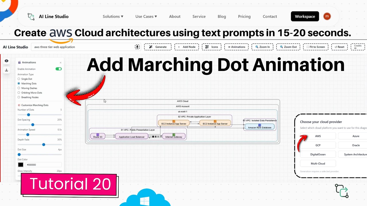
This tutorial shows you how to add and customize moving dashes animation on AWS architecture diagrams in AI Line Studio. After generating a three-tier AWS diagram from a text prompt, you can enable animated connection lines that show exactly how data flows between components. The animation turns static infrastructure drawings into dynamic visuals that explain system behavior at a glance.
YouTube Tutorial
Advanced Marching Dot Animation for AWS Diagrams AI Line Studio Tutorial 20
Setting Up Your AWS Architecture Diagram
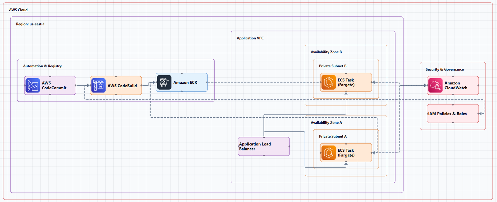
Before you can animate anything, you need a diagram. After registering on AI Line Studio, you land on the Workspace page. From there, select Cloud Architecture and choose AWS as your provider. Enter "AWS 3 tier application" as your prompt, and the platform generates a structured architecture diagram in roughly 15 to 20 seconds.
The generated diagram includes the standard components you'd expect: load balancers, application servers, and database layers, all connected by lines that represent data paths. At this stage, the diagram is static. The connections show that components talk to each other, but they don't show direction or movement. That's where the animation comes in.
If you want to improve the quality of the initial diagram, the input guide covers how to write prompts that produce cleaner topologies.
How to Enable Moving Dashes Animation AWS Diagrams in AI Line Studio
Once your diagram is ready, navigate to the animation portal. This is where you control dynamic effects for your connections. Select the "moving dashes" option and click enable. The dashes immediately begin moving along the diagram's connection lines.
The effect is instant. You don't need to configure animation paths or draw motion trajectories manually. The platform detects the existing connection lines and applies the movement to them automatically. This means any diagram you generate, whether it's a three-tier web app, a microservices mesh, or a VPC design, can support the effect without restructuring.
Adding moving dashes animation AWS diagrams to your cloud architecture diagram visuals turns static connection lines into dynamic data flow indicators. Instead of explaining verbally that traffic moves from the load balancer to the application tier, the animation shows it.
Customizing the Animation Settings
After enabling the effect, you can adjust four properties to match your presentation style or brand requirements:
Dash Color, Update the dash color to any value that fits your design. If you're presenting to executives, you might match corporate colors. If you're documenting for engineers, high-contrast colors improve readability in screenshots.
Dash Length, Increase or decrease the physical length of each dash. Shorter dashes create a subtle, refined motion. Longer dashes make the movement more prominent and easier to spot from a distance.
Gap Customisation, Adjust the space between each moving dash. Tighter gaps create a continuous flow appearance. Wider gaps emphasize individual packets or discrete data transfers, which can be useful when explaining batch processing or request-response cycles.
Animation Speed, Speed up or slow down how fast the dashes travel along the paths. Slower speeds work well for walkthroughs where you narrate each step. Faster speeds convey high-throughput systems or real-time data streams.
These settings apply per diagram, so you can create different versions for different audiences without rebuilding the underlying architecture.
Why Animated Connection Lines Matter for Architecture Diagrams
Static diagrams document structure. Animated diagrams explain behavior. When you're presenting a cloud architecture diagram to stakeholders who don't live in AWS Console every day, the direction and flow of data isn't obvious from boxes and lines alone.
The moving dashes solve this by providing a highly visual, dynamic way to represent exactly how data moves between different architectural components. A system architect can point to a line and say, "this is the request path," and the audience sees the request traveling. A DevOps engineer can highlight a backup replication stream without writing a paragraph of explanation.
This aligns with the core goal of helping users stop drawing and start explaining. The diagram becomes a communication tool rather than just a documentation artifact.
Who Benefits From Animated AWS Diagrams
System architects can use these visuals during design reviews to validate assumptions about traffic patterns before implementation. When you're proposing a new topology, animated flows help stakeholders understand the proposal without requiring them to read technical specifications.
Software engineers benefit when onboarding to existing systems. A static diagram shows what connects to what. An animated diagram shows how the system behaves under normal operation. That behavioral context reduces the time it takes to understand why a particular service sits where it does.
Technical writers and educators also find value here. When you need to explain a complex AWS concept to an audience that doesn't share your mental model, a generated diagram with animated data flow bridges the gap faster than a wall of text.
Comparing Animated Diagrams to Static Alternatives
Most diagram tools produce static outputs. You export a PNG, paste it into a slide, and hope the audience understands the flow. If you're comparing approaches, Cloudcraft offers polished isometric AWS visuals, but the output is still a static image. You can't show live data flow without recording a video or adding external animation tools.
AI Line Studio keeps the animation inside the diagram itself. That means you can share a link, present live, or export a video loop without leaving the platform. The animation isn't an afterthought, it's part of the diagram's native behavior.
For teams that need to produce architecture documentation regularly, the time savings add up. You generate the diagram, enable the effect, adjust settings, and export. No manual frame-by-frame animation required.
Getting Started With Your First Animated AWS Diagram
The workflow is consistent regardless of architecture complexity. Generate your AWS diagram from a text prompt, open the animation portal, enable moving dashes, and customize the settings to fit your context. The entire process from prompt to animated output takes under a minute.
If you're building diagrams for production documentation or client presentations, you can review the pricing plans to see which tier includes animation features and export options.
Key Takeaways
- Moving dashes animation AWS diagrams make it easier to explain how data travels between components in complex architectures.
- The animation portal lets you enable moving dashes on any AWS diagram generated from a text prompt.
- You can customize dash color, length, gap size, and animation speed to match your presentation needs.
- Animated connection lines turn static documentation into dynamic communication tools for stakeholders.
Ready to add animated data flow to your AWS diagrams?
Try the moving dashes feature on AI Line Studio's free plan and see your architecture come to life.
Try It FreeFrequently Asked Questions
It is an animation effect available in the animation portal that adds moving dashed lines along connection paths in AWS architecture diagrams. You select the option, click enable, and the dashes begin moving automatically.