
Oracle Architecture Diagram Breathing Node Animation: A Step-by-Step Guide
An Oracle architecture diagram breathing node animation turns static node icons into pulsing, attention-drawing indicators that highlight the most critical components in your OCI layout. Learn how AI Line Studio enables breathing nodes on an Oracle multi-region active-passive architecture and customize size, color, glow, speed, and intensity. From prompt to animated diagram takes under a minute.
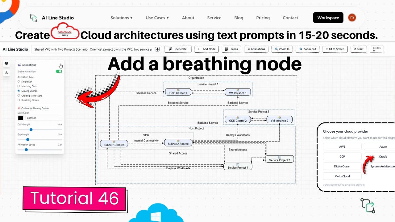
YouTube Tutorial
Oracle Diagram: Add Breathing Node Animation in 20s (AI Line Studio) tutorial 46
What an Oracle Architecture Diagram Breathing Node Animation Does
Static architecture diagrams show structure, but they do not draw attention to what matters most. A breathing node animation adds a pulsing, glowing visual effect around key node icons, making it immediately obvious which components are critical, active, or under focus. Dashed edges surround the node with an animating dot that flows around these edges, creating a rhythmic breathing effect that catches the eye without overwhelming the rest of the diagram.
This is especially valuable in stakeholder presentations and design reviews where the goal is to communicate not just what the architecture contains, but which parts deserve attention. When a viewer sees a breathing node around a primary database or a failover region, they understand its importance without reading a single annotation.
Generating the Base Oracle Diagram
Start by registering on the platform. Once your account is set up, you land on the Workspace page. Select the Cloud Architecture feature, which redirects you to the interactive AI Builder canvas. Select Oracle as your cloud architecture provider.
For this tutorial, the demonstration features an Oracle diagram representing a multi-region active-passive architecture. Enter this scenario into the prompt box and the system automatically generates and renders the completed diagram on the canvas in roughly 15 to 20 seconds. An active-passive multi-region topology typically includes a primary region that handles live traffic and a secondary region that stands ready for failover, with replication and networking components connecting the two.
If you are unsure how to phrase your prompt, the input guide covers how to write prompts for diagrams that produce clean, accurate outputs on the first try. Because the cloud architecture diagram generator builds the foundation in under half a minute, most of your time goes toward reviewing and customizing the output, not manually placing icons and drawing connection lines.
Enabling the Breathing Node Animation
Once the base diagram is ready, activate the breathing node animation on the nodes you want to highlight. Once enabled, the breathing node displays dashed edges with an animating dot flowing around these edges. There is no manual path tracing, no keyframe editing, and no export to a separate animation tool. The animation is generated automatically from the existing node geometry.
This automatic mapping matters for teams that iterate frequently. If you add a new region or replace a node, you do not need to rebuild the animation from scratch. A quick diagram regeneration followed by re-enabling the breathing nodes updates the effect automatically. For system architects who revise diagrams during design sprints, that automation removes the maintenance overhead that usually comes with animated visuals.
Customizing the Breathing Node Animation
The default animation works immediately, but eight settings let you tune the visual to match your audience. All adjustments happen inside the same animation panel.
Size Control. Increase or decrease the size of the animating elements using the size slider. Larger draws immediate attention. Smaller keeps the effect subtle when multiple nodes are animated.
Color Selection. Easily change and update the primary color of the animation. Color coding helps distinguish node roles, red for primary databases, yellow for standby systems, green for healthy endpoints.
Glow Color. Customize the specific color of the glowing trail. Matching the glow to the primary color creates a unified halo. Contrasting the glow creates a more energetic, attention-grabbing pulse.
Glow Intensity. Use the slider bar to make the glow effect brighter or softer. Higher intensity makes the node visible from a distance. Lower intensity keeps the effect refined and professional.
Border Width. Adjust and set the exact thickness of the node animation borders. Thicker borders frame the node more prominently. Thinner borders produce a delicate, elegant edge.
Animation Speed. Speed up or slow down the rate at which the dot circulates around the node edges. Faster circulation creates a more urgent, active feel. Slower circulation produces a calm, measured pulse that suggests stability.
Breathing Intensity. Increase or decrease the pulse scale of the node. Higher intensity makes the node expand and contract more dramatically, ideal for highlighting a single critical component. Lower intensity creates a gentle, ambient pulse that works well when several nodes need attention.
Dot Size. Scale the physical size of the flowing dot up or down. A larger dot emphasizes the motion path; a smaller dot keeps focus on the breathing pulse.
These controls let you adapt the animation for live demos, recorded tutorials, or embedded documentation. The architecture diagrams you create are no longer just structural references, they become living communication tools.
Why Animated OCI Diagrams Improve Communication
The core value of adding a breathing node animation is that it helps cloud architects highlight key elements and draw immediate attention to the most critical components within their designs, making the overall cloud architecture significantly more visually engaging and interactive. A static diagram lists every node with equal visual weight; an animated diagram tells the viewer which nodes matter most.
For teams onboarding new engineers, the animation helps them understand which components to monitor first. The feature also scales with complexity. In larger Oracle environments, breathing nodes make the hierarchy visually obvious.
From Drawing to Explaining
AI Line Studio's core motto is "stop drawing, start explaining." That phrase addresses a real friction point: most diagramming tools spend the majority of your time on manual formatting, leaving little room for the actual thinking. When layout, icons, and animations are handled automatically, effort shifts to accuracy. You verify that the primary region actually replicates to the standby. You catch missing connections before they become production issues.
The diagram becomes a thinking tool, not a presentation chore. A software engineer can use the same workflow to document microservice interactions. Teams that adopt this approach produce documentation that stays accurate longer.
Key Takeaways
- An Oracle architecture diagram breathing node animation adds a pulsing, glowing visual effect around critical node icons to draw immediate attention to the most important components.
- Generate the base Oracle diagram by selecting Cloud Architecture in the Workspace, choosing Oracle as your provider, and entering a prompt like "multi-region active-passive architecture", output arrives in 15 to 20 seconds.
- Enable the breathing node animation to display dashed edges with an animating dot flowing around the node edges; the effect generates automatically from existing node geometry.
- Customize size, color, glow color, glow intensity, border width, animation speed, breathing intensity, and dot size to match your presentation style or operational narrative.
- Animated diagrams make cloud architecture more engaging for stakeholders and help technical teams identify critical components during design reviews.
Ready to make your Oracle diagrams highlight what matters most?
Try it free and add breathing node animation to your first OCI architecture diagram in under a minute.
Try It FreeFrequently Asked Questions
Generate your base diagram first by selecting Cloud Architecture in the Workspace, choosing Oracle as your provider, and entering your prompt. Then activate the breathing node animation on the nodes you want to highlight; dashed edges with an animating dot will immediately begin flowing around the node edges.