
Orbiting Micro Dot Animation AWS Diagrams: Step-by-Step Tutorial
Static architecture diagrams show structure, but they do not show flow. AI Line Studio solves this with an animation feature that adds orbiting micro dots to connection lines, visually highlighting how data moves through your AWS infrastructure. This tutorial walks through the exact steps: generate a base diagram, enable the animation, and customize the speed, quantity, and color to match your presentation needs.

YouTube Tutorial
How to Add Orbiting Micro Dot Animation to AWS Diagrams AI Line Studio Tutorial 21
How the Animation Feature Works
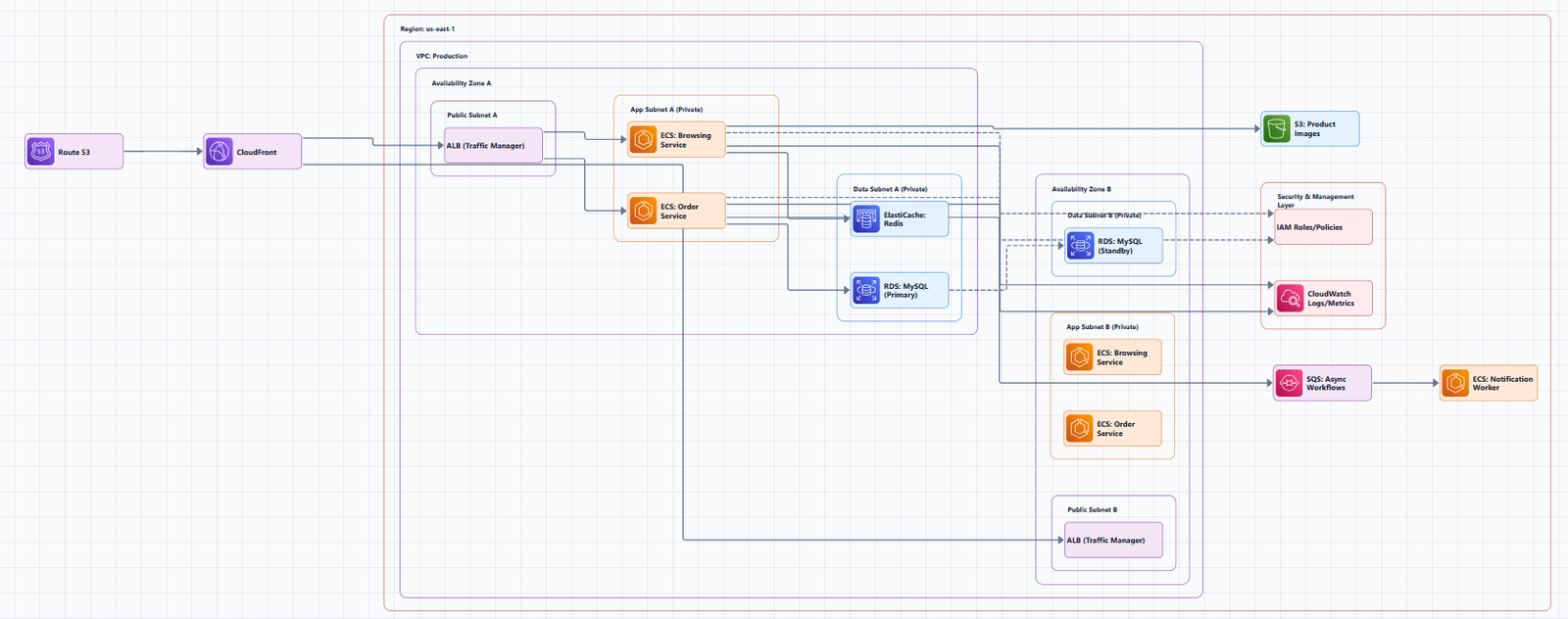
The platform's animation tool turns static connection lines into moving data paths. Instead of asking stakeholders to trace arrows with their eyes, you let the motion do the explaining. Small dots travel along the connections between services, orbit around junction points, and give the diagram a sense of live data flow. This orbiting micro dot animation AWS diagrams walkthrough covers generation, activation, and customization from start to finish.
Step 1: Generate the Base AWS Architecture
After you register on the platform, you land on the Workspace page. Click Cloud Architecture to open the provider selection screen, then choose AWS. In the input box, type your scenario prompt. The tutorial uses "AWS three application" to generate a complete architecture diagram in 15 to 20 seconds. This gives you the foundational layout with connected nodes, service icons, and logical groupings. The animation is applied to the connection lines between these nodes, so starting with a clean, accurate base diagram is essential. A well-structured base ensures that the orbiting dots follow meaningful paths rather than bouncing between randomly placed elements. If you are unsure how to phrase prompts for the best initial output, the input guide covers techniques for describing multi-tier applications, network topologies, and security boundaries.
Step 2: Enable the Orbiting Micro Dots
With the base diagram on the canvas, click the "Animation" option in the interface. The orbiting micro dots animation starts immediately on the connection lines between nodes. You do not need to select individual arrows, configure keyframes, or set up motion paths manually. The system applies the effect to all visible connections automatically, turning a static architecture into a moving representation of data flow. This instant activation is useful when you are in a time-constrained review and need to add visual interest without rebuilding the diagram. It also means you can experiment quickly: turn the animation on, assess whether it improves clarity, and turn it off again if the diagram works better static.
Customizing Orbiting Micro Dot Animation AWS Diagrams
Once the animation is running, you can fine-tune how the dots behave using four independent controls. These settings let you match the animation to your audience, brand, and the complexity of the architecture. You do not need to commit to the default settings; every control is adjustable in real time, so you can preview changes as you make them and settle on a configuration that supports your narrative rather than distracting from it.
Travel Speed
The travel speed control increases or decreases how fast the micro dots move along the connection lines. If you are presenting to a large audience or recording a video, a slightly slower travel speed makes the flow easier to follow. For quick internal reviews, a faster speed keeps the energy up without losing clarity.
Orbit Speed
The orbit speed control adjusts how fast the dots rotate around connection junctions or bend points. Slowing this down creates a smoother, more deliberate visual; speeding it up adds urgency. These two speed controls are independent, so you can pair a slow travel speed with a fast orbit speed, or vice versa, depending on the tone of your presentation.
Dot Quantity
The dot quantity slider lets you increase or decrease the number of animating micro dots on the connection lines. A higher density of dots emphasizes heavy data flow between services, while fewer dots create a cleaner, less distracting look for simple point-to-point connections.
Color Customization
You can update the dot color to fit your design or branding. The tutorial demonstrates changing the dots to red, yellow, or any other color. Color coding is especially useful in complex architecture diagrams where different connection types carry different kinds of traffic. For example, you might use red dots for write operations, yellow for read operations, and green for health checks, giving viewers an immediate visual legend without adding extra text boxes.
When to Use Animated AWS Diagrams
Animated diagrams are not just for aesthetics. In stakeholder presentations, the motion draws attention to the data paths that matter most, preventing viewers from getting lost in a dense web of boxes and lines. During onboarding, new engineers can watch the dots travel from a load balancer to an application server to a database, internalizing the request flow faster than they could from a static image. For system architects who present multi-tier designs to cross-functional teams, the animation turns a technical blueprint into a story that non-technical stakeholders can follow. In incident response, animating the affected path highlights exactly which services are involved in a failure chain. The visual engagement keeps remote attendees focused during video calls where static slides often lose their attention.
Tips for Clean, Effective Animation
Subtlety usually wins. A diagram with too many fast-moving dots can feel chaotic rather than informative. Start with a moderate quantity and speed, then adjust based on your audience and screen size. If you are exporting the diagram as a video or GIF for social media, test the color contrast against your background to ensure the dots remain visible on different displays. Remember that animation should clarify the architecture, not obscure it. If a connection line is so short that orbiting dots overlap and create visual noise, reduce the quantity for that section or simplify the layout. You can also turn the animation off for specific connections if the platform supports selective masking, keeping motion limited to the most critical data paths. For more advanced tutorials on building and refining cloud architecture visuals, visit the resources hub.
Key Takeaways
- AI Line Studio's orbiting micro dot animation AWS diagrams feature adds motion to static connection lines without manual keyframe setup.
- The workflow starts on the Workspace page: select Cloud Architecture, choose AWS, enter a prompt, and generate the base layout in 15 to 20 seconds.
- Clicking "Animation" instantly applies orbiting micro dots to all connection lines across the generated diagram.
- Travel speed, orbit speed, and dot quantity can be adjusted independently to match your audience and presentation style.
- Color customization lets you brand the animation or code connection types for clearer communication during reviews.
Ready to add motion to your AWS diagrams?
Visit the pricing page to try AI Line Studio free and explore the animation controls.
View PricingFrequently Asked Questions
After registering on AI Line Studio, navigate to the Workspace page, select Cloud Architecture, choose AWS, and generate your base diagram. Then click the "Animation" option to start the orbiting micro dots on the connection lines.